9.6 KiB
Visualizing Quantities
Sketchnote comes here
In this lesson you will explore how to use the ggplot2 package to create meaningful visualizations around the concept of quantity. Using a clean dataset about the number of COVID-19 cases in the world, you can make these visualizations and explore the trends of the COVID-19 numbers. This dataset has many variables including the number of confirmed, recovered and deceased cases all over the world from 21-01-2020 and is updated regularly.
Pre-lecture quiz yet to be linked
Observe COVID-19 trends with ggplot2
ggplot2 is a system for declaratively creating graphics, based on The Grammar of Graphics. The Grammar of Graphics is a general scheme for data visualization which breaks up graphs into semantic components such as scales and layers. In other words, the ease of creating plots and graphs for univariate or multivariate data with little code makes ggplot2 the most popular package used for visualizations in R. The user tells ggplot2 how to map the variables to aesthetics, the graphical primitives to use, and ggplot2 takes care of the remaining.
✅ Plot = Data + Aesthetics + Geometry
- Data refers to the dataset
- Aesthetics indicate the variables to be studied (x and y variables)
- Geometry refers to the type of plot (line plot, bar plot, etc.)
Choose the best geometry (type of plot) according to your data and the story you want to tell through the plot.
- To analyze trends: line, column
- To compare values: bar, column, pie, scatterplot
- To show how parts relate to a whole: pie
- To show distribution of data: scatterplot, bar
- To show relationships between values: line, scatterplot, bubble
✅ You can also checkout this descriptive cheatsheet for ggplot2.
Build a line plot on the number of COVID-19 cases
In this section, you would be plotting a line graph to analyse the trends of the confirmed, recovered and deceased COVID-19 cases in the world.
Open the R console and import the dataset.
Note: The dataset is stored in the root of this repo in the
/datafolder.
Let's import the dataset and observe the head (top 5 rows) of the data.
df_covid <- read.csv("../../data/covid.csv")
head(df_covid)
The head of the data has a mix of numbers and text:
| id | updated | confirmed | confirmed_change | deaths | deaths_change | recovered | recovered_change | load_time |
|---|---|---|---|---|---|---|---|---|
| 338995 | 21-01-2020 | 262 | NA | 0 | NA | NA | NA | 09:54.1 |
| 338996 | 22-01-2020 | 313 | 51 | 0 | 0 | NA | NA | 09:54.1 |
| 338997 | 23-01-2020 | 578 | 265 | 0 | 0 | NA | NA | 09:54.1 |
| 338998 | 24-01-2020 | 841 | 263 | 0 | 0 | NA | NA | 09:54.1 |
| 338999 | 25-01-2020 | 1320 | 479 | 0 | 0 | NA | NA | 09:54.1 |
The data type for the "updated" column is achr(character), but we would want it in a date-time format for analysing and vidualizing. In order to convert the values to the date-time format in the updated column, the lubridate package is used. To install, load and convert the data type to date-time, enter the following in the R console.
install.packages("lubridate")
library("lubridate")
df_covid$updated<-as.Date(parse_date_time(df_covid$updated, c('ymd', 'ymd')))
Using the command above, we convert the "updated" column in the "df_covid" dataset into a date-time format. We specify the existing format of the dates to be yyyy-mm-dd and the desired format as yyyy-mm-dd
Next, to get started with visualizations, let's install and loadggplot2package using the R console.
install.packages("ggplot2")
library("ggplot2")
Let's start visualizing the data we imported by plotting a line graph of the confirmed, deceased and the recovered cases.
ggplot(df_covid,aes(x=updated, y=confirmed)) +
   geom_line()
We use theggplot2package for plotting a line graph of the confirmed covid cases for the range of dates starting January 2020 to November 2021. Thegeom_line()function is used for plotting a line graph, with the dataset being the first argument inggplot() The 'aes' specifies the variables for the x and y axes which would be 'updated' and 'confirmed' respectively.
The graph looks like this:

To make the plot understandable, we can change the Y-axis scales to numbers instead of abbreviated points (abbreviated to e) using the 'scales' package. We can also add points, title, customized labels on the line graph for a better presentation.
install.packages("scales")
library("scales")
ggplot(df_covid,aes(x=updated, y=confirmed)) +
  geom_line(colour="red") +
  geom_point() +
  xlab("Month") +
  ylab("Confirmed Cases") +
  ggtitle("Confirmed COVID-19 cases from Jan 2020 to Nov 2021") +
  scale_y_continuous(labels=comma)
You have now successfully added customized labels to the axes, titled the plot, changed the colour of the line to red and points on the y-axis are now in the numerical format instead of the abbreviated format.

Similarly, you can now plot the line graphs for the recovered and the deceased cases.
ggplot(df_covid,aes(x=updated, y=recovered)) +
geom_line(colour="red") +
geom_point() +
xlab("Month") +
ylab("Recovered Cases") +
ggtitle("Recovered COVID-19 cases from Jan 2020 to Nov 2021") +
scale_y_continuous(labels=comma)
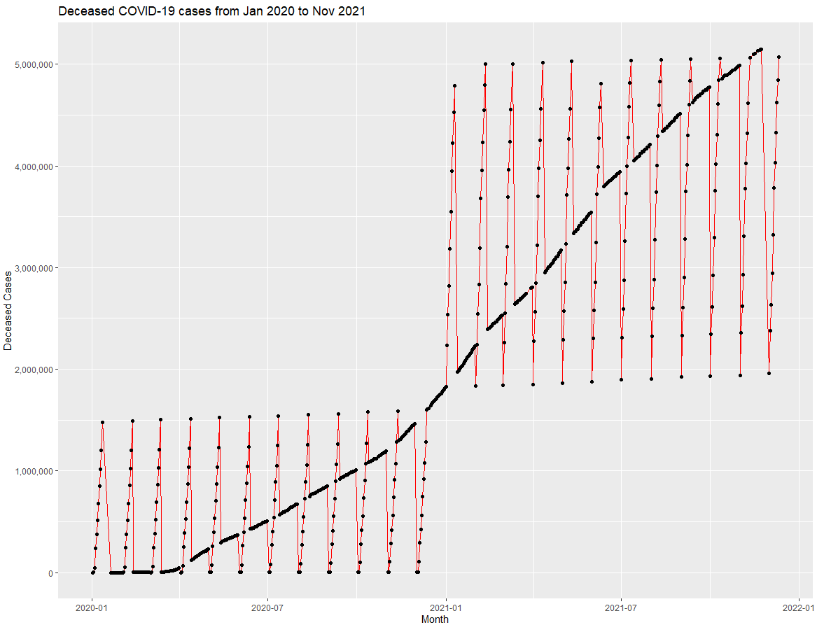
ggplot(df_covid,aes(x=updated, y=deaths)) +
geom_line(colour="red") +
geom_point() +
xlab("Month") +
ylab("Deceased Cases") +
ggtitle("Deceased COVID-19 cases from Jan 2020 to Nov 2021") +
scale_y_continuous(labels=comma)

Exploring bar graphs
Let's start off with creating a simple bar chart of the confirmed COVID-19 cases
ggplot(data=df, aes(x=updated, y=confirmed, fill=confirmed)) +
   geom_bar(stat="identity") +
   xlab("Month") +
   ylab("Confirmed Cases") +
   ggtitle("Confirmed COVID-19 cases from Jan 2020 to Nov 2021") +
   scale_y_continuous(labels=comma) +
   scale_fill_gradient(low = "green", high = "red",labels = comma)

Similarly, we can also make the bar charts for the recovered and the deceased cases in different colours.


Stacked Bar Chart
You can now analyse the data using a stacked bar chart. Each bar is divided into a number of sub-bars which get stacked end to end over one another. In our case we can stack the bars corresponding to confirmed, recovered and deceased cases in one graph.
In order to convert multiple columns into columns of key-value pairs, thegather() function from the tidyverse and dplyr packages will help us summarize the data.
install.packages("dplyr")
install.packages("tidyverse")
library(lubridate)
library(scales)
library(dplyr)
library(ggplot2)
library(tidyverse)
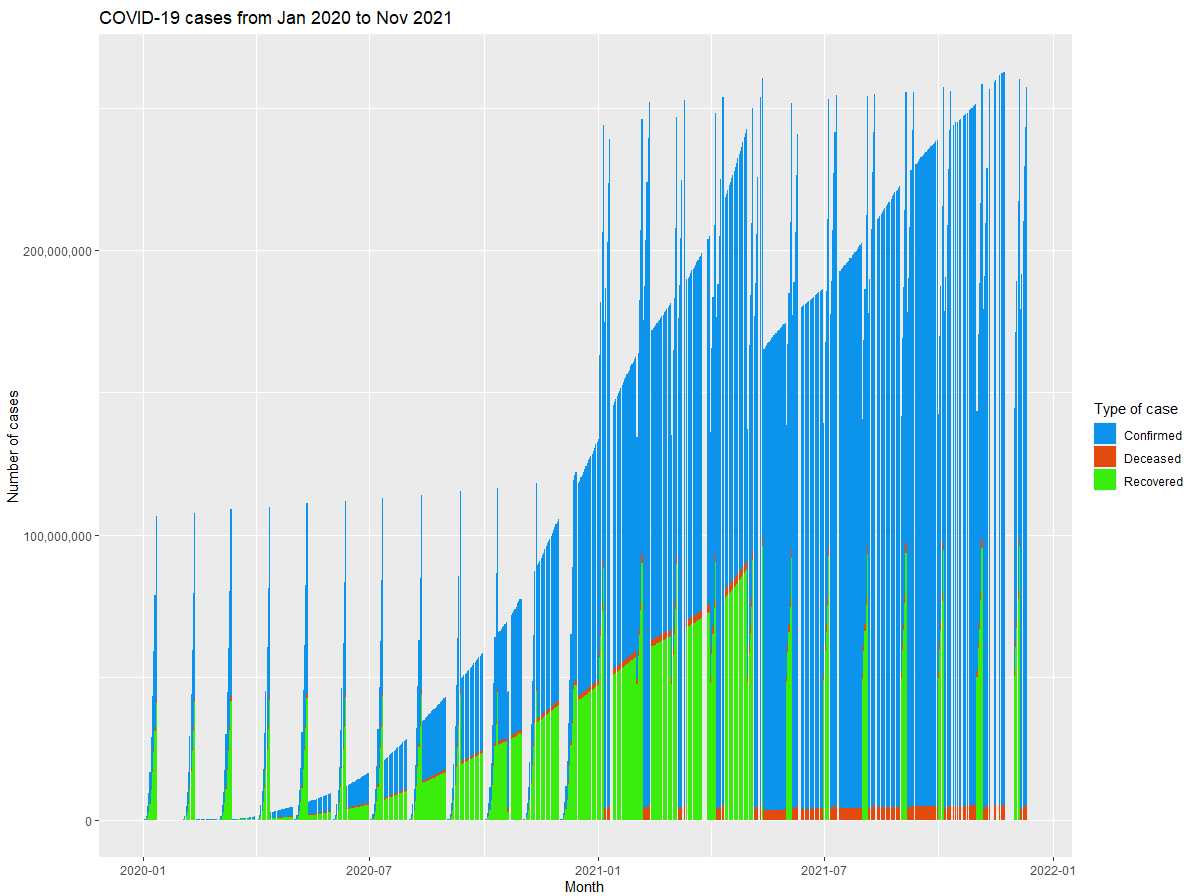
df_covid %>% group_by(updated) %>%
summarise(n=n(),
Deceased = mean(deaths),
Recovered = mean(recovered),
Confirmed = mean(confirmed)) %>%
gather("key", "value", - c(updated, n)) %>%
ggplot(aes(x = updated, y = value, group = key, fill = key)) +
geom_bar(stat = "identity") +
scale_fill_manual(values = c("#0c94ed", "#e34a0d", "#3bed0c")) +
xlab("Month") +
ylab("Number of cases") +
ggtitle("COVID-19 cases from Jan 2020 to Nov 2021") +
scale_y_continuous(labels=comma) +
labs(fill="Type of case")
Scatter plot
You can also plot a scatter plot using thegeom_point()function to have a look at the variation in the data.
df%>% group_by(updated) %>%
summarise(n=n(),
Deceased = mean(deaths),
Recovered = mean(recovered),
Confirmed = mean(confirmed)) %>%
gather("key", "value", - c(updated, n)) %>%
ggplot(aes(x = updated, y = value, group = key, fill = key)) +
geom_point(stat = "identity") +
scale_color_manual(values = c("#0c94ed", "#e34a0d", "#3bed0c")) +
xlab("Month") +
ylab("Number of cases") +
ggtitle("COVID-19 cases from Jan 2020 to Nov 2021") +
scale_y_continuous(labels=comma) +aes(color=key)

All these graphs help in clear interpretation and analysis of the COVID-19 data
🚀 Challenge
The dataset used in this lesson visualizes the data worldwide. Practice building plots and visualizing quantities around the data for countries that you like. The dataset can be found here
Review & Self Study
This first lesson has given you some information about how to use ggplot2 to visualize quantities. Research and lookout for datasets that you could visualize using other packages like Lattice and Plotly
Assignment
Line, Bar and Scatter plot yet to be linked