
19 KiB
အချိုးအစားများကို ရှင်းလင်းဖော်ပြခြင်း
 |
|---|
| အချိုးအစားများကို ရှင်းလင်းဖော်ပြခြင်း - Sketchnote by @nitya |
ဒီသင်ခန်းစာမှာ သင့်အနေဖြင့် သဘာဝနှင့်ဆက်စပ်သော အခြား dataset ကို အသုံးပြုပြီး အချိုးအစားများကို ရှင်းလင်းဖော်ပြပါမည်။ ဥပမာအားဖြင့် မုန့်ဖုတ် dataset တွင် မုန့်ဖုတ်အမျိုးအစားများ ဘယ်လောက်ရှိသည်ကို ဖော်ပြခြင်း။ Audubon မှ ရရှိသော Agaricus နှင့် Lepiota မိသားစုများတွင် ပါဝင်သော 23 မျိုးစိတ်အကြောင်းအရာများပါဝင်သော dataset ကို အသုံးပြုကာ မုန့်ဖုတ်များကို စူးစမ်းလေ့လာကြမည်။ သင့်အနေဖြင့် အောက်ပါအတိုင်း ရှင်းလင်းဖော်ပြမှုများကို စမ်းသပ်နိုင်ပါသည်-
- ပိုင်း chart 🥧
- ဒိုနတ် chart 🍩
- ဝါဖယ် chart 🧇
💡 Microsoft Research မှ Charticulator ဟုခေါ်သော စိတ်ဝင်စားဖွယ်ကောင်းသော project တစ်ခုသည် data visualizations အတွက် အခမဲ့ drag and drop interface ကို ပေးထားသည်။ သူတို့၏ tutorial တစ်ခုတွင်လည်း မုန့်ဖုတ် dataset ကို အသုံးပြုထားသည်။ ထို့ကြောင့် သင့်အနေဖြင့် data ကို စူးစမ်းလေ့လာပြီး library ကို တစ်ချိန်တည်းမှာလည်း သင်ယူနိုင်ပါသည်- Charticulator tutorial။
Post-lecture quiz
မုန့်ဖုတ်များကို သိရှိပါ 🍄
မုန့်ဖုတ်များသည် စိတ်ဝင်စားဖွယ်ကောင်းသည်။ dataset ကို import လုပ်ပြီး မုန့်ဖုတ်များကို လေ့လာကြပါစို့-
import pandas as pd
import matplotlib.pyplot as plt
mushrooms = pd.read_csv('../../data/mushrooms.csv')
mushrooms.head()
အလွန်ကောင်းမွန်သော data များပါဝင်သော table တစ်ခု print ထုတ်ထားသည်-
| class | cap-shape | cap-surface | cap-color | bruises | odor | gill-attachment | gill-spacing | gill-size | gill-color | stalk-shape | stalk-root | stalk-surface-above-ring | stalk-surface-below-ring | stalk-color-above-ring | stalk-color-below-ring | veil-type | veil-color | ring-number | ring-type | spore-print-color | population | habitat |
|---|---|---|---|---|---|---|---|---|---|---|---|---|---|---|---|---|---|---|---|---|---|---|
| Poisonous | Convex | Smooth | Brown | Bruises | Pungent | Free | Close | Narrow | Black | Enlarging | Equal | Smooth | Smooth | White | White | Partial | White | One | Pendant | Black | Scattered | Urban |
| Edible | Convex | Smooth | Yellow | Bruises | Almond | Free | Close | Broad | Black | Enlarging | Club | Smooth | Smooth | White | White | Partial | White | One | Pendant | Brown | Numerous | Grasses |
| Edible | Bell | Smooth | White | Bruises | Anise | Free | Close | Broad | Brown | Enlarging | Club | Smooth | Smooth | White | White | Partial | White | One | Pendant | Brown | Numerous | Meadows |
| Poisonous | Convex | Scaly | White | Bruises | Pungent | Free | Close | Narrow | Brown | Enlarging | Equal | Smooth | Smooth | White | White | Partial | White | One | Pendant | Black | Scattered | Urban |
အချက်အလက်များအားလုံးသည် စာသားအနေဖြင့် ရှိနေသည်ကို သင်ချက်ချင်း သတိပြုမိပါသည်။ chart တွင် အသုံးပြုနိုင်ရန်အတွက် data ကို ပြောင်းလဲရမည်ဖြစ်သည်။ အချက်အလက်များအများစုသည် object အနေဖြင့် ဖော်ပြထားသည်-
print(mushrooms.select_dtypes(["object"]).columns)
output သည်-
Index(['class', 'cap-shape', 'cap-surface', 'cap-color', 'bruises', 'odor',
       'gill-attachment', 'gill-spacing', 'gill-size', 'gill-color',
       'stalk-shape', 'stalk-root', 'stalk-surface-above-ring',
       'stalk-surface-below-ring', 'stalk-color-above-ring',
       'stalk-color-below-ring', 'veil-type', 'veil-color', 'ring-number',
       'ring-type', 'spore-print-color', 'population', 'habitat'],
      dtype='object')
ဒီ data ကိုယူပြီး 'class' column ကို category အဖြစ် ပြောင်းလဲပါ-
cols = mushrooms.select_dtypes(["object"]).columns
mushrooms[cols] = mushrooms[cols].astype('category')
edibleclass=mushrooms.groupby(['class']).count()
edibleclass
အခုတော့ မုန့်ဖုတ် data ကို print ထုတ်ပါက Poisonous/Edible class အလိုက် category အဖြစ် အုပ်စုဖွဲ့ထားသည်ကို တွေ့နိုင်ပါသည်-
| cap-shape | cap-surface | cap-color | bruises | odor | gill-attachment | gill-spacing | gill-size | gill-color | stalk-shape | ... | stalk-surface-below-ring | stalk-color-above-ring | stalk-color-below-ring | veil-type | veil-color | ring-number | ring-type | spore-print-color | population | habitat | |
|---|---|---|---|---|---|---|---|---|---|---|---|---|---|---|---|---|---|---|---|---|---|
| class | |||||||||||||||||||||
| Edible | 4208 | 4208 | 4208 | 4208 | 4208 | 4208 | 4208 | 4208 | 4208 | 4208 | ... | 4208 | 4208 | 4208 | 4208 | 4208 | 4208 | 4208 | 4208 | 4208 | 4208 |
| Poisonous | 3916 | 3916 | 3916 | 3916 | 3916 | 3916 | 3916 | 3916 | 3916 | 3916 | ... | 3916 | 3916 | 3916 | 3916 | 3916 | 3916 | 3916 | 3916 | 3916 | 3916 |
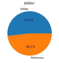
ဒီ table တွင် ဖော်ပြထားသော အစီအစဉ်အတိုင်း class category labels များကို ဖန်တီးပါက ပိုင်း chart တစ်ခုကို ဖန်တီးနိုင်ပါသည်-
ပိုင်း!
labels=['Edible','Poisonous']
plt.pie(edibleclass['population'],labels=labels,autopct='%.1f %%')
plt.title('Edible?')
plt.show()
Voila, မုန့်ဖုတ်များ၏ class နှစ်ခုအလိုက် data အချိုးအစားများကို ဖော်ပြထားသော ပိုင်း chart တစ်ခု။ label array ကို ဖန်တီးရာတွင် label အစီအစဉ်ကို အတိအကျ စစ်ဆေးရန် အထူးအရေးကြီးပါသည်။
ဒိုနတ်!
ပိုင်း chart ထက် အနည်းငယ် ပိုမိုစိတ်ဝင်စားဖွယ်ကောင်းသော chart တစ်ခုမှာ ဒိုနတ် chart ဖြစ်သည်။ ဒိုနတ် chart သည် အလယ်တွင် အပေါက်ပါသော ပိုင်း chart ဖြစ်သည်။ ဒီနည်းလမ်းဖြင့် data ကို ကြည့်ရှုကြပါစို့။
မုန့်ဖုတ်များ၏ အမျိုးမျိုးသော နေရာများကို ကြည့်ရှုပါ-
habitat=mushrooms.groupby(['habitat']).count()
habitat
ဒီမှာ သင့် data ကို habitat အလိုက် အုပ်စုဖွဲ့ထားသည်။ habitat 7 ခုရှိပြီး ဒိုနတ် chart အတွက် label အဖြစ် အသုံးပြုပါ-
labels=['Grasses','Leaves','Meadows','Paths','Urban','Waste','Wood']

plt.pie(habitat['class'], labels=labels,
        autopct='%1.1f%%', pctdistance=0.85)

center_circle = plt.Circle((0, 0), 0.40, fc='white')
fig = plt.gcf()

fig.gca().add_artist(center_circle)

plt.title('Mushroom Habitats')

plt.show()
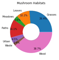
ဒီ code သည် chart နှင့် center circle တစ်ခုကို ရေးဆွဲပြီး ထို့နောက် center circle ကို chart တွင် ထည့်သွင်းသည်။ center circle ၏ width ကို 0.40 ကို အခြားတန်ဖိုးဖြင့် ပြောင်းလဲခြင်းဖြင့် ပြင်ဆင်နိုင်သည်။
ဒိုနတ် chart များကို label များကို ဖတ်ရှုနိုင်စေရန် highlight ပြုလုပ်ခြင်းအပါအဝင် အမျိုးမျိုးသောနည်းလမ်းများဖြင့် ပြင်ဆင်နိုင်သည်။ docs တွင် ပိုမိုလေ့လာပါ။
အခုတော့ သင့် data ကို အုပ်စုဖွဲ့ပြီး ပိုင်း သို့မဟုတ် ဒိုနတ်အဖြစ် ဖော်ပြနည်းကို သိရှိပြီးဖြစ်သည်။ အခြား chart အမျိုးအစားများကို စူးစမ်းကြည့်ပါ။ ဝါဖယ် chart ကို စမ်းကြည့်ပါ၊ အချိုးအစားကို 2D square array အဖြစ် ဖော်ပြခြင်းဖြစ်သည်။
ဝါဖယ်!
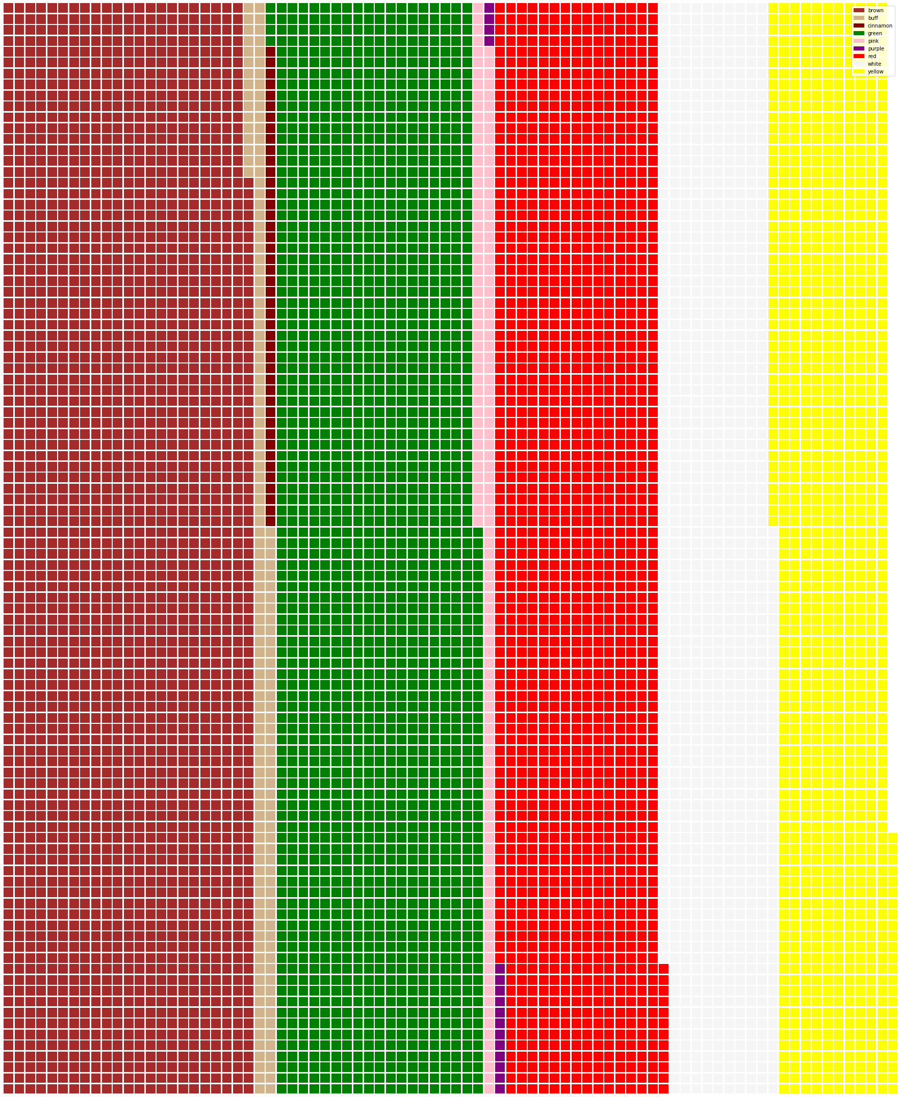
'ဝါဖယ်' အမျိုးအစား chart သည် အချိုးအစားများကို 2D square array အဖြစ် ရှင်းလင်းဖော်ပြခြင်းဖြစ်သည်။ dataset တွင် မုန့်ဖုတ် cap color များ၏ အချိုးအစားများကို ရှင်းလင်းဖော်ပြရန် ကြိုးစားပါ။ ဒီအတွက် PyWaffle ဟုခေါ်သော helper library ကို install လုပ်ပြီး Matplotlib ကို အသုံးပြုပါ-
pip install pywaffle
သင့် data ၏ segment တစ်ခုကို ရွေးချယ်ပါ-
capcolor=mushrooms.groupby(['cap-color']).count()
capcolor
label များကို ဖန်တီးပြီး data ကို အုပ်စုဖွဲ့ကာ ဝါဖယ် chart တစ်ခုကို ဖန်တီးပါ-
import pandas as pd
import matplotlib.pyplot as plt
from pywaffle import Waffle

data ={'color': ['brown', 'buff', 'cinnamon', 'green', 'pink', 'purple', 'red', 'white', 'yellow'],
    'amount': capcolor['class']
     }

df = pd.DataFrame(data)

fig = plt.figure(
    FigureClass = Waffle,
    rows = 100,
    values = df.amount,
    labels = list(df.color),
    figsize = (30,30),
    colors=["brown", "tan", "maroon", "green", "pink", "purple", "red", "whitesmoke", "yellow"],
)
ဝါဖယ် chart ကို အသုံးပြု၍ dataset တွင် မုန့်ဖုတ် cap color များ၏ အချိုးအစားများကို ရှင်းလင်းဖော်ပြနိုင်သည်။ စိတ်ဝင်စားဖွယ်ကောင်းစွာ green-capped မုန့်ဖုတ်များ များစွာရှိသည်ကို တွေ့ရသည်။
✅ Pywaffle သည် Font Awesome တွင် ရရှိနိုင်သော icon များကို အသုံးပြု၍ chart များတွင် icon များထည့်သွင်းနိုင်သည်။ square များအစား icon များကို အသုံးပြုကာ ပိုမိုစိတ်ဝင်စားဖွယ်ကောင်းသော ဝါဖယ် chart ကို ဖန်တီးရန် စမ်းသပ်ပါ။
ဒီသင်ခန်းစာတွင် အချိုးအစားများကို ရှင်းလင်းဖော်ပြရန် နည်းလမ်း ၃ မျိုးကို သင်ယူခဲ့ပါသည်။ ပထမဦးဆုံး သင့် data ကို category များအဖြစ် အုပ်စုဖွဲ့ပြီး data ကို ဖော်ပြရန် အကောင်းဆုံးနည်းလမ်းကို ဆုံးဖြတ်ပါ- ပိုင်း, ဒိုနတ်, သို့မဟုတ် ဝါဖယ်။ အားလုံးသည် စိတ်ဝင်စားဖွယ်ကောင်းပြီး dataset ၏ snapshot ကို ချက်ချင်း ဖော်ပြပေးသည်။
🚀 စိန်ခေါ်မှု
ဒီအရသာရှိသော chart များကို Charticulator တွင် ပြန်ဖန်တီးကြည့်ပါ။
Post-lecture quiz
ပြန်လည်သုံးသပ်ခြင်းနှင့် ကိုယ်တိုင်လေ့လာခြင်း
တစ်ခါတစ်ရံ ပိုင်း, ဒိုနတ်, သို့မဟုတ် ဝါဖယ် chart ကို ဘယ်အချိန်မှာ အသုံးပြုရမည်ဆိုတာ မရှင်းလင်းနိုင်ပါ။ ဒီအကြောင်းအရာနှင့်ပတ်သက်သော ဆောင်းပါးများကို ဖတ်ရှုပါ-
https://www.beautiful.ai/blog/battle-of-the-charts-pie-chart-vs-donut-chart
https://medium.com/@hypsypops/pie-chart-vs-donut-chart-showdown-in-the-ring-5d24fd86a9ce
https://www.mit.edu/~mbarker/formula1/f1help/11-ch-c6.htm
ပိုမိုသိရှိရန် သုတေသနပြုပါ။
လုပ်ငန်းတာဝန်
အကြောင်းကြားချက်:
ဤစာရွက်စာတမ်းကို AI ဘာသာပြန်ဝန်ဆောင်မှု Co-op Translator ကို အသုံးပြု၍ ဘာသာပြန်ထားပါသည်။ ကျွန်ုပ်တို့သည် တိကျမှုအတွက် ကြိုးစားနေသော်လည်း၊ အလိုအလျောက် ဘာသာပြန်မှုများတွင် အမှားများ သို့မဟုတ် မတိကျမှုများ ပါဝင်နိုင်သည်ကို သတိပြုပါ။ မူရင်းဘာသာစကားဖြင့် ရေးသားထားသော စာရွက်စာတမ်းကို အာဏာတရ အရင်းအမြစ်အဖြစ် ရှုလေ့လာသင့်ပါသည်။ အရေးကြီးသော အချက်အလက်များအတွက် လူ့ဘာသာပြန်ပညာရှင်များမှ ပရော်ဖက်ရှင်နယ် ဘာသာပြန်မှုကို အကြံပြုပါသည်။ ဤဘာသာပြန်မှုကို အသုံးပြုခြင်းမှ ဖြစ်ပေါ်လာသော အလွဲအမှားများ သို့မဟုတ် အနားလွဲမှုများအတွက် ကျွန်ုပ်တို့သည် တာဝန်မယူပါ။