
12 KiB
비율 시각화
 |
|---|
| 비율 시각화 - Sketchnote by @nitya |
이 강의에서는 자연을 주제로 한 다른 데이터셋을 사용하여 비율을 시각화합니다. 예를 들어, 주어진 버섯 데이터셋에서 다양한 종류의 균류가 얼마나 많은지 알아볼 수 있습니다. Audubon에서 제공한 Agaricus와 Lepiota 계열의 23종의 주름버섯에 대한 데이터를 활용하여 이 흥미로운 균류를 탐구해 봅시다. 다음과 같은 맛있는 시각화를 실험해 볼 것입니다:
- 파이 차트 🥧
- 도넛 차트 🍩
- 와플 차트 🧇
💡 Microsoft Research의 Charticulator라는 매우 흥미로운 프로젝트는 데이터 시각화를 위한 무료 드래그 앤 드롭 인터페이스를 제공합니다. 그들의 튜토리얼 중 하나에서도 이 버섯 데이터셋을 사용합니다! 데이터를 탐구하면서 라이브러리를 배울 수 있습니다: Charticulator 튜토리얼.
강의 후 퀴즈
버섯에 대해 알아보기 🍄
버섯은 매우 흥미로운 생물입니다. 데이터를 가져와서 연구해 봅시다:
import pandas as pd
import matplotlib.pyplot as plt
mushrooms = pd.read_csv('../../data/mushrooms.csv')
mushrooms.head()
테이블이 출력되며 분석에 적합한 훌륭한 데이터가 표시됩니다:
| class | cap-shape | cap-surface | cap-color | bruises | odor | gill-attachment | gill-spacing | gill-size | gill-color | stalk-shape | stalk-root | stalk-surface-above-ring | stalk-surface-below-ring | stalk-color-above-ring | stalk-color-below-ring | veil-type | veil-color | ring-number | ring-type | spore-print-color | population | habitat |
|---|---|---|---|---|---|---|---|---|---|---|---|---|---|---|---|---|---|---|---|---|---|---|
| Poisonous | Convex | Smooth | Brown | Bruises | Pungent | Free | Close | Narrow | Black | Enlarging | Equal | Smooth | Smooth | White | White | Partial | White | One | Pendant | Black | Scattered | Urban |
| Edible | Convex | Smooth | Yellow | Bruises | Almond | Free | Close | Broad | Black | Enlarging | Club | Smooth | Smooth | White | White | Partial | White | One | Pendant | Brown | Numerous | Grasses |
| Edible | Bell | Smooth | White | Bruises | Anise | Free | Close | Broad | Brown | Enlarging | Club | Smooth | Smooth | White | White | Partial | White | One | Pendant | Brown | Numerous | Meadows |
| Poisonous | Convex | Scaly | White | Bruises | Pungent | Free | Close | Narrow | Brown | Enlarging | Equal | Smooth | Smooth | White | White | Partial | White | One | Pendant | Black | Scattered | Urban |
바로 눈에 띄는 점은 모든 데이터가 텍스트로 되어 있다는 것입니다. 차트에서 사용할 수 있도록 데이터를 변환해야 합니다. 실제로 대부분의 데이터는 객체로 표현됩니다:
print(mushrooms.select_dtypes(["object"]).columns)
출력 결과는 다음과 같습니다:
Index(['class', 'cap-shape', 'cap-surface', 'cap-color', 'bruises', 'odor',
       'gill-attachment', 'gill-spacing', 'gill-size', 'gill-color',
       'stalk-shape', 'stalk-root', 'stalk-surface-above-ring',
       'stalk-surface-below-ring', 'stalk-color-above-ring',
       'stalk-color-below-ring', 'veil-type', 'veil-color', 'ring-number',
       'ring-type', 'spore-print-color', 'population', 'habitat'],
      dtype='object')
이 데이터를 가져와 'class' 열을 카테고리로 변환합니다:
cols = mushrooms.select_dtypes(["object"]).columns
mushrooms[cols] = mushrooms[cols].astype('category')
edibleclass=mushrooms.groupby(['class']).count()
edibleclass
이제 버섯 데이터를 출력하면 독성/식용 클래스에 따라 카테고리로 그룹화된 것을 확인할 수 있습니다:
| cap-shape | cap-surface | cap-color | bruises | odor | gill-attachment | gill-spacing | gill-size | gill-color | stalk-shape | ... | stalk-surface-below-ring | stalk-color-above-ring | stalk-color-below-ring | veil-type | veil-color | ring-number | ring-type | spore-print-color | population | habitat | |
|---|---|---|---|---|---|---|---|---|---|---|---|---|---|---|---|---|---|---|---|---|---|
| class | |||||||||||||||||||||
| Edible | 4208 | 4208 | 4208 | 4208 | 4208 | 4208 | 4208 | 4208 | 4208 | 4208 | ... | 4208 | 4208 | 4208 | 4208 | 4208 | 4208 | 4208 | 4208 | 4208 | 4208 |
| Poisonous | 3916 | 3916 | 3916 | 3916 | 3916 | 3916 | 3916 | 3916 | 3916 | 3916 | ... | 3916 | 3916 | 3916 | 3916 | 3916 | 3916 | 3916 | 3916 | 3916 | 3916 |
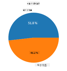
이 테이블에 표시된 순서를 따라 클래스 카테고리 레이블을 생성하면 파이 차트를 만들 수 있습니다:
파이!
labels=['Edible','Poisonous']
plt.pie(edibleclass['population'],labels=labels,autopct='%.1f %%')
plt.title('Edible?')
plt.show()
짜잔, 이 두 가지 버섯 클래스에 따라 데이터의 비율을 보여주는 파이 차트가 완성되었습니다. 특히 여기에서는 레이블 배열을 생성할 때 순서를 올바르게 설정하는 것이 매우 중요하니 반드시 확인하세요!
도넛!
파이 차트보다 시각적으로 더 흥미로운 차트는 도넛 차트입니다. 도넛 차트는 가운데에 구멍이 있는 파이 차트입니다. 이 방법을 사용하여 데이터를 살펴봅시다.
버섯이 자라는 다양한 서식지를 살펴보세요:
habitat=mushrooms.groupby(['habitat']).count()
habitat
여기에서는 데이터를 서식지별로 그룹화합니다. 7개가 나열되어 있으니 이를 도넛 차트의 레이블로 사용하세요:
labels=['Grasses','Leaves','Meadows','Paths','Urban','Waste','Wood']

plt.pie(habitat['class'], labels=labels,
        autopct='%1.1f%%', pctdistance=0.85)

center_circle = plt.Circle((0, 0), 0.40, fc='white')
fig = plt.gcf()

fig.gca().add_artist(center_circle)

plt.title('Mushroom Habitats')

plt.show()
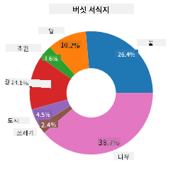
이 코드는 차트와 중심 원을 그린 다음 그 중심 원을 차트에 추가합니다. 중심 원의 너비는 0.40 값을 변경하여 조정할 수 있습니다.
도넛 차트는 레이블을 변경하여 가독성을 높이는 등 여러 가지 방식으로 조정할 수 있습니다. 자세한 내용은 문서에서 확인하세요.
이제 데이터를 그룹화하고 파이 또는 도넛으로 표시하는 방법을 알았으니 다른 유형의 차트를 탐구해 보세요. 와플 차트를 시도해 보세요. 이는 수량을 탐구하는 또 다른 방법입니다.
와플!
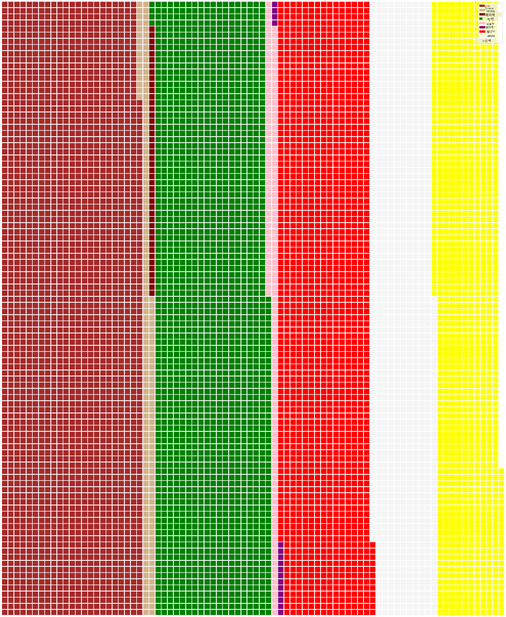
'와플' 유형 차트는 2D 배열의 사각형으로 수량을 시각화하는 또 다른 방법입니다. 이 데이터셋에서 버섯 갓 색상의 다양한 수량을 시각화해 보세요. 이를 위해 PyWaffle라는 도우미 라이브러리를 설치하고 Matplotlib을 사용해야 합니다:
pip install pywaffle
데이터의 일부를 선택하여 그룹화합니다:
capcolor=mushrooms.groupby(['cap-color']).count()
capcolor
레이블을 생성한 다음 데이터를 그룹화하여 와플 차트를 만듭니다:
import pandas as pd
import matplotlib.pyplot as plt
from pywaffle import Waffle

data ={'color': ['brown', 'buff', 'cinnamon', 'green', 'pink', 'purple', 'red', 'white', 'yellow'],
    'amount': capcolor['class']
     }

df = pd.DataFrame(data)

fig = plt.figure(
    FigureClass = Waffle,
    rows = 100,
    values = df.amount,
    labels = list(df.color),
    figsize = (30,30),
    colors=["brown", "tan", "maroon", "green", "pink", "purple", "red", "whitesmoke", "yellow"],
)
와플 차트를 사용하면 이 버섯 데이터셋의 갓 색상 비율을 명확히 볼 수 있습니다. 흥미롭게도 녹색 갓을 가진 버섯이 많이 있습니다!
✅ PyWaffle은 Font Awesome에서 사용할 수 있는 모든 아이콘을 차트 내에 사용할 수 있습니다. 아이콘 대신 사각형을 사용하여 더욱 흥미로운 와플 차트를 만들어 보세요.
이 강의에서는 비율을 시각화하는 세 가지 방법을 배웠습니다. 먼저 데이터를 카테고리로 그룹화한 다음 데이터를 표시하는 가장 적합한 방법 - 파이, 도넛, 또는 와플 - 을 결정해야 합니다. 모두 맛있고 사용자에게 데이터셋의 즉각적인 스냅샷을 제공합니다.
🚀 도전
Charticulator에서 이 맛있는 차트를 재현해 보세요.
강의 후 퀴즈
복습 및 자기 학습
파이, 도넛, 또는 와플 차트를 언제 사용할지 명확하지 않을 때가 있습니다. 이 주제에 대한 다음 기사들을 읽어보세요:
https://www.beautiful.ai/blog/battle-of-the-charts-pie-chart-vs-donut-chart
https://medium.com/@hypsypops/pie-chart-vs-donut-chart-showdown-in-the-ring-5d24fd86a9ce
https://www.mit.edu/~mbarker/formula1/f1help/11-ch-c6.htm
더 많은 정보를 찾기 위해 추가 연구를 해보세요.
과제
면책 조항:
이 문서는 AI 번역 서비스 Co-op Translator를 사용하여 번역되었습니다. 정확성을 위해 최선을 다하고 있으나, 자동 번역에는 오류나 부정확성이 포함될 수 있습니다. 원본 문서를 해당 언어로 작성된 상태에서 권위 있는 자료로 간주해야 합니다. 중요한 정보의 경우, 전문적인 인간 번역을 권장합니다. 이 번역 사용으로 인해 발생할 수 있는 오해나 잘못된 해석에 대해 당사는 책임을 지지 않습니다.