11 KiB
Visualizing Proportions
 |
|---|
| Visualizing Proportions - Sketchnote by @nitya |
In this lesson, you'll work with a nature-focused dataset to visualize proportions, such as the distribution of different types of fungi in a dataset about mushrooms. We'll dive into these fascinating fungi using a dataset from Audubon that provides details about 23 species of gilled mushrooms in the Agaricus and Lepiota families. You'll experiment with fun visualizations like:
- Pie charts 🥧
- Donut charts 🍩
- Waffle charts 🧇
💡 A fascinating project called Charticulator by Microsoft Research offers a free drag-and-drop interface for creating data visualizations. One of their tutorials even uses this mushroom dataset! This means you can explore the data while learning the library: Charticulator tutorial.
Pre-lecture quiz
Get to know your mushrooms 🍄
Mushrooms are truly fascinating. Let's import a dataset to study them:
import pandas as pd
import matplotlib.pyplot as plt
mushrooms = pd.read_csv('../../data/mushrooms.csv')
mushrooms.head()
A table is displayed with some great data for analysis:
| class | cap-shape | cap-surface | cap-color | bruises | odor | gill-attachment | gill-spacing | gill-size | gill-color | stalk-shape | stalk-root | stalk-surface-above-ring | stalk-surface-below-ring | stalk-color-above-ring | stalk-color-below-ring | veil-type | veil-color | ring-number | ring-type | spore-print-color | population | habitat |
|---|---|---|---|---|---|---|---|---|---|---|---|---|---|---|---|---|---|---|---|---|---|---|
| Poisonous | Convex | Smooth | Brown | Bruises | Pungent | Free | Close | Narrow | Black | Enlarging | Equal | Smooth | Smooth | White | White | Partial | White | One | Pendant | Black | Scattered | Urban |
| Edible | Convex | Smooth | Yellow | Bruises | Almond | Free | Close | Broad | Black | Enlarging | Club | Smooth | Smooth | White | White | Partial | White | One | Pendant | Brown | Numerous | Grasses |
| Edible | Bell | Smooth | White | Bruises | Anise | Free | Close | Broad | Brown | Enlarging | Club | Smooth | Smooth | White | White | Partial | White | One | Pendant | Brown | Numerous | Meadows |
| Poisonous | Convex | Scaly | White | Bruises | Pungent | Free | Close | Narrow | Brown | Enlarging | Equal | Smooth | Smooth | White | White | Partial | White | One | Pendant | Black | Scattered | Urban |
Immediately, you notice that all the data is textual. You'll need to convert this data to make it usable in a chart. Most of the data is represented as an object:
print(mushrooms.select_dtypes(["object"]).columns)
The output is:
Index(['class', 'cap-shape', 'cap-surface', 'cap-color', 'bruises', 'odor',
       'gill-attachment', 'gill-spacing', 'gill-size', 'gill-color',
       'stalk-shape', 'stalk-root', 'stalk-surface-above-ring',
       'stalk-surface-below-ring', 'stalk-color-above-ring',
       'stalk-color-below-ring', 'veil-type', 'veil-color', 'ring-number',
       'ring-type', 'spore-print-color', 'population', 'habitat'],
      dtype='object')
Now, convert the 'class' column into a category:
cols = mushrooms.select_dtypes(["object"]).columns
mushrooms[cols] = mushrooms[cols].astype('category')
edibleclass=mushrooms.groupby(['class']).count()
edibleclass
When you print out the mushrooms data, you'll see that it has been grouped into categories based on the poisonous/edible class:
| cap-shape | cap-surface | cap-color | bruises | odor | gill-attachment | gill-spacing | gill-size | gill-color | stalk-shape | ... | stalk-surface-below-ring | stalk-color-above-ring | stalk-color-below-ring | veil-type | veil-color | ring-number | ring-type | spore-print-color | population | habitat | |
|---|---|---|---|---|---|---|---|---|---|---|---|---|---|---|---|---|---|---|---|---|---|
| class | |||||||||||||||||||||
| Edible | 4208 | 4208 | 4208 | 4208 | 4208 | 4208 | 4208 | 4208 | 4208 | 4208 | ... | 4208 | 4208 | 4208 | 4208 | 4208 | 4208 | 4208 | 4208 | 4208 | 4208 |
| Poisonous | 3916 | 3916 | 3916 | 3916 | 3916 | 3916 | 3916 | 3916 | 3916 | 3916 | ... | 3916 | 3916 | 3916 | 3916 | 3916 | 3916 | 3916 | 3916 | 3916 | 3916 |
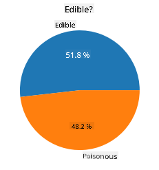
Using the order presented in this table to create your class category labels, you can build a pie chart:
Pie!
labels=['Edible','Poisonous']
plt.pie(edibleclass['population'],labels=labels,autopct='%.1f %%')
plt.title('Edible?')
plt.show()
And there you have it—a pie chart showing the proportions of the data based on the two mushroom classes. It's crucial to get the order of the labels correct, especially here, so double-check the order when building the label array!
Donuts!
A slightly more visually appealing pie chart is a donut chart, which is essentially a pie chart with a hole in the center. Let's use this method to examine our data.
Take a look at the various habitats where mushrooms grow:
habitat=mushrooms.groupby(['habitat']).count()
habitat
Here, you're grouping the data by habitat. There are seven listed habitats, so use those as labels for your donut chart:
labels=['Grasses','Leaves','Meadows','Paths','Urban','Waste','Wood']

plt.pie(habitat['class'], labels=labels,
        autopct='%1.1f%%', pctdistance=0.85)

center_circle = plt.Circle((0, 0), 0.40, fc='white')
fig = plt.gcf()

fig.gca().add_artist(center_circle)

plt.title('Mushroom Habitats')

plt.show()
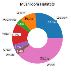
This code draws a chart and a center circle, then adds the center circle to the chart. You can adjust the width of the center circle by changing 0.40 to another value.
Donut charts can be customized in various ways, including tweaking the labels for better readability. Learn more in the docs.
Now that you know how to group your data and display it as a pie or donut chart, let's explore another type of chart: the waffle chart.
Waffles!
A waffle chart is a unique way to visualize quantities as a 2D array of squares. Let's use this method to visualize the different quantities of mushroom cap colors in the dataset. To do this, you'll need to install a helper library called PyWaffle and use Matplotlib:
pip install pywaffle
Select a segment of your data to group:
capcolor=mushrooms.groupby(['cap-color']).count()
capcolor
Create a waffle chart by defining labels and grouping your data:
import pandas as pd
import matplotlib.pyplot as plt
from pywaffle import Waffle

data ={'color': ['brown', 'buff', 'cinnamon', 'green', 'pink', 'purple', 'red', 'white', 'yellow'],
    'amount': capcolor['class']
     }

df = pd.DataFrame(data)

fig = plt.figure(
    FigureClass = Waffle,
    rows = 100,
    values = df.amount,
    labels = list(df.color),
    figsize = (30,30),
    colors=["brown", "tan", "maroon", "green", "pink", "purple", "red", "whitesmoke", "yellow"],
)
Using a waffle chart, you can clearly see the proportions of cap colors in the mushroom dataset. Interestingly, there are many green-capped mushrooms!
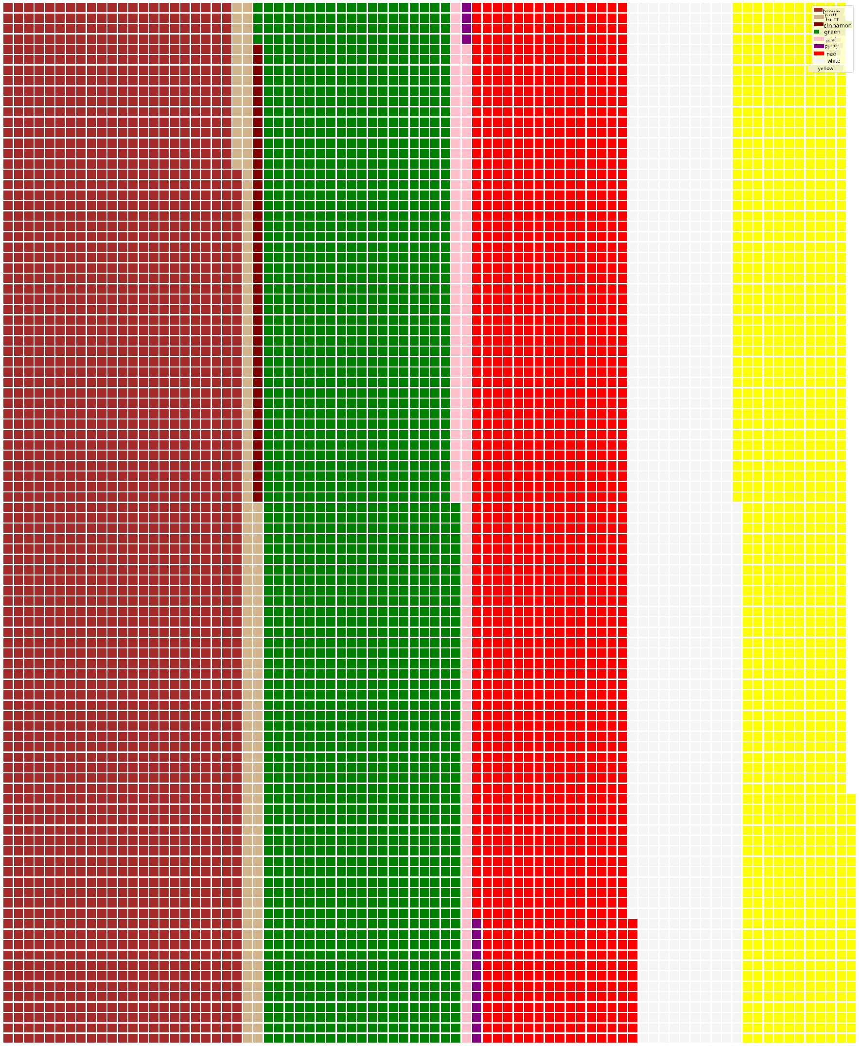
✅ PyWaffle supports icons within the charts, allowing you to use any icon available in Font Awesome. Experiment with creating an even more engaging waffle chart using icons instead of squares.
In this lesson, you learned three ways to visualize proportions. First, group your data into categories, then decide which visualization method—pie, donut, or waffle—best represents the data. All three are visually appealing and provide an instant snapshot of the dataset.
🚀 Challenge
Try recreating these fun charts in Charticulator.
Post-lecture quiz
Review & Self Study
Sometimes it's not clear when to use a pie, donut, or waffle chart. Here are some articles to help you decide:
https://www.beautiful.ai/blog/battle-of-the-charts-pie-chart-vs-donut-chart
https://medium.com/@hypsypops/pie-chart-vs-donut-chart-showdown-in-the-ring-5d24fd86a9ce
https://www.mit.edu/~mbarker/formula1/f1help/11-ch-c6.htm
Do some research to find more information on this tricky decision.
Assignment
Disclaimer:
This document has been translated using the AI translation service Co-op Translator. While we strive for accuracy, please note that automated translations may contain errors or inaccuracies. The original document in its native language should be regarded as the authoritative source. For critical information, professional human translation is recommended. We are not responsible for any misunderstandings or misinterpretations resulting from the use of this translation.