|
|
2 weeks ago | |
|---|---|---|
| .. | ||
| solution | 3 weeks ago | |
| README.md | 2 weeks ago | |
| assignment.md | 3 weeks ago | |
| notebook.ipynb | 3 weeks ago | |
README.md
การแสดงภาพสัดส่วน
 |
|---|
| การแสดงภาพสัดส่วน - ภาพสเก็ตช์โดย @nitya |
ในบทเรียนนี้ คุณจะได้ใช้ชุดข้อมูลที่เกี่ยวกับธรรมชาติในการแสดงภาพสัดส่วน เช่น การดูว่ามีเห็ดประเภทต่าง ๆ กี่ชนิดในชุดข้อมูลเกี่ยวกับเห็ด มาสำรวจเห็ดที่น่าสนใจเหล่านี้ผ่านชุดข้อมูลจาก Audubon ซึ่งมีรายละเอียดเกี่ยวกับเห็ด 23 สายพันธุ์ในตระกูล Agaricus และ Lepiota คุณจะได้ทดลองสร้างภาพที่น่าสนใจ เช่น:
- แผนภูมิวงกลม 🥧
- แผนภูมิวงแหวน 🍩
- แผนภูมิแบบวาฟเฟิล 🧇
💡 โครงการที่น่าสนใจมากชื่อ Charticulator โดย Microsoft Research มีอินเทอร์เฟซแบบลากและวางสำหรับการสร้างภาพข้อมูลฟรี ในหนึ่งในบทเรียนของพวกเขายังใช้ชุดข้อมูลเห็ดนี้ด้วย! คุณสามารถสำรวจข้อมูลและเรียนรู้การใช้ไลบรารีไปพร้อมกัน: บทเรียน Charticulator
แบบทดสอบก่อนเรียน
ทำความรู้จักกับเห็ดของคุณ 🍄
เห็ดเป็นสิ่งที่น่าสนใจมาก มานำเข้าชุดข้อมูลเพื่อศึกษาเกี่ยวกับมันกันเถอะ:
import pandas as pd
import matplotlib.pyplot as plt
mushrooms = pd.read_csv('../../data/mushrooms.csv')
mushrooms.head()
ตารางข้อมูลจะถูกพิมพ์ออกมาพร้อมข้อมูลที่น่าสนใจสำหรับการวิเคราะห์:
| class | cap-shape | cap-surface | cap-color | bruises | odor | gill-attachment | gill-spacing | gill-size | gill-color | stalk-shape | stalk-root | stalk-surface-above-ring | stalk-surface-below-ring | stalk-color-above-ring | stalk-color-below-ring | veil-type | veil-color | ring-number | ring-type | spore-print-color | population | habitat |
|---|---|---|---|---|---|---|---|---|---|---|---|---|---|---|---|---|---|---|---|---|---|---|
| Poisonous | Convex | Smooth | Brown | Bruises | Pungent | Free | Close | Narrow | Black | Enlarging | Equal | Smooth | Smooth | White | White | Partial | White | One | Pendant | Black | Scattered | Urban |
| Edible | Convex | Smooth | Yellow | Bruises | Almond | Free | Close | Broad | Black | Enlarging | Club | Smooth | Smooth | White | White | Partial | White | One | Pendant | Brown | Numerous | Grasses |
| Edible | Bell | Smooth | White | Bruises | Anise | Free | Close | Broad | Brown | Enlarging | Club | Smooth | Smooth | White | White | Partial | White | One | Pendant | Brown | Numerous | Meadows |
| Poisonous | Convex | Scaly | White | Bruises | Pungent | Free | Close | Narrow | Brown | Enlarging | Equal | Smooth | Smooth | White | White | Partial | White | One | Pendant | Black | Scattered | Urban |
ทันทีที่เห็น คุณจะสังเกตได้ว่าข้อมูลทั้งหมดเป็นข้อความ คุณจะต้องแปลงข้อมูลนี้เพื่อให้สามารถใช้ในแผนภูมิได้ ข้อมูลส่วนใหญ่ในความเป็นจริงถูกแสดงเป็นออบเจ็กต์:
print(mushrooms.select_dtypes(["object"]).columns)
ผลลัพธ์คือ:
Index(['class', 'cap-shape', 'cap-surface', 'cap-color', 'bruises', 'odor',
       'gill-attachment', 'gill-spacing', 'gill-size', 'gill-color',
       'stalk-shape', 'stalk-root', 'stalk-surface-above-ring',
       'stalk-surface-below-ring', 'stalk-color-above-ring',
       'stalk-color-below-ring', 'veil-type', 'veil-color', 'ring-number',
       'ring-type', 'spore-print-color', 'population', 'habitat'],
      dtype='object')
นำข้อมูลนี้มาแปลงคอลัมน์ 'class' ให้เป็นหมวดหมู่:
cols = mushrooms.select_dtypes(["object"]).columns
mushrooms[cols] = mushrooms[cols].astype('category')
edibleclass=mushrooms.groupby(['class']).count()
edibleclass
ตอนนี้ หากคุณพิมพ์ข้อมูลเห็ดออกมา คุณจะเห็นว่ามันถูกจัดกลุ่มเป็นหมวดหมู่ตามคลาสที่เป็นพิษ/กินได้:
| cap-shape | cap-surface | cap-color | bruises | odor | gill-attachment | gill-spacing | gill-size | gill-color | stalk-shape | ... | stalk-surface-below-ring | stalk-color-above-ring | stalk-color-below-ring | veil-type | veil-color | ring-number | ring-type | spore-print-color | population | habitat | |
|---|---|---|---|---|---|---|---|---|---|---|---|---|---|---|---|---|---|---|---|---|---|
| class | |||||||||||||||||||||
| Edible | 4208 | 4208 | 4208 | 4208 | 4208 | 4208 | 4208 | 4208 | 4208 | 4208 | ... | 4208 | 4208 | 4208 | 4208 | 4208 | 4208 | 4208 | 4208 | 4208 | 4208 |
| Poisonous | 3916 | 3916 | 3916 | 3916 | 3916 | 3916 | 3916 | 3916 | 3916 | 3916 | ... | 3916 | 3916 | 3916 | 3916 | 3916 | 3916 | 3916 | 3916 | 3916 | 3916 |
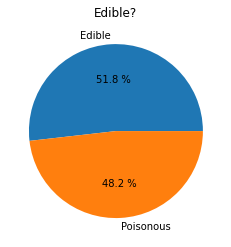
หากคุณทำตามลำดับที่แสดงในตารางนี้เพื่อสร้างป้ายกำกับหมวดหมู่ คุณสามารถสร้างแผนภูมิวงกลมได้:
วงกลม!
labels=['Edible','Poisonous']
plt.pie(edibleclass['population'],labels=labels,autopct='%.1f %%')
plt.title('Edible?')
plt.show()
และนี่คือแผนภูมิวงกลมที่แสดงสัดส่วนของข้อมูลตามสองคลาสของเห็ดนี้ สิ่งสำคัญคือการจัดลำดับป้ายกำกับให้ถูกต้อง โดยเฉพาะในกรณีนี้ ดังนั้นอย่าลืมตรวจสอบลำดับของอาร์เรย์ป้ายกำกับ!
วงแหวน!
แผนภูมิวงแหวนเป็นแผนภูมิวงกลมที่มีรูตรงกลาง ซึ่งดูน่าสนใจมากขึ้น มาดูข้อมูลของเราด้วยวิธีนี้กัน
ลองดูที่แหล่งที่อยู่อาศัยต่าง ๆ ของเห็ด:
habitat=mushrooms.groupby(['habitat']).count()
habitat
ที่นี่ คุณกำลังจัดกลุ่มข้อมูลตามแหล่งที่อยู่อาศัย มีทั้งหมด 7 แหล่งที่อยู่อาศัย ใช้สิ่งเหล่านี้เป็นป้ายกำกับสำหรับแผนภูมิวงแหวนของคุณ:
labels=['Grasses','Leaves','Meadows','Paths','Urban','Waste','Wood']

plt.pie(habitat['class'], labels=labels,
        autopct='%1.1f%%', pctdistance=0.85)

center_circle = plt.Circle((0, 0), 0.40, fc='white')
fig = plt.gcf()

fig.gca().add_artist(center_circle)

plt.title('Mushroom Habitats')

plt.show()
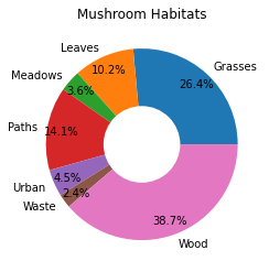
โค้ดนี้สร้างแผนภูมิและวงกลมตรงกลาง จากนั้นเพิ่มวงกลมตรงกลางในแผนภูมิ คุณสามารถแก้ไขความกว้างของวงกลมตรงกลางได้โดยเปลี่ยน 0.40 เป็นค่าอื่น
แผนภูมิวงแหวนสามารถปรับแต่งได้หลายวิธีเพื่อเปลี่ยนป้ายกำกับ โดยเฉพาะป้ายกำกับสามารถทำให้เด่นชัดขึ้นเพื่อให้อ่านง่ายขึ้น เรียนรู้เพิ่มเติมได้ที่ เอกสาร
เมื่อคุณรู้วิธีจัดกลุ่มข้อมูลและแสดงผลเป็นแผนภูมิวงกลมหรือวงแหวนแล้ว คุณสามารถสำรวจแผนภูมิประเภทอื่น ๆ ได้ ลองแผนภูมิแบบวาฟเฟิล ซึ่งเป็นวิธีที่แตกต่างในการแสดงปริมาณ
วาฟเฟิล!
แผนภูมิแบบ 'วาฟเฟิล' เป็นวิธีการแสดงปริมาณในรูปแบบตาราง 2 มิติของช่องสี่เหลี่ยม ลองแสดงปริมาณสีของหมวกเห็ดในชุดข้อมูลนี้ ในการทำเช่นนี้ คุณต้องติดตั้งไลบรารีช่วยเหลือชื่อ PyWaffle และใช้ Matplotlib:
pip install pywaffle
เลือกส่วนหนึ่งของข้อมูลของคุณเพื่อจัดกลุ่ม:
capcolor=mushrooms.groupby(['cap-color']).count()
capcolor
สร้างแผนภูมิแบบวาฟเฟิลโดยสร้างป้ายกำกับและจัดกลุ่มข้อมูลของคุณ:
import pandas as pd
import matplotlib.pyplot as plt
from pywaffle import Waffle

data ={'color': ['brown', 'buff', 'cinnamon', 'green', 'pink', 'purple', 'red', 'white', 'yellow'],
    'amount': capcolor['class']
     }

df = pd.DataFrame(data)

fig = plt.figure(
    FigureClass = Waffle,
    rows = 100,
    values = df.amount,
    labels = list(df.color),
    figsize = (30,30),
    colors=["brown", "tan", "maroon", "green", "pink", "purple", "red", "whitesmoke", "yellow"],
)
ด้วยแผนภูมิแบบวาฟเฟิล คุณสามารถเห็นสัดส่วนของสีหมวกเห็ดในชุดข้อมูลนี้ได้อย่างชัดเจน น่าสนใจที่มีเห็ดหมวกสีเขียวจำนวนมาก!
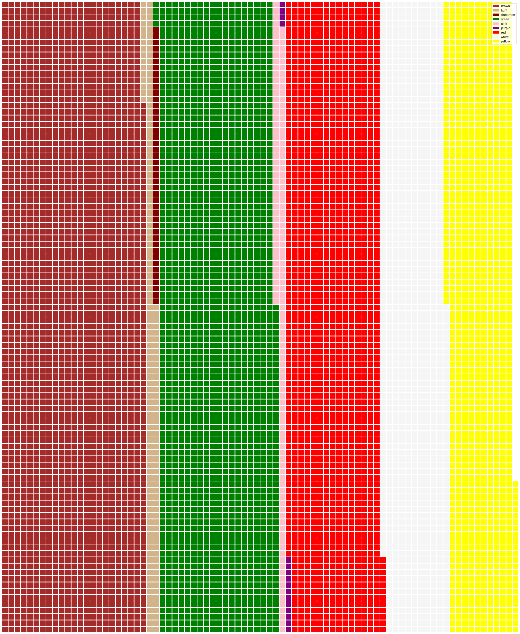
✅ PyWaffle รองรับการใช้ไอคอนในแผนภูมิที่ใช้ไอคอนใด ๆ ที่มีใน Font Awesome ลองทดลองสร้างแผนภูมิแบบวาฟเฟิลที่น่าสนใจยิ่งขึ้นโดยใช้ไอคอนแทนช่องสี่เหลี่ยม
ในบทเรียนนี้ คุณได้เรียนรู้สามวิธีในการแสดงภาพสัดส่วน ก่อนอื่น คุณต้องจัดกลุ่มข้อมูลของคุณเป็นหมวดหมู่ จากนั้นตัดสินใจว่าวิธีใดดีที่สุดในการแสดงข้อมูล - วงกลม วงแหวน หรือวาฟเฟิล ทั้งหมดนี้น่าสนใจและให้ภาพรวมของชุดข้อมูลได้ทันที
🚀 ความท้าทาย
ลองสร้างแผนภูมิที่น่าสนใจเหล่านี้ใน Charticulator
แบบทดสอบหลังเรียน
ทบทวนและศึกษาด้วยตนเอง
บางครั้งอาจไม่ชัดเจนว่าควรใช้แผนภูมิวงกลม วงแหวน หรือวาฟเฟิลเมื่อใด นี่คือบทความบางส่วนที่คุณสามารถอ่านได้ในหัวข้อนี้:
https://www.beautiful.ai/blog/battle-of-the-charts-pie-chart-vs-donut-chart
https://medium.com/@hypsypops/pie-chart-vs-donut-chart-showdown-in-the-ring-5d24fd86a9ce
https://www.mit.edu/~mbarker/formula1/f1help/11-ch-c6.htm
ลองค้นคว้าเพิ่มเติมเพื่อหาข้อมูลเกี่ยวกับการตัดสินใจที่สำคัญนี้
การบ้าน
ข้อจำกัดความรับผิดชอบ:
เอกสารนี้ได้รับการแปลโดยใช้บริการแปลภาษา AI Co-op Translator แม้ว่าเราจะพยายามให้การแปลมีความถูกต้อง แต่โปรดทราบว่าการแปลอัตโนมัติอาจมีข้อผิดพลาดหรือความไม่แม่นยำ เอกสารต้นฉบับในภาษาดั้งเดิมควรถือเป็นแหล่งข้อมูลที่เชื่อถือได้ สำหรับข้อมูลที่สำคัญ ขอแนะนำให้ใช้บริการแปลภาษามนุษย์ที่เป็นมืออาชีพ เราจะไม่รับผิดชอบต่อความเข้าใจผิดหรือการตีความที่ผิดพลาดซึ่งเกิดจากการใช้การแปลนี้