14 KiB
Visualizing Quantities
 |
|---|
| Visualizing Quantities - Sketchnote by @nitya |
In this lesson, you'll learn how to use some of the many R packages and libraries to create engaging visualizations focused on the concept of quantity. Using a cleaned dataset about the birds of Minnesota, you can uncover fascinating insights about local wildlife.
Pre-lecture quiz
Observing Wingspan with ggplot2
An excellent library for creating both simple and complex plots and charts is ggplot2. Generally, the process of plotting data with these libraries involves identifying the parts of your dataframe to target, performing any necessary transformations, assigning x and y axis values, choosing the type of plot, and then displaying it.
ggplot2 is a system for declaratively creating graphics, based on The Grammar of Graphics. The Grammar of Graphics is a general framework for data visualization that breaks graphs into semantic components like scales and layers. In simpler terms, the ease of creating plots and graphs for univariate or multivariate data with minimal code makes ggplot2 the most popular visualization package in R. The user specifies how to map variables to aesthetics, chooses graphical primitives, and ggplot2 handles the rest.
✅ Plot = Data + Aesthetics + Geometry
- Data refers to the dataset
- Aesthetics indicate the variables to study (x and y variables)
- Geometry refers to the type of plot (line plot, bar plot, etc.)
Choose the best geometry (type of plot) based on your data and the story you want to tell through the visualization.
- To analyze trends: line, column
- To compare values: bar, column, pie, scatterplot
- To show how parts relate to a whole: pie
- To show data distribution: scatterplot, bar
- To show relationships between values: line, scatterplot, bubble
✅ You can also check out this helpful cheatsheet for ggplot2.
Build a Line Plot for Bird Wingspan Values
Open the R console and import the dataset.
Note: The dataset is stored in the root of this repo in the
/datafolder.
Let's import the dataset and view the first five rows of the data.
birds <- read.csv("../../data/birds.csv",fileEncoding="UTF-8-BOM")
head(birds)
The first few rows of the data contain a mix of text and numbers:
| Name | ScientificName | Category | Order | Family | Genus | ConservationStatus | MinLength | MaxLength | MinBodyMass | MaxBodyMass | MinWingspan | MaxWingspan | |
|---|---|---|---|---|---|---|---|---|---|---|---|---|---|
| 0 | Black-bellied whistling-duck | Dendrocygna autumnalis | Ducks/Geese/Waterfowl | Anseriformes | Anatidae | Dendrocygna | LC | 47 | 56 | 652 | 1020 | 76 | 94 |
| 1 | Fulvous whistling-duck | Dendrocygna bicolor | Ducks/Geese/Waterfowl | Anseriformes | Anatidae | Dendrocygna | LC | 45 | 53 | 712 | 1050 | 85 | 93 |
| 2 | Snow goose | Anser caerulescens | Ducks/Geese/Waterfowl | Anseriformes | Anatidae | Anser | LC | 64 | 79 | 2050 | 4050 | 135 | 165 |
| 3 | Ross's goose | Anser rossii | Ducks/Geese/Waterfowl | Anseriformes | Anatidae | Anser | LC | 57.3 | 64 | 1066 | 1567 | 113 | 116 |
| 4 | Greater white-fronted goose | Anser albifrons | Ducks/Geese/Waterfowl | Anseriformes | Anatidae | Anser | LC | 64 | 81 | 1930 | 3310 | 130 | 165 |
Let's start by plotting some of the numeric data using a basic line plot. Suppose you want to visualize the maximum wingspan of these birds.
install.packages("ggplot2")
library("ggplot2")
ggplot(data=birds, aes(x=Name, y=MaxWingspan,group=1)) +
  geom_line()
Here, you install the ggplot2 package and import it into the workspace using the library("ggplot2") command. To create any plot in ggplot, the ggplot() function is used, where you specify the dataset, x and y variables as attributes. In this case, we use the geom_line() function to create a line plot.
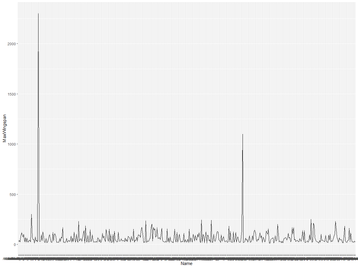
What do you notice right away? There seems to be at least one outlier—what a wingspan! A 2000+ centimeter wingspan equals more than 20 meters—are there Pterodactyls in Minnesota? Let's investigate.
While you could sort the data in Excel to find these outliers (likely typos), let's continue the visualization process directly within the plot.
Add labels to the x-axis to show the bird species:
ggplot(data=birds, aes(x=Name, y=MaxWingspan,group=1)) +
  geom_line() +
  theme(axis.text.x = element_text(angle = 45, hjust=1))+
  xlab("Birds") +
  ylab("Wingspan (CM)") +
  ggtitle("Max Wingspan in Centimeters")
We specify the angle in the theme and set the x and y axis labels using xlab() and ylab(). The ggtitle() adds a title to the graph.
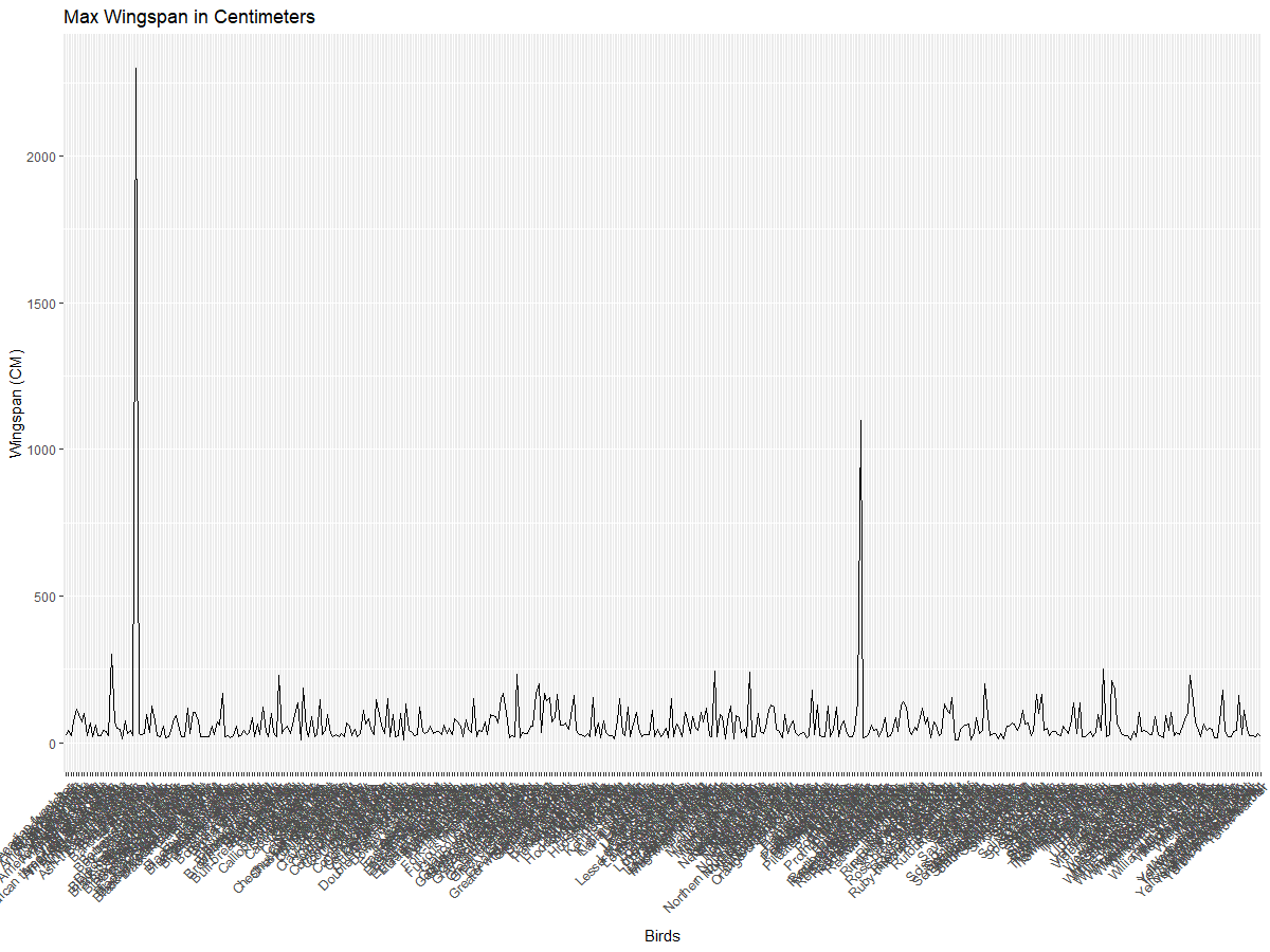
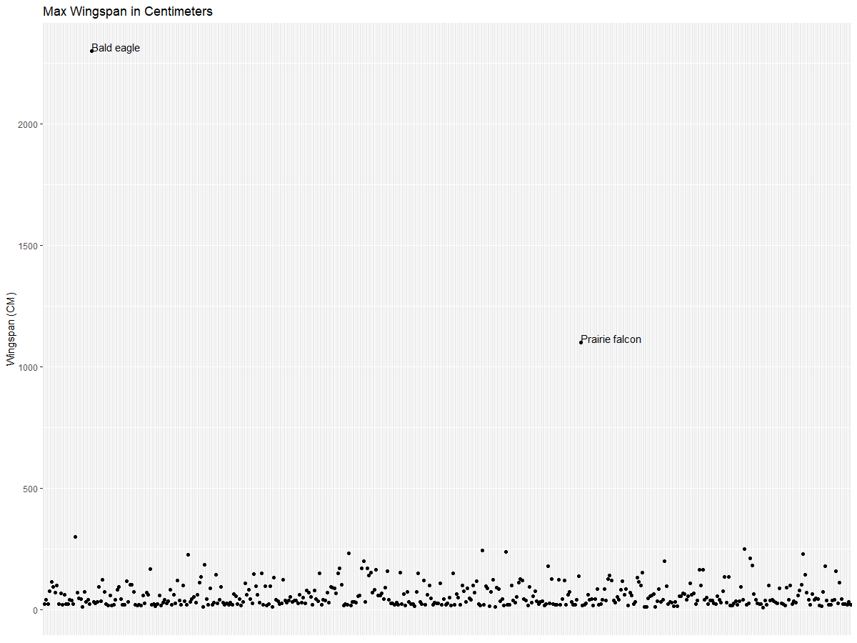
Even with the labels rotated 45 degrees, there are too many to read. Let's try a different approach: label only the outliers and place the labels within the chart. You can use a scatter plot to make room for the labels:
ggplot(data=birds, aes(x=Name, y=MaxWingspan,group=1)) +
  geom_point() +
  geom_text(aes(label=ifelse(MaxWingspan>500,as.character(Name),'')),hjust=0,vjust=0) +
  theme(axis.title.x=element_blank(), axis.text.x=element_blank(), axis.ticks.x=element_blank())
  ylab("Wingspan (CM)") +
  ggtitle("Max Wingspan in Centimeters") +
What happens here? You use the geom_point() function to plot scatter points. You also add labels for birds with MaxWingspan > 500 and hide the x-axis labels to declutter the plot.
What do you discover?
Filter Your Data
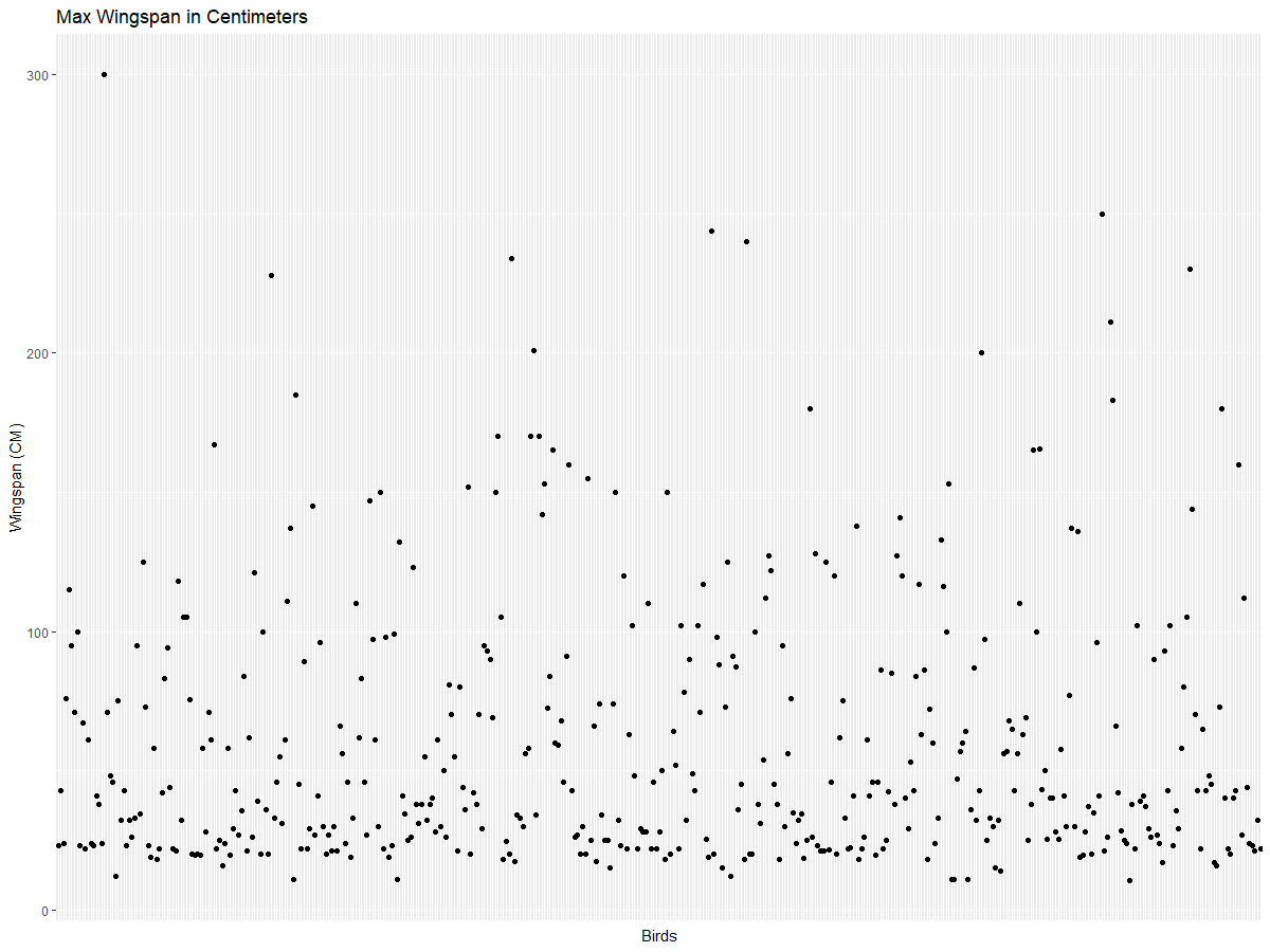
Both the Bald Eagle and the Prairie Falcon, while likely large birds, seem to have been mislabeled with an extra 0 in their maximum wingspan. A Bald Eagle with a 25-meter wingspan is unlikely, but if you see one, let us know! Let's create a new dataframe without these two outliers:
birds_filtered <- subset(birds, MaxWingspan < 500)

ggplot(data=birds_filtered, aes(x=Name, y=MaxWingspan,group=1)) +
  geom_point() +
  ylab("Wingspan (CM)") +
  xlab("Birds") +
  ggtitle("Max Wingspan in Centimeters") +
  geom_text(aes(label=ifelse(MaxWingspan>500,as.character(Name),'')),hjust=0,vjust=0) +
  theme(axis.text.x=element_blank(), axis.ticks.x=element_blank())
We create a new dataframe birds_filtered and plot a scatter plot. By filtering out outliers, your data becomes more cohesive and easier to interpret.
Now that we have a cleaner dataset in terms of wingspan, let's explore more about these birds.
While line and scatter plots can display data values and distributions, we want to think about the quantities in this dataset. You could create visualizations to answer questions like:
How many categories of birds are there, and how many birds are in each?
How many birds are extinct, endangered, rare, or common?
How many birds belong to various genera and orders in Linnaeus's classification?
Explore Bar Charts
Bar charts are useful for showing groupings of data. Let's explore the bird categories in this dataset to see which is the most common.
Let's create a bar chart using the filtered data.
install.packages("dplyr")
install.packages("tidyverse")

library(lubridate)
library(scales)
library(dplyr)
library(ggplot2)
library(tidyverse)

birds_filtered %>% group_by(Category) %>%
  summarise(n=n(),
  MinLength = mean(MinLength),
  MaxLength = mean(MaxLength),
  MinBodyMass = mean(MinBodyMass),
  MaxBodyMass = mean(MaxBodyMass),
  MinWingspan=mean(MinWingspan),
  MaxWingspan=mean(MaxWingspan)) %>%
  gather("key", "value", - c(Category, n)) %>%
  ggplot(aes(x = Category, y = value, group = key, fill = key)) +
  geom_bar(stat = "identity") +
  scale_fill_manual(values = c("#D62728", "#FF7F0E", "#8C564B","#2CA02C", "#1F77B4", "#9467BD")) +
  xlab("Category")+ggtitle("Birds of Minnesota")
In this snippet, we install the dplyr and lubridate packages to help manipulate and group data for a stacked bar chart. First, we group the data by the Category of bird and summarize columns like MinLength, MaxLength, MinBodyMass, MaxBodyMass, MinWingspan, and MaxWingspan. Then, we use the ggplot2 package to plot the bar chart, specifying colors and labels for the categories.
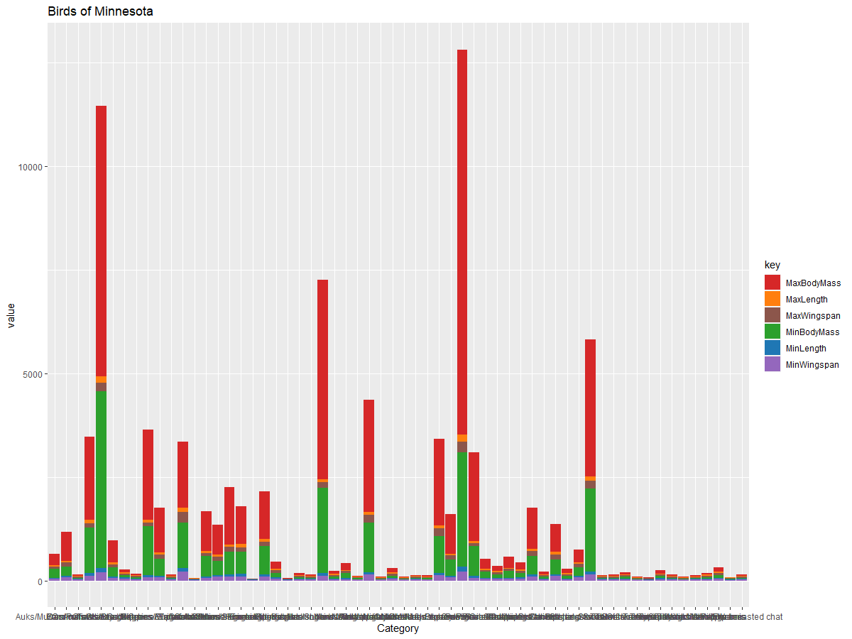
This bar chart is hard to read because there's too much ungrouped data. Let's focus on the length of birds based on their category.
Filter the data to include only the bird categories.
Since there are many categories, display the chart vertically and adjust its height to fit all the data:
birds_count<-dplyr::count(birds_filtered, Category, sort = TRUE)
birds_count$Category <- factor(birds_count$Category, levels = birds_count$Category)
ggplot(birds_count,aes(Category,n))+geom_bar(stat="identity")+coord_flip()
We count unique values in the Category column and sort them into a new dataframe birds_count. This sorted data is then factored at the same level to ensure it is plotted in order. Using ggplot2, we create a bar chart. The coord_flip() function plots horizontal bars.
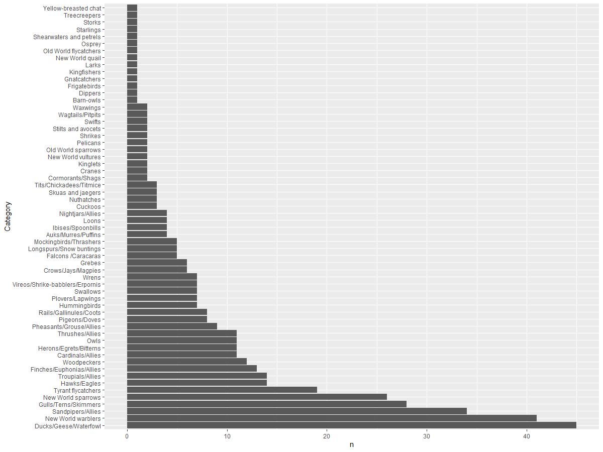
This bar chart provides a clear view of the number of birds in each category. At a glance, you can see that the Ducks/Geese/Waterfowl category has the most birds. Given that Minnesota is the "land of 10,000 lakes," this makes sense!
✅ Try counting other attributes in this dataset. Do any results surprise you?
Comparing Data
You can compare grouped data by creating new axes. For example, compare the MaxLength of birds based on their category:
birds_grouped <- birds_filtered %>%
  group_by(Category) %>%
  summarise(
  MaxLength = max(MaxLength, na.rm = T),
  MinLength = max(MinLength, na.rm = T)
           ) %>%
  arrange(Category)

ggplot(birds_grouped,aes(Category,MaxLength))+geom_bar(stat="identity")+coord_flip()
We group the birds_filtered data by Category and plot a bar graph.
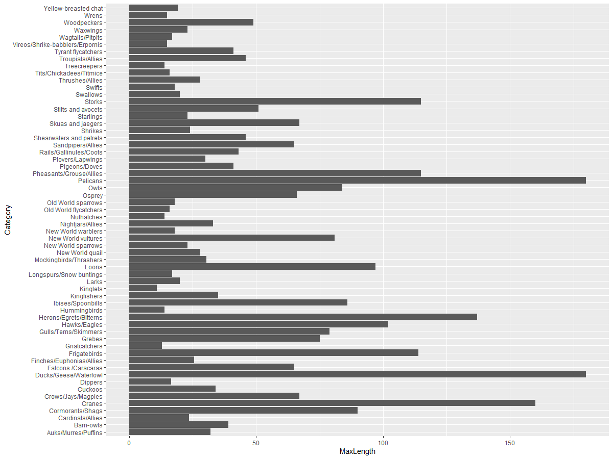
No surprises here: hummingbirds have the smallest MaxLength compared to pelicans or geese. It's reassuring when data aligns with logic!
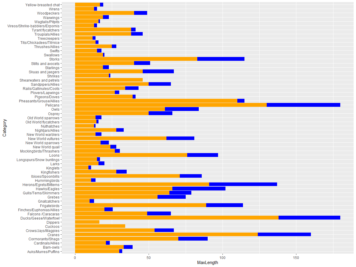
You can make bar charts more interesting by superimposing data. For example, compare the Minimum and Maximum Length of birds within each category:
ggplot(data=birds_grouped, aes(x=Category)) +
  geom_bar(aes(y=MaxLength), stat="identity", position ="identity",  fill='blue') +
  geom_bar(aes(y=MinLength), stat="identity", position="identity", fill='orange')+
  coord_flip()
🚀 Challenge
This bird dataset offers a wealth of information about different bird species in a specific ecosystem. Search online for other bird-related datasets. Practice creating charts and graphs to uncover new insights about birds.
Post-lecture quiz
Review & Self-Study
This lesson introduced you to using ggplot2 for visualizing quantities. Research other ways to work with datasets for visualization. Look for datasets you can visualize using other packages like Lattice and Plotly.
Assignment
Disclaimer:
This document has been translated using the AI translation service Co-op Translator. While we aim for accuracy, please note that automated translations may include errors or inaccuracies. The original document in its native language should be regarded as the authoritative source. For critical information, professional human translation is advised. We are not responsible for any misunderstandings or misinterpretations resulting from the use of this translation.