|
|
3 years ago | |
|---|---|---|
| .. | ||
| android | 3 years ago | |
| ios | 3 years ago | |
| lib | 4 years ago | |
| test | 4 years ago | |
| web | 3 years ago | |
| .gitignore | 7 years ago | |
| .metadata | 3 years ago | |
| README.md | 7 years ago | |
| adaptive-overview.gif | 7 years ago | |
| analysis_options.yaml | 5 years ago | |
| codelab_rebuild.yaml | 3 years ago | |
| pubspec.yaml | 4 years ago | |
README.md
Platform Design
Instead of transliterating widgets one by one between Cupertino and Material, Android and iOS apps often follow different information architecture patterns that require some design decisions.
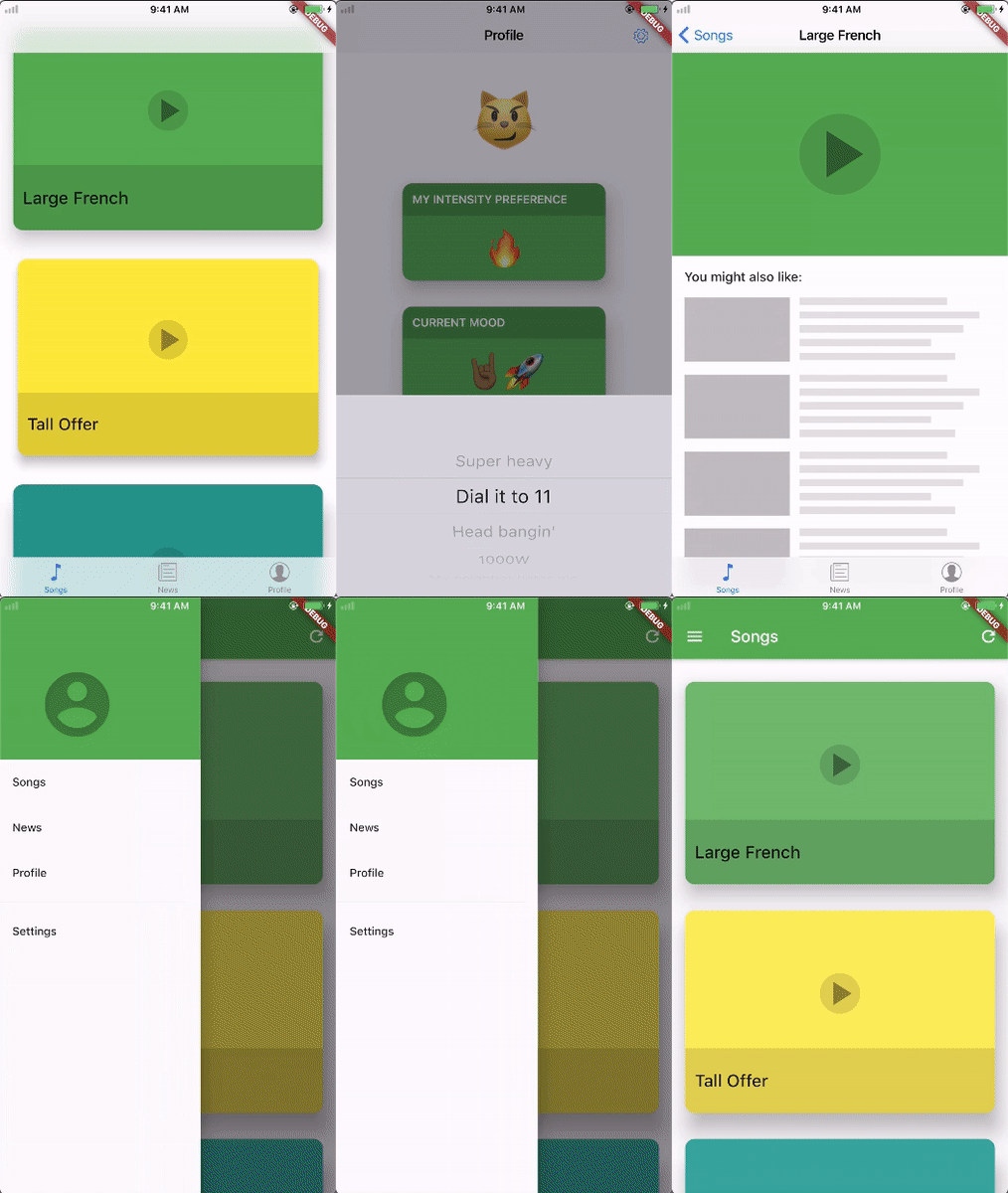
This sample project shows a Flutter app that maximizes application code reuse while adhering to different design patterns on Android and iOS. On Android, it uses Material's lateral navigation based on a drawer and on iOS, it adheres to Apple Human Interface Guideline's flat navigation by using a bottom tab bar.
Visually, the app presents platform-agnostic content surrounded by platform-specific 'chrome'.
Preview
See https://youtu.be/svhbbFZg1IA for a longer non-gif format.
Features
Home
Defines the top level navigation structure of the app and shows the contents of the songs tab on launch.
Android
- Uses the drawer paradigm on the root page.
iOS
- Uses bottom tab bars with parallel navigation stacks.
Songs feed tab
Shows platform-agnostic cards that is tappable and that performs a hero transition on top of the platform native page transitions.
Both platforms also show a button in their app/nav bar to toggle the platform.
Android
- Android uses a static pull-to-refresh pattern with an additional refresh button in the app bar.
- The song details page must be popped in order to change tabs on Android.
iOS
- The iOS songs tab uses a scrollable iOS 11 large title style navigation bar.
- iOS uses an overscrolling pull-to-refresh pattern.
- On iOS, parallel tabs are always accessible and the songs tab's navigation stack is preserved when changing tabs.
News Tab
Shows platform-agnostic news boxes.
Android
- The news tab always appears on top of the songs tab when summoned from the drawer.
iOS
- The news tab appears instead of the songs tab on iOS when switching tabs from the tab bar.
Profile Tab
Shows a number of user preferences.
Android
- The profile tab appears on top of the songs tab on Android.
- Has tappable preference cards which shows a multiple-choice dialog on Android.
- The log out button shows a 2 button dialog on Android.
iOS
- The profile tab appears instead of the songs tab on iOS.
- Has tappable preference cards which shows a picker on iOS.
- The log out button shows a 3 choice action sheet on iOS.
Settings Tab
Shows a number of app settings via Material switches which auto adapt to the platform.
Android
- The settings is directly available in the drawer on Android since a Material Design drawer can fit many tabs.
iOS
- The settings is accessible from a button inside the profile tab's nav bar on iOS. This is a common pattern since there are conventionally more items in the drawer than there are tabs.
- On iOS, the settings page is shown as a full screen dialog instead of a tab in the tab scaffold.
