|
|
4 years ago | |
|---|---|---|
| .. | ||
| .github | ||
| images | ||
| translations | 4 years ago | |
| README.md | ||
| assignment.md | ||
README.md
Terrarium Project Part 2: Introduction to CSS
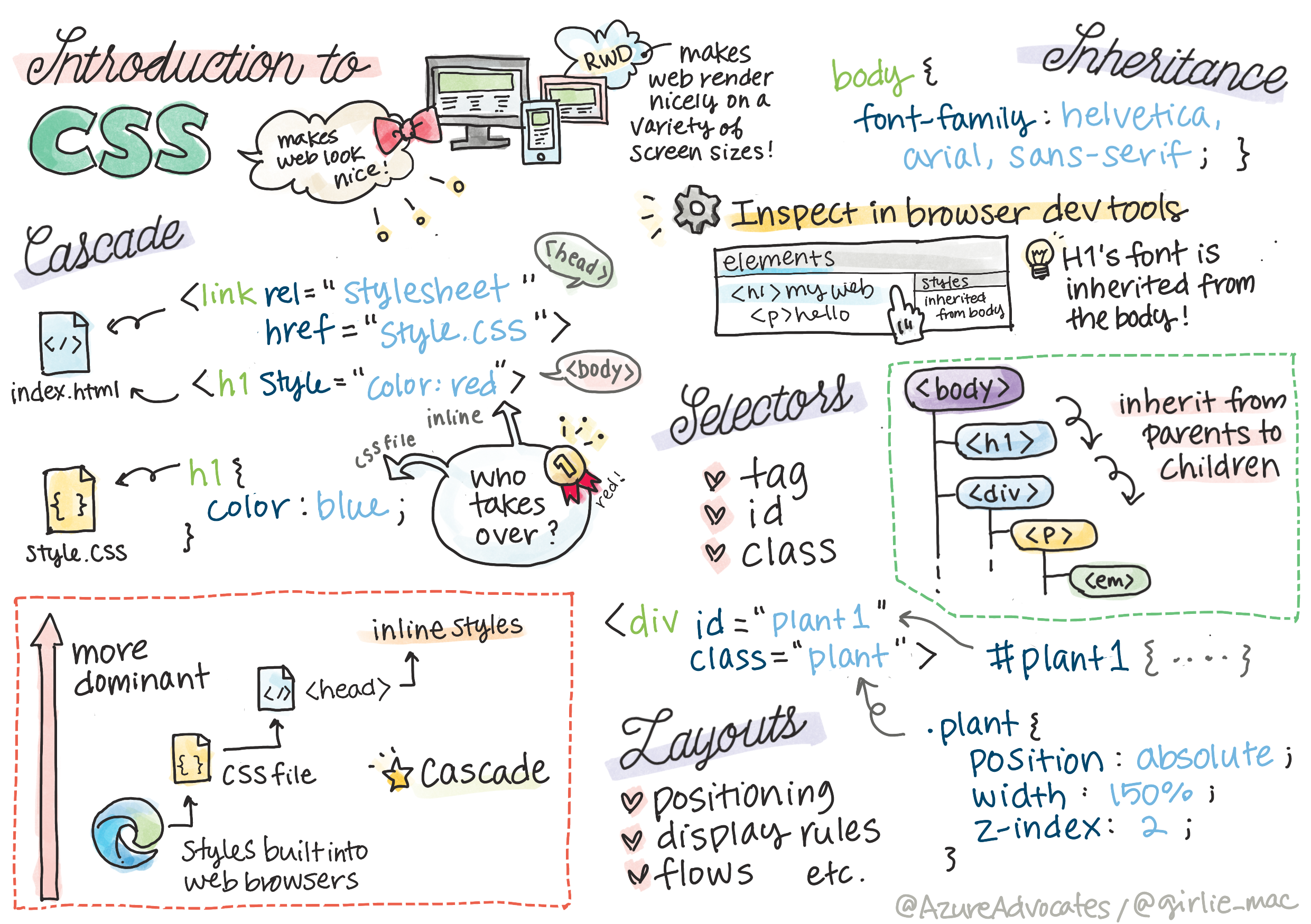
Sketchnote by Tomomi Imura
Pre-Lecture Quiz
Introduction
CSS, or Cascading Style Sheets, solve an important problem of web development: how to make your web site look nice. Styling your apps makes them more usable and nicer-looking; you can also use CSS to create Responsive Web Design (RWD) - allowing your apps to look good no matter what screen size they are displayed on. CSS is not only about making your app look nice; its spec includes animations and transforms that can enable sophisticated interactions for your apps. The CSS Working Group helps maintain current CSS specifications; you can follow their work at World Wide Web Consortium's site.
Note, CSS is a language that evolves, like everything on the web, and not all browsers support newer parts of the specification. Always check your implementations by consulting CanIUse.com.
In this lesson, we're going to add styles to our online terrarium and learn more about several CSS concepts: the cascade, inheritance, and the use of selectors, positioning, and using CSS to build layouts. In the process we will layout the terrarium and create the actual terrarium itself.
Prequisite
You should have the HTML for your terrarium built and ready to be styled.
Task
In your terrarium folder, create a new file called style.css. Import that file in the <head> section:
<link rel="stylesheet" href="./style.css" />
The Cascade
Cascading Style Sheets incorporate the idea that the styles 'cascade' such that the application of a style is guided by its priority. Styles set by a web site author take priority over those set by a browser. Styles set 'inline' take priority over those set in an external style sheet.
Task
Add the inline style "color: red" to your <h1> tag:
<h1 style="color: red">My Terrarium</h1>
Then, add the following code to your style.css file:
h1 {
 color: blue;
}
✅ Which color displays in your web app? Why? Can you find a way to override styles? When would you want to do this, or why not?
Inheritance
Styles are inherited from an ancestor style to a descendent, such that nested elements inherit the styles of their parents.
Task
Set the body's font to a given font, and check to see a nested element's font:
body {
	font-family: helvetica, arial, sans-serif;
}
Open your browser's console to the 'Elements' tab and observe the H1's font. It inherits its font from the body, as stated within the browser:
✅ Can you make a nested style inherit a different property?
CSS Selectors
Tags
So far, your style.css file has only a few tags styled, and the app looks pretty strange:
body {
	font-family: helvetica, arial, sans-serif;
}

h1 {
	color: #3a241d;
	text-align: center;
}
This way of styling a tag gives you control over unique elements, but you need to control the styles of many plants in your terrarium. To do that, you need to leverage CSS selectors.
Ids
Add some style to layout the left and right containers. Since there is only one left container and only one right container, they are given ids in the markup. To style them, use #:
#left-container {
	background-color: #eee;
	width: 15%;
	left: 0px;
	top: 0px;
	position: absolute;
	height: 100%;
	padding: 10px;
}

#right-container {
	background-color: #eee;
	width: 15%;
	right: 0px;
	top: 0px;
	position: absolute;
	height: 100%;
	padding: 10px;
}
Here, you have placed these containers with absolute positioning to the far left and right of the screen, and used percentages for their width so that they can scale for small mobile screens.
✅ This code is quite repeated, thus not "DRY" (Don't Repeat Yourself); can you find a better way to style these ids, perhaps with an id and a class? You would need to change the markup and refactor the CSS:
<div id="left-container" class="container"></div>
Classes
In the example above, you styled two unique elements on the screen. If you want styles to apply to many elements on the screen, you can use CSS classes. Do this to layout the plants in the left and right containers.
Notice that each plant in the HTML markup has a combination of ids and classes. The ids here are used by the JavaScript that you will add later to manipulate the terrarium plant placement. The classes, however, give all the plants a given style.
<div class="plant-holder">
	<img class="plant" alt="plant" id="plant1" src="./images/plant1.png" />
</div>
Add the following to your style.css file:
.plant-holder {
	position: relative;
	height: 13%;
	left: -10px;
}

.plant {
	position: absolute;
	max-width: 150%;
	max-height: 150%;
	z-index: 2;
}
Notable in this snippet is the mixture of relative and absolute positioning, which we'll cover in the next section. Take a look at the way heights are handled by percentages:
You set the height of the plant holder to 13%, a good number to ensure that all the plants are displayed in each vertical container without need for scrolling.
You set the plant holder to move to the left to allow the plants to be more centered within their container. The images have a large amount of transparent background so as to make them more draggable, so need to be pushed to the left to fit better on the screen.
Then, the plant itself is given a max-width of 150%. This allows it to scale down as the browser scales down. Try resizing your browser; the plants stay in their containers but scale down to fit.
Also notable is the use of z-index, which controls the relative altitude of an element (so that the plants sit on top of the container and appear to sit inside the terrarium).
✅ Why do you need both a plant holder and a plant CSS selector?
CSS Positioning
Mixing position properties (there are static, relative, fixed, absolute, and sticky positions) can be a little tricky, but when done properly it gives you good control over the elements on your pages.
Absolute positioned elements are positioned relative to their nearest positioned ancestors, and if there are none, it is positioned according to the document body.
Relative positioned elements are positioned based on the CSS's directions to adjust its placement away from its initial position.
In our sample, the plant-holder is a relative-positioned element that is positioned within an absolute-positioned container. The resultant behavior is that the side bar containers are pinned left and right, and the plant-holder is nested, adjusting itself within the side bars, giving space for the plants to be placed in a vertical row.
The
plantitself also has absolute positioning, necessary to making it draggable, as you will discover in the next lesson.
✅ Experiment with switching the types of positioning of the side containers and the plant-holder. What happens?
CSS Layouts
Now you will use what you learned to build the terrarium itself, all using CSS!
First, style the .terrarium div children as a rounded rectangle using CSS:
.jar-walls {
	height: 80%;
	width: 60%;
	background: #d1e1df;
	border-radius: 10%;
	position: absolute;
	bottom: 0.5%;
	left: 20%;
	opacity: 0.5;
	z-index: 1;
}

.jar-top {
	width: 50%;
	height: 5%;
	background: #d1e1df;
	position: absolute;
	bottom: 80.5%;
	left: 25%;
	opacity: 0.7;
	z-index: 1;
}

.jar-bottom {
	width: 50%;
	height: 1%;
	background: #d1e1df;
	position: absolute;
	bottom: 0%;
	left: 25%;
	opacity: 0.7;
}

.dirt {
	width: 58%;
	height: 5%;
	background: #3a241d;
	position: absolute;
	border-radius: 0 0 4rem 4rem;
	bottom: 1%;
	left: 21%;
	opacity: 0.7;
	z-index: -1;
}
Note the use of percentages here, even for the border-radius. If you scale your browser down, you can see how the jar corners scale as well. Also notice the widths and height percentages for the jar elements and how each element is absolutely positioned in the center, pinned to the bottom of the viewport.
✅ Try changing the jar colors and opacity vs. those of the dirt. What happens? Why?
🚀Challenge
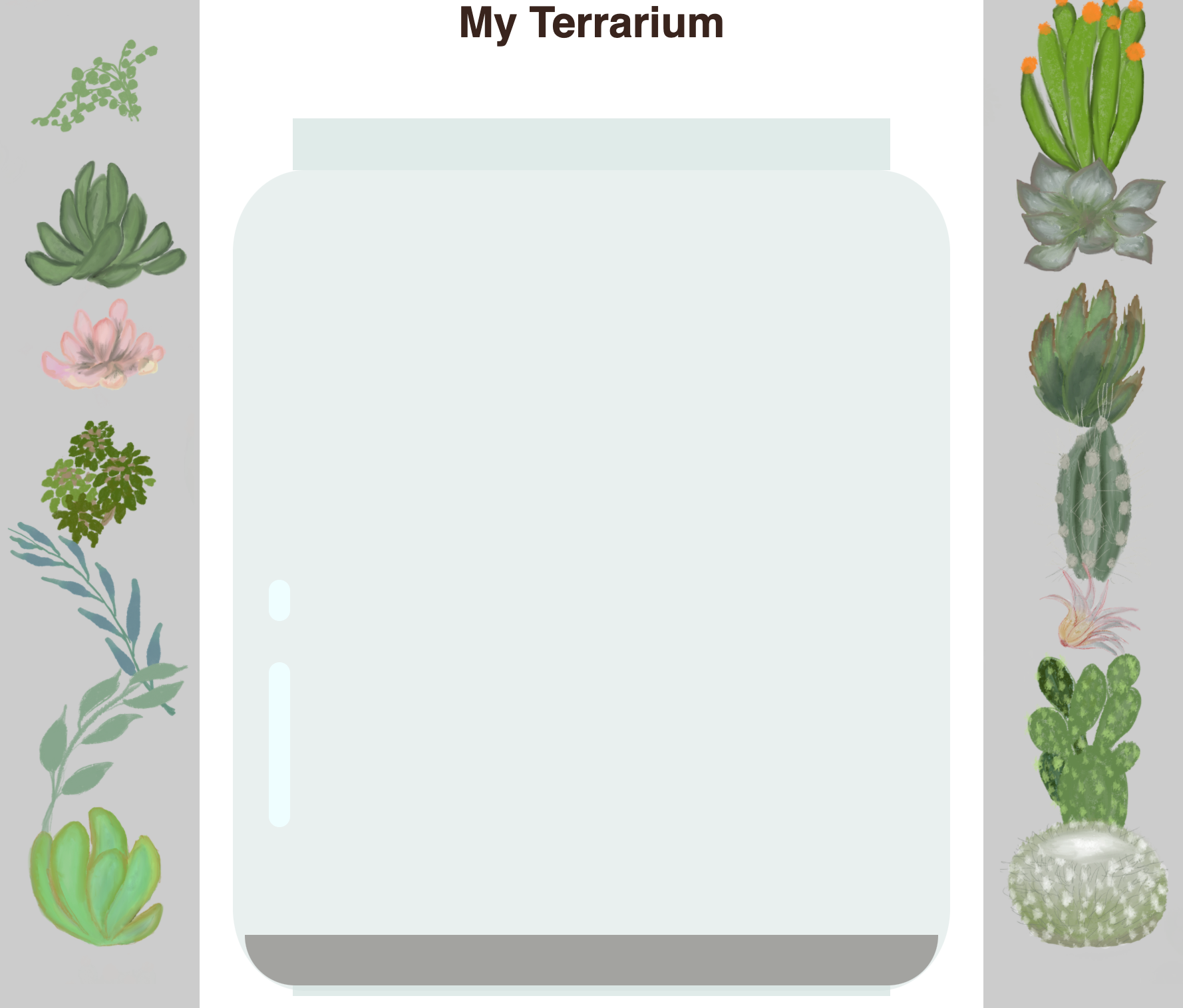
Add a 'bubble' shine to the left bottom area of the jar to make it look more glasslike. You will be styling the .jar-glossy-long and .jar-glossy-short to look like a reflected shine. Here's how it would look:
To complete the post-lecture quiz, go through this Learn module: Style your HTML app with CSS
Post-Lecture Quiz
Review & Self Study
CSS seems deceptively straightforward, but there are many challenges when trying to style an app perfectly for all browsers and all screen sizes. CSS-Grid and Flexbox are tools that have been developed to make the job a little more structured and more reliable. Learn about these tools by playing Flexbox Froggy and Grid Garden.


