
 localizeflow[bot]
9e661e295d
localizeflow[bot]
9e661e295d
|
8 months ago | |
|---|---|---|
| .. | ||
| README.md | 8 months ago | |
| assignment.md | 8 months ago | |
README.md
Terrarium Project Part 2: Introduction to CSS
journey
    title Your CSS Styling Journey
    section Foundation
      Link CSS file: 3: Student
      Understand cascade: 4: Student
      Learn inheritance: 4: Student
    section Selectors
      Element targeting: 4: Student
      Class patterns: 5: Student
      ID specificity: 5: Student
    section Layout
      Position elements: 4: Student
      Create containers: 5: Student
      Build terrarium: 5: Student
    section Polish
      Add visual effects: 5: Student
      Responsive design: 5: Student
      Glass reflections: 5: Student
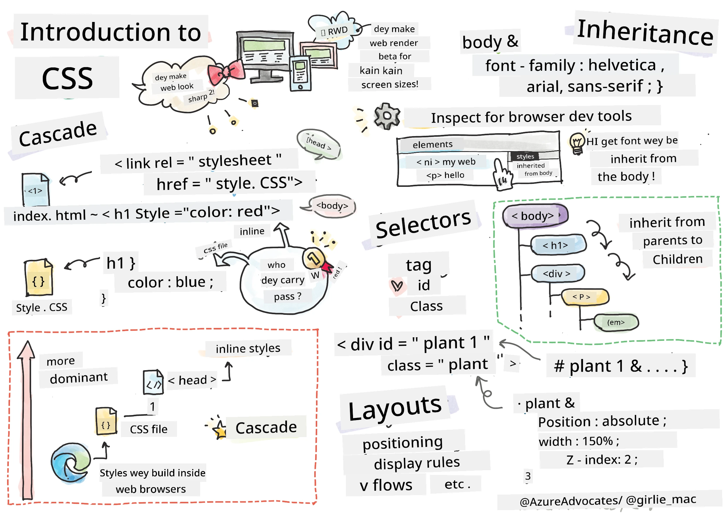
Sketchnote by Tomomi Imura
Memba how your HTML terrarium bin fine simple? CSS na di place wey we go take change dat plain structure come one wey fine for eye.
If HTML be like di building frame for house, then CSS na wetin make e feel like home - di paint color dem, how furniture arrange, di light dem, and how di rooms dey flow together. Think about how Palace of Versailles start as small hunting lodge, but correct attention to decoration and layout turn am to one of di world’s most fine buildings.
Today, we go change your terrarium from just working to fine finish. You go learn how to position elements correct correct, make layouts dey respond to different screen sizes, and make di visual fine wey dey make websites dey interesting.
By di end of dis lesson, you go see how correct CSS styling fit improve your project well well. Make we add style to your terrarium.
mindmap
  root((CSS Fundamentals))
    Cascade
      Specificity Rules
      Inheritance
      Priority Order
      Conflict Resolution
    Selectors
      Element Tags
      Classes (.class)
      IDs (#id)
      Combinators
    Box Model
      Margin
      Border
      Padding
      Content
    Layout
      Positioning
      Display Types
      Flexbox
      Grid
    Visual Effects
      Colors
      Shadows
      Transitions
      Animations
    Responsive Design
      Media Queries
      Flexible Units
      Viewport Meta
      Mobile First
Pre-Lecture Quiz
Getting Started with CSS
People often talk say CSS na just to make things fine, but e get plenty purpose pass dat. CSS na like director for movie - you dey control not just how everything look, but how e dey move, how e take respond to interaction, and how e take change for different situations.
Modern CSS get power well well. You fit write code wey go automatically adjust layout for phone, tablet, and desktop. You fit create smooth animation wey go guide users eye where e suppose dey. Di result fit dey very impressive when everything work together well.
💡 Pro Tip: CSS dey always dey evolve with new features and power. Always check CanIUse.com to confirm browser support for new CSS features before you use am for production projects.
Wet we go do for dis lesson be:
- Create complete visual design for your terrarium using modern CSS techniques
- Explore fundamental concepts like cascade, inheritance, and CSS selectors
- Implement responsive positioning and layout strategies
- Build di terrarium container using CSS shapes and styling
Prerequisite
You suppose don finish di HTML structure for your terrarium from di last lesson and dem dey ready for styling.
📺 Video Resource: Check dis helpful video walkthrough

Setting Up Your CSS File
Before we fit start styling, we gats connect CSS to our HTML. Dis connection go tell di browser where to find di styling instruction for our terrarium.
For your terrarium folder, create new file wey dem go call style.css, then link am for your HTML document <head> section:
<link rel="stylesheet" href="./style.css" />
Wet dis code dey do be:
- Create connection between your HTML and CSS files
- Tell di browser to load and apply di styles from
style.css - Use di
rel="stylesheet"attribute to talk say dis na CSS file - Reference di file path with
href="./style.css"
Understanding the CSS Cascade
You don ever wonder why dem call CSS "Cascading" Style Sheets? Styles dey cascade down like waterfall, and sometimes dem dey clash.
Think about how military command structures dey work - one general order fit talk say "all troops make dem wear green," but specific order for your unit fit talk say "wear dress blues for di ceremony." Di specific order go win. CSS dey follow dis kind logic, and if you understand dis hierarchy, e go make debugging easy.
Experimenting with Cascade Priority
Make we see di cascade work by creating style wahala. First, add inline style to your <h1> tag:
<h1 style="color: red">My Terrarium</h1>
Wet dis code dey do:
- Apply red color direct to
<h1>element using inline styling - Use di
styleattribute to put CSS direct for HTML - Create highest priority style rule for dis specific element
Next, put dis rule for your style.css file:
h1 {
  color: blue;
}
For di code top, we:
- Define CSS rule wey target all
<h1>elements - Set di text color to blue using external stylesheet
- Create lower priority rule compared to inline styles
✅ Knowledge Check: Which color your web app go show? Why dat color win? You fit think of situations wey you go like override styles?
flowchart TD
    A["Browser jam h1 element"] --> B{"Check for inline styles"}
    B -->|Found| C["style='color: red'"]
    B -->|None| D{"Check for ID rules"}
    C --> E["Apply red color (1000 points)"]
    D -->|Found| F["#heading { color: green }"]
    D -->|None| G{"Check for class rules"}
    F --> H["Apply green color (100 points)"]
    G -->|Found| I[".title { color: blue }"]
    G -->|None| J{"Check element rules"}
    I --> K["Apply blue color (10 points)"]
    J -->|Found| L["h1 { color: purple }"]
    J -->|None| M["Use browser default"]
    L --> N["Apply purple color (1 point)"]

    style C fill:#ff6b6b
    style F fill:#51cf66
    style I fill:#339af0
    style L fill:#9775fa
💡 CSS Priority Order (from highest go lowest):
- Inline styles (style attribute)
- IDs (#myId)
- Classes (.myClass) and attributes
- Element selectors (h1, div, p)
- Browser defaults
CSS Inheritance in Action
CSS inheritance be like genetics - elements dey inherit some properties from their parent elements. If you set font family for body element, all text inside go use dat same font. E resemble how Habsburg family jawline appear for generations without e get to talk about am for each person.
But no be everything dey inherit. Text styles like fonts and colors dey inherit, but layout properties like margins and borders no dey. Just like pikin fit inherit physical traits but no inherit their parents fashion choice.
Observing Font Inheritance
Make we see inheritance work by setting font family on <body> element:
body {
  font-family: 'Segoe UI', Tahoma, Geneva, Verdana, sans-serif;
}
Wet happen here:
- Set font family for whole page by targeting
<body>element - Use font stack with fallback options for better browser compatibility
- Apply modern system fonts wey fine for different operating systems
- Ensure all child elements inherit dis font unless dem override am
Open browser developer tools (F12), go Elements tab, inspect your <h1> element. You go see say e inherit font family from body:
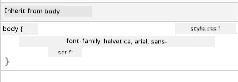
✅ Experiment Time: Try set other inheritable properties for <body> like color, line-height, or text-align. Wetin happen to your heading and other elements?
📝 Inheritable Properties Include:
color,font-family,font-size,line-height,text-align,visibilityNon-Inheritable Properties Include:
margin,padding,border,width,height,position
🔄 Pedagogical Check-in
CSS Foundation Understanding: Before you waka go selectors, make sure you fit:
- ✅ Explain di difference between cascade and inheritance
- ✅ Predict which style go win for specificity conflict
- ✅ Identify which properties dey inherit from parent elements
- ✅ Connect CSS files to HTML correct
Quick Test: If you get these styles, which color <h1> inside <div class="special"> go be?
div { color: blue; }
.special { color: green; }
h1 { color: red; }
Answer: Red (element selector direct target h1)
Mastering CSS Selectors
CSS selectors na your way to target specific elements for styling. Dem work like giving exact direction - instead of saying "di house," you fit talk "di blue house wey get red door for Maple Street."
CSS get different ways to be specific, and to choose di correct selector na like to choose correct tool for di job. Sometimes you want style every door for neighborhood, sometime na just the one door.
Element Selectors (Tags)
Element selectors dey target HTML elements by their tag name. Dem good for base styles wey go apply for the entire page:
body {
  font-family: 'Segoe UI', Tahoma, Geneva, Verdana, sans-serif;
  margin: 0;
  padding: 0;
}

h1 {
  color: #3a241d;
  text-align: center;
  font-size: 2.5rem;
  margin-bottom: 1rem;
}
Understanding dis styles:
- Set consistent typography across whole page with
bodyselector - Remove default browser margins and padding for better control
- Style all heading elements with color, alignment, and spacing
- Use
remunits for font wey fit scale and dey accessible
Even though element selectors good for general styling, you go still need specific selectors to style individual parts like di plants for your terrarium.
ID Selectors for Unique Elements
ID selectors use # symbol and dem target elements with specific id attributes. Because IDs suppose to be unique for a page, dem good for styling individual special elements like our left and right plant containers.
Make we create styling for our terrarium side containers wey plants go dey:
#left-container {
  background-color: #f5f5f5;
  width: 15%;
  left: 0;
  top: 0;
  position: absolute;
  height: 100vh;
  padding: 1rem;
  box-sizing: border-box;
}

#right-container {
  background-color: #f5f5f5;
  width: 15%;
  right: 0;
  top: 0;
  position: absolute;
  height: 100vh;
  padding: 1rem;
  box-sizing: border-box;
}
Wet dis code do be:
- Position containers for far left and right side using
absolutepositioning - Use
vh(viewport height) units for height wey go adjust according to screen size - Apply
box-sizing: border-boxto include padding for overall width - Remove unnecessary
pxunits from zero values to make code fine - Set subtle background color wey easy for eye pass plain gray
✅ Code Quality Challenge: You notice say dis CSS dey break DRY (Don't Repeat Yourself) rule. Fit refactor am with both ID and class?
Better way to do am:
<div id="left-container" class="container"></div>
<div id="right-container" class="container"></div>
.container {
  background-color: #f5f5f5;
  width: 15%;
  top: 0;
  position: absolute;
  height: 100vh;
  padding: 1rem;
  box-sizing: border-box;
}

#left-container {
  left: 0;
}

#right-container {
  right: 0;
}
Class Selectors for Reusable Styles
Class selectors use . symbol and dem good for when you want apply same styles to many elements. Unlike IDs, classes fit dey used plenty times for your HTML, making dem perfect for consistent styling.
Inside our terrarium, each plant need similar styling but also need individual position. We go use mix of classes for shared styles and IDs for individual placement.
Dis na di HTML structure for each plant:
<div class="plant-holder">
  <img class="plant" alt="Decorative plant for terrarium" id="plant1" src="../../../../translated_images/plant1.d18b18ffe73da18f.pcm.png" />
</div>
Key elements explain:
- Use
class="plant-holder"for container styling wey dey same for all plants - Apply
class="plant"for shared image styling and behaviour - Include unique
id="plant1"for individual positioning and JavaScript interaction - Provide descriptive alt text for screen reader access
Now put these styles for your style.css file:
.plant-holder {
  position: relative;
  height: 13%;
  left: -0.6rem;
}

.plant {
  position: absolute;
  max-width: 150%;
  max-height: 150%;
  z-index: 2;
  transition: transform 0.3s ease;
}

.plant:hover {
  transform: scale(1.05);
}
Wet dey happen for these styles:
- Create relative positioning for plant holder to make positioning context
- Set each plant holder to 13% height, to fit all plants vertically without scrolling
- Shift holders small left to better center plants inside their container
- Allow plants to scale responsively using
max-widthandmax-height - Use
z-indexto put plants ahead of other things for terrarium - Add small hover effect with CSS transitions for better user interaction
✅ Critical Thinking: Why we need both .plant-holder and .plant selectors? Which tin go happen if you use only one?
💡 Design Pattern: Container (
.plant-holder) control layout and positioning, content (.plant) control appearance and scaling. Dis kind separation make code easier to maintain and more flexible.
Understanding CSS Positioning
CSS positioning na like being stage director for play - you direct where each actor stand and how dem move. Some actors follow normal formation, others need special position for drama.
Once you understand positioning, many layout problems go dey easy. You want navigation bar wey no go comot from top when user dey scroll? Positioning na di solution. You want tooltip wey go show for one specific place? Na positioning too.
The Five Position Values
quadrantChart
    title CSS Positioning Strategy
    x-axis Document Flow --> Removed from Flow
    y-axis Static Position --> Precise Control
    quadrant-1 Absolute
    quadrant-2 Fixed
    quadrant-3 Static
    quadrant-4 Sticky

    Static: [0.2, 0.2]
    Relative: [0.3, 0.6]
    Absolute: [0.8, 0.8]
    Fixed: [0.9, 0.7]
    Sticky: [0.5, 0.9]
| Position Value | Behavior | Use Case |
|---|---|---|
static |
Default flow, no mind top/left/right/bottom | Normal document layout |
relative |
Position relative to normal place | Small movements, create positioning context |
absolute |
Position relative to closest positioned ancestor | Exact placement, overlays |
fixed |
Position relative to viewport | Navigation bars, floating elements |
sticky |
Switch between relative and fixed depending on scroll | Headers wey stick as you scroll |
Positioning in Our Terrarium
Our terrarium use correct combination of positioning types to get di layout we want:
/* Container positioning */
.container {
  position: absolute; /* Removes from normal flow */
  /* ... other styles ... */
}

/* Plant holder positioning */
.plant-holder {
  position: relative; /* Creates positioning context */
  /* ... other styles ... */
}

/* Plant positioning */
.plant {
  position: absolute; /* Allows precise placement within holder */
  /* ... other styles ... */
}
Understand di positioning strategy:
- Absolute containers comot for normal document flow and dey pinned to screen edges
- Relative plant holders create positioning context while dem dey for document flow
- Absolute plants fit position well inside their relative containers
- Dis combination allow plants stack vertical and still fit uniquely positioned each one
🎯 Why Dis Important: Di
plantelements need absolute positioning so dem fit dey draggable for next lesson. Absolute positioning comot dem from normal layout flow, make drag-and-drop interaction possible.
✅ Experiment Time: Try change positioning values and watch wetin happen:
- Wetin go happen if you change
.containerfromabsolutetorelative? - How di layout go change if
.plant-holderuseabsoluteinstead ofrelative? - Wetin go happen when you switch
.planttorelativepositioning?
🔄 Pedagogical Check-in
CSS Positioning Mastery: Pause to check say you sabi well:
- ✅ You fit explain why plants need absolute positioning for drag-and-drop?
- ✅ You understand how relative containers dey create positioning context?
- ✅ Why side containers dem dey use absolute positioning?
- ✅ Wetin go happen if you comot position declarations finish?
Real-World Connection: Think about how CSS positioning dey imitate real-world layout:
- Static: Books for shelf (natural order)
- Relative: Move book small but still keep im position
- Absolute: Put bookmark for exact page number
- Fixed: Sticky note wey dey remain visible as you dey flip pages
Building the Terrarium with CSS
Now we go build glass jar using only CSS - no images or graphics software needed.
To create glass wey dey realistic, shadows, and depth effects using positioning and transparency na how CSS sabi make things visual. This method dey resemble how architects for Bauhaus movement take simple geometric shapes create complex, beautiful buildings. Once you understand these principles, you go fit see the CSS skill for many web designs.
flowchart LR
    A[Jar Top] --> E[Complete Terrarium]
    B[Jar Walls] --> E
    C[Dirt Layer] --> E
    D[Jar Bottom] --> E
    F[Glass Effects] --> E

    A1["50% width<br/>5% height<br/>Top position"] --> A
    B1["60% width<br/>80% height<br/>Rounded corners<br/>0.5 opacity"] --> B
    C1["60% width<br/>5% height<br/>Dark brown<br/>Bottom layer"] --> C
    D1["50% width<br/>1% height<br/>Bottom position"] --> D
    F1["Small shadows<br/>See through<br/>Z-index layering"] --> F

    style E fill:#d1e1df,stroke:#3a241d
    style A fill:#e8f5e8
    style B fill:#e8f5e8
    style C fill:#8B4513
    style D fill:#e8f5e8
Creating the Glass Jar Components
Make we build the terrarium jar piece by piece. Each part use absolute positioning and percentage-based sizing for responsive design:
.jar-walls {
  height: 80%;
  width: 60%;
  background: #d1e1df;
  border-radius: 1rem;
  position: absolute;
  bottom: 0.5%;
  left: 20%;
  opacity: 0.5;
  z-index: 1;
  box-shadow: inset 0 0 2rem rgba(0, 0, 0, 0.1);
}

.jar-top {
  width: 50%;
  height: 5%;
  background: #d1e1df;
  position: absolute;
  bottom: 80.5%;
  left: 25%;
  opacity: 0.7;
  z-index: 1;
  border-radius: 0.5rem 0.5rem 0 0;
}

.jar-bottom {
  width: 50%;
  height: 1%;
  background: #d1e1df;
  position: absolute;
  bottom: 0;
  left: 25%;
  opacity: 0.7;
  border-radius: 0 0 0.5rem 0.5rem;
}

.dirt {
  width: 60%;
  height: 5%;
  background: #3a241d;
  position: absolute;
  border-radius: 0 0 1rem 1rem;
  bottom: 1%;
  left: 20%;
  opacity: 0.7;
  z-index: -1;
}
Understanding the terrarium construction:
- Uses percentage-based dimensions for scaling well on all screen sizes
- Positions elements absolute to stack and align am well
- Applies different opacity levels to make glass transparency effect
- Implements
z-indexlayering so plants fit show inside the jar - Adds subtle box-shadow and neat border-radius for more realistic look
Responsive Design with Percentages
See how all dimensions dey use percentage instead of fixed pixel values:
Why dis matter:
- Ensure say terrarium scales well for any screen size
- Maintain visual relationship between jar parts
- Provide consistent experience from mobile phones to big desktop monitors
- Allow design to adapt without spoiling visual layout
CSS Units in Action
We dey use rem units for border-radius, wey scale relative to root font size. This one dey create easier-to-access designs wey respect user font preferences. Learn more about CSS relative units for official specs.
✅ Visual Experimentation: Try change these values and watch di effects:
- Change jar opacity from 0.5 to 0.8 – how e go affect glass look?
- Change dirt color from
#3a241dto#8B4513– which kind visual impact e get? - Modify
z-indexof dirt to 2 – wetin go happen to layering?
🔄 Pedagogical Check-in
CSS Visual Design Understanding: Confirm say you sabi visual CSS well:
- ✅ How percentage-based dimensions dey create responsive design?
- ✅ Why opacity dey create glass transparency effect?
- ✅ Wetin be role of z-index for layering elements?
- ✅ How border-radius values dey create jar shape?
Design Principle: Notice how we dey build complex visuals from simple shapes:
- Rectangles → Rounded rectangles → Jar components
- Flat colors → Opacity → Glass effect
- Individual elements → Layered composition → 3D appearance
GitHub Copilot Agent Challenge 🚀
Use Agent mode to complete this challenge:
Description: Create CSS animation wey go make terrarium plants gently sway back and forth, like breeze dey blow. This go help you practice CSS animations, transforms, and keyframes to make your terrarium fine.
Prompt: Add CSS keyframe animations to make the plants for terrarium sway gently side to side. Create sway animation wey go rotate each plant small (2-3 degrees) left and right with duration of 3-4 seconds, and apply am to .plant class. Make sure say animation dey loop forever and get easing function for natural movement.
Learn more about agent mode here.
🚀 Challenge: Adding Glass Reflections
Ready to make your terrarium better with real glass reflections? This technique go add depth and realism to design.
You go create subtle white or light-colored oval shapes for glass reflections. Position dem well for left side of jar, apply correct opacity and blur effects for realistic light reflection, use border-radius to make organic, bubble-like shapes, and experiment with gradients or box-shadows for strong realism.
Post-Lecture Quiz
Expand Your CSS Knowledge
CSS fit look hard at first, but understanding these main concepts go give you strong foundation for advanced techniques.
Your next CSS learning areas:
- Flexbox - simplify alignment and distribution of elements
- CSS Grid - give powerful tools for complex layouts
- CSS Variables - reduce repetition and make maintenance easy
- Responsive design - make sure sites work well on different screen sizes
Interactive Learning Resources
Practice these concepts with these fun, hands-on games:
- 🐸 Flexbox Froggy - Master Flexbox through fun challenges
- 🌱 Grid Garden - Learn CSS Grid by growing virtual carrots
- 🎯 CSS Battle - Test your CSS skills with coding challenges
Additional Learning
For full CSS basics, finish this Microsoft Learn module: Style your HTML app with CSS
⚡ Wetin You Fit Do For Next 5 Minutes
- Open DevTools and inspect CSS styles on any website using Elements panel
- Create simple CSS file and link am to HTML page
- Try change colors using diff methods: hex, RGB, and named colors
- Practice box model by adding padding and margin to div
🎯 Wetin You Fit Achieve Dis Hour
- Complete post-lesson quiz and review CSS basics
- Style your HTML page with fonts, colors, and spacing
- Create simple layout using flexbox or grid
- Experiment with CSS transitions for smooth effects
- Practice responsive design with media queries
📅 Your Week-Long CSS Journey
- Complete terrarium styling task with creativity
- Master CSS Grid by building photo gallery layout
- Learn CSS animations to bring your designs alive
- Explore CSS preprocessors like Sass or Less
- Study design principles and apply am for CSS
- Analyze and recreate interesting designs you find online
🌟 Your Month-Long Design Mastery
- Build complete responsive website design system
- Learn CSS-in-JS or utility-first frameworks like Tailwind
- Contribute to open source projects with CSS improvements
- Master advanced CSS concepts like custom properties and containment
- Create reusable components libraries with modular CSS
- Mentor others wey dey learn CSS and share design knowledge
🎯 Your CSS Mastery Timeline
timeline
    title CSS Lernin Progression

    section Foundation (10 minutes)
        File Connection: Link CSS to HTML
                       : Undastan cascade rules
                       : Learn inheritance basics

    section Selectors (15 minutes)
        Targetin Elements: Element selectors
                          : Class patterns
                          : ID specificity
                          : Combinators

    section Box Model (20 minutes)
        Layout Fundamentals: Margin and padding
                           : Border properties
                           : Content sizing
                           : Box-sizing behavior

    section Positioning (25 minutes)
        Element Placement: Static vs relative
                         : Absolute positioning
                         : Z-index layering
                         : Responsive units

    section Visual Design (30 minutes)
        Styling Mastery: Colors and opacity
                       : Shadows and effects
                       : Transitions
                       : Transform properties

    section Responsive Design (45 minutes)
        Multi-Device Support: Media queries
                            : Flexible layouts
                            : Mobile-first approach
                            : Viewport optimization

    section Advanced Techniques (1 week)
        Modern CSS: Flexbox layouts
                  : CSS Grid systems
                  : Custom properties
                  : Animation keyframes

    section Professional Skills (1 month)
        CSS Architecture: Component patterns
                        : Maintainable code
                        : Performance optimization
                        : Cross-browser compatibility
🛠️ Your CSS Toolkit Summary
After completing dis lesson, you get:
- Cascade Understanding: How styles dey inherit and override each other
- Selector Mastery: Precise targeting with elements, classes, and IDs
- Positioning Skills: Strategic element placing and layering
- Visual Design: Creating glass effects, shadows, and transparency
- Responsive Techniques: Percentage-based layouts wey go adapt to any screen
- Code Organization: Clean, maintainable CSS structure
- Modern Practices: Using relative units and accessible design patterns
Next Steps: Your terrarium now get both structure (HTML) and style (CSS). Final lesson go add interactivity with JavaScript!
Assignment
Disclaimer: Dis document don translate wit AI translation service wey dem dey call Co-op Translator. Even though we try make am correct, abeg make you sabi say automated translation fit get some mistakes or wrong tins. Di original document wey na di native language na di correct source. If na important tin you dey look for, make you use person wey sabi professional translation. We no go carry any yawa wey fit happen if person misunderstand or misinterpret dis translation.