# Terrarium Project Part 2: Introduction to CSS
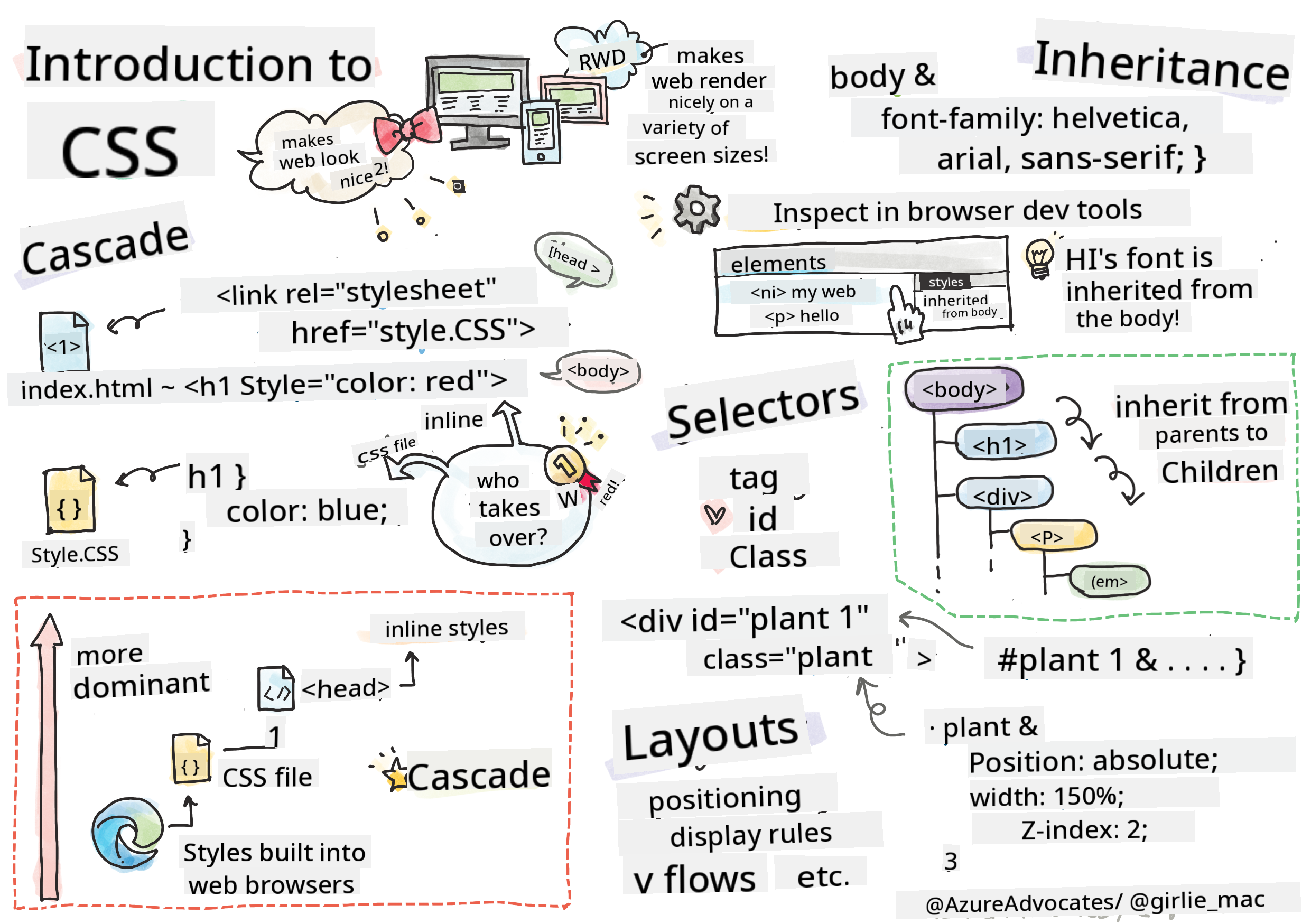
> Sketchnote by [Tomomi Imura](https://twitter.com/girlie_mac)
## Pre-Lecture Quiz
[Pre-lecture quiz](https://ff-quizzes.netlify.app/web/quiz/17)
### Introduction
CSS, or Cascading Style Sheets, addresses a key challenge in web development: making your website visually appealing. Styling your applications improves usability and aesthetics, and CSS also enables Responsive Web Design (RWD), ensuring your apps look great on any screen size. Beyond aesthetics, CSS includes features like animations and transforms, allowing for advanced interactions in your apps. The CSS Working Group oversees the current CSS specifications, and you can follow their updates on the [World Wide Web Consortium's site](https://www.w3.org/Style/CSS/members).
> Note: CSS is an evolving language, like everything on the web, and not all browsers support the latest specifications. Always verify your implementations using [CanIUse.com](https://caniuse.com).
In this lesson, we'll add styles to our online terrarium and explore key CSS concepts such as the cascade, inheritance, selectors, positioning, and layout creation. By the end, we'll have styled and structured the terrarium itself.
### Prerequisite
Ensure you have the HTML for your terrarium ready to be styled.
> Watch the video
>
> [](https://www.youtube.com/watch?v=6yIdOIV9p1I)
### Task
In your terrarium folder, create a new file named `style.css`. Import this file in the `` section:
```html
```
---
## The Cascade
Cascading Style Sheets follow the principle of "cascading," where the application of styles is determined by their priority. Styles defined by the website author take precedence over browser defaults, and inline styles override those in external stylesheets.
### Task
Add the inline style "color: red" to your `
` tag:
```HTML
My Terrarium
```
Next, add the following code to your `style.css` file:
```CSS
h1 {
color: blue;
}
```
✅ Which color appears in your web app? Why? Can you find a way to override styles? When would you want to do this, or why not?
---
## Inheritance
Styles can be inherited from parent elements to child elements, meaning nested elements often inherit the styles of their ancestors.
### Task
Set the font for the body and check if a nested element inherits the font:
```CSS
body {
font-family: helvetica, arial, sans-serif;
}
```
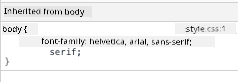
Open your browser's console and navigate to the 'Elements' tab to observe the font of the `
` tag. You'll see that it inherits the font from the body, as indicated by the browser:
✅ Can you make a nested style inherit a different property?
---
## CSS Selectors
### Tags
Currently, your `style.css` file has only a few tags styled, and the app looks a bit odd:
```CSS
body {
font-family: helvetica, arial, sans-serif;
}
h1 {
color: #3a241d;
text-align: center;
}
```
Styling tags this way allows you to control individual elements, but to style multiple plants in your terrarium, you'll need to use CSS selectors.
### Ids
Add styles to position the left and right containers. Since there is only one left container and one right container, they are assigned ids in the markup. Use `#` to style them:
```CSS
#left-container {
background-color: #eee;
width: 15%;
left: 0px;
top: 0px;
position: absolute;
height: 100%;
padding: 10px;
}
#right-container {
background-color: #eee;
width: 15%;
right: 0px;
top: 0px;
position: absolute;
height: 100%;
padding: 10px;
}
```
Here, the containers are positioned absolutely to the far left and right of the screen, with their widths defined in percentages to ensure they scale properly on smaller screens.
✅ This code is somewhat repetitive and not "DRY" (Don't Repeat Yourself). Can you find a better way to style these ids, perhaps by combining an id and a class? You would need to update the markup and refactor the CSS:
```html
```
### Classes
In the example above, you styled two unique elements. To apply styles to multiple elements, use CSS classes. Style the plants in the left and right containers this way.
Notice that each plant in the HTML markup has both ids and classes. The ids are used by JavaScript later to manipulate plant placement, while the classes provide consistent styling for all plants.
```html
```
Add the following to your `style.css` file:
```CSS
.plant-holder {
position: relative;
height: 13%;
left: -10px;
}
.plant {
position: absolute;
max-width: 150%;
max-height: 150%;
z-index: 2;
}
```
Key points in this snippet include the combination of relative and absolute positioning, which we'll discuss in the next section. Pay attention to how heights are managed using percentages:
- The plant holder's height is set to 13%, ensuring all plants fit within each vertical container without scrolling.
- The plant holder is shifted to the left to center the plants within their container. The images have transparent backgrounds to make them draggable, so they need to be adjusted for better alignment.
- The plant's max-width is set to 150%, allowing it to scale down as the browser window shrinks. Resize your browser to see how the plants remain in their containers while scaling down.
Also noteworthy is the use of z-index, which controls the stacking order of elements (ensuring plants appear above the container and look like they're inside the terrarium).
✅ Why do you need both a plant holder and a plant CSS selector?
## CSS Positioning
Combining position properties (static, relative, fixed, absolute, and sticky) can be tricky, but when done correctly, it provides precise control over page elements.
Absolutely positioned elements are placed relative to their nearest positioned ancestor, or the document body if no ancestor exists.
Relatively positioned elements are adjusted based on CSS instructions, moving away from their original position.
In this example, the `plant-holder` is relatively positioned within an absolutely positioned container. This setup ensures the side bar containers are pinned to the left and right, while the `plant-holder` adjusts itself within the side bars, creating space for plants to be arranged vertically.
> The `plant` itself is also absolutely positioned, which is necessary for making it draggable, as you'll learn in the next lesson.
✅ Experiment with changing the positioning types of the side containers and the plant-holder. What happens?
## CSS Layouts
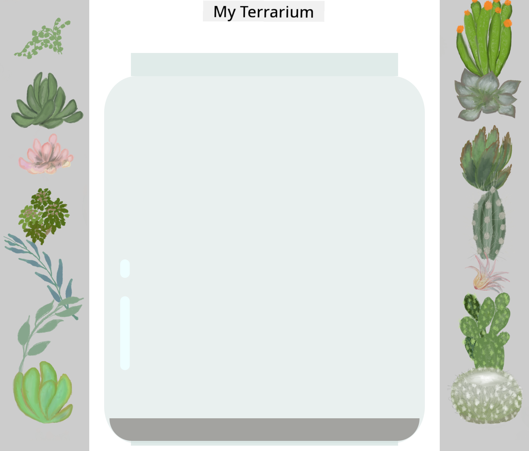
Now, use what you've learned to build the terrarium entirely with CSS!
First, style the `.terrarium` div children as a rounded rectangle:
```CSS
.jar-walls {
height: 80%;
width: 60%;
background: #d1e1df;
border-radius: 1rem;
position: absolute;
bottom: 0.5%;
left: 20%;
opacity: 0.5;
z-index: 1;
}
.jar-top {
width: 50%;
height: 5%;
background: #d1e1df;
position: absolute;
bottom: 80.5%;
left: 25%;
opacity: 0.7;
z-index: 1;
}
.jar-bottom {
width: 50%;
height: 1%;
background: #d1e1df;
position: absolute;
bottom: 0%;
left: 25%;
opacity: 0.7;
}
.dirt {
width: 60%;
height: 5%;
background: #3a241d;
position: absolute;
border-radius: 0 0 1rem 1rem;
bottom: 1%;
left: 20%;
opacity: 0.7;
z-index: -1;
}
```
Notice the use of percentages here. When you resize your browser, the jar scales accordingly. Pay attention to the width and height percentages for the jar elements and how each element is absolutely centered and pinned to the bottom of the viewport.
The `rem` unit is used for the border-radius, which is a font-relative measurement. Learn more about this type of relative measurement in the [CSS spec](https://www.w3.org/TR/css-values-3/#font-relative-lengths).
✅ Try changing the jar colors and opacity compared to the dirt. What happens? Why?
---
## 🚀Challenge
Add a 'bubble' shine to the bottom-left area of the jar to make it appear more glass-like. Style the `.jar-glossy-long` and `.jar-glossy-short` to create a reflective shine. Here's the desired result:
To complete the post-lecture quiz, explore this Learn module: [Style your HTML app with CSS](https://docs.microsoft.com/learn/modules/build-simple-website/4-css-basics/?WT.mc_id=academic-77807-sagibbon)
## Post-Lecture Quiz
[Post-lecture quiz](https://ff-quizzes.netlify.app/web/quiz/18)
## Review & Self Study
CSS may seem simple, but styling an app perfectly for all browsers and screen sizes can be challenging. Tools like CSS-Grid and Flexbox make this process more structured and reliable. Learn about these tools by playing [Flexbox Froggy](https://flexboxfroggy.com/) and [Grid Garden](https://codepip.com/games/grid-garden/).
## Assignment
[CSS Refactoring](assignment.md)
---
**Disclaimer**:
This document has been translated using the AI translation service [Co-op Translator](https://github.com/Azure/co-op-translator). While we aim for accuracy, please note that automated translations may include errors or inaccuracies. The original document in its native language should be regarded as the authoritative source. For critical information, professional human translation is advised. We are not responsible for any misunderstandings or misinterpretations resulting from the use of this translation.
 ```
Add the following to your `style.css` file:
```CSS
.plant-holder {
position: relative;
height: 13%;
left: -10px;
}
.plant {
position: absolute;
max-width: 150%;
max-height: 150%;
z-index: 2;
}
```
Key points in this snippet include the combination of relative and absolute positioning, which we'll discuss in the next section. Pay attention to how heights are managed using percentages:
- The plant holder's height is set to 13%, ensuring all plants fit within each vertical container without scrolling.
- The plant holder is shifted to the left to center the plants within their container. The images have transparent backgrounds to make them draggable, so they need to be adjusted for better alignment.
- The plant's max-width is set to 150%, allowing it to scale down as the browser window shrinks. Resize your browser to see how the plants remain in their containers while scaling down.
Also noteworthy is the use of z-index, which controls the stacking order of elements (ensuring plants appear above the container and look like they're inside the terrarium).
✅ Why do you need both a plant holder and a plant CSS selector?
## CSS Positioning
Combining position properties (static, relative, fixed, absolute, and sticky) can be tricky, but when done correctly, it provides precise control over page elements.
Absolutely positioned elements are placed relative to their nearest positioned ancestor, or the document body if no ancestor exists.
Relatively positioned elements are adjusted based on CSS instructions, moving away from their original position.
In this example, the `plant-holder` is relatively positioned within an absolutely positioned container. This setup ensures the side bar containers are pinned to the left and right, while the `plant-holder` adjusts itself within the side bars, creating space for plants to be arranged vertically.
> The `plant` itself is also absolutely positioned, which is necessary for making it draggable, as you'll learn in the next lesson.
✅ Experiment with changing the positioning types of the side containers and the plant-holder. What happens?
## CSS Layouts
Now, use what you've learned to build the terrarium entirely with CSS!
First, style the `.terrarium` div children as a rounded rectangle:
```CSS
.jar-walls {
height: 80%;
width: 60%;
background: #d1e1df;
border-radius: 1rem;
position: absolute;
bottom: 0.5%;
left: 20%;
opacity: 0.5;
z-index: 1;
}
.jar-top {
width: 50%;
height: 5%;
background: #d1e1df;
position: absolute;
bottom: 80.5%;
left: 25%;
opacity: 0.7;
z-index: 1;
}
.jar-bottom {
width: 50%;
height: 1%;
background: #d1e1df;
position: absolute;
bottom: 0%;
left: 25%;
opacity: 0.7;
}
.dirt {
width: 60%;
height: 5%;
background: #3a241d;
position: absolute;
border-radius: 0 0 1rem 1rem;
bottom: 1%;
left: 20%;
opacity: 0.7;
z-index: -1;
}
```
Notice the use of percentages here. When you resize your browser, the jar scales accordingly. Pay attention to the width and height percentages for the jar elements and how each element is absolutely centered and pinned to the bottom of the viewport.
The `rem` unit is used for the border-radius, which is a font-relative measurement. Learn more about this type of relative measurement in the [CSS spec](https://www.w3.org/TR/css-values-3/#font-relative-lengths).
✅ Try changing the jar colors and opacity compared to the dirt. What happens? Why?
---
## 🚀Challenge
Add a 'bubble' shine to the bottom-left area of the jar to make it appear more glass-like. Style the `.jar-glossy-long` and `.jar-glossy-short` to create a reflective shine. Here's the desired result:

To complete the post-lecture quiz, explore this Learn module: [Style your HTML app with CSS](https://docs.microsoft.com/learn/modules/build-simple-website/4-css-basics/?WT.mc_id=academic-77807-sagibbon)
## Post-Lecture Quiz
[Post-lecture quiz](https://ff-quizzes.netlify.app/web/quiz/18)
## Review & Self Study
CSS may seem simple, but styling an app perfectly for all browsers and screen sizes can be challenging. Tools like CSS-Grid and Flexbox make this process more structured and reliable. Learn about these tools by playing [Flexbox Froggy](https://flexboxfroggy.com/) and [Grid Garden](https://codepip.com/games/grid-garden/).
## Assignment
[CSS Refactoring](assignment.md)
---
**Disclaimer**:
This document has been translated using the AI translation service [Co-op Translator](https://github.com/Azure/co-op-translator). While we aim for accuracy, please note that automated translations may include errors or inaccuracies. The original document in its native language should be regarded as the authoritative source. For critical information, professional human translation is advised. We are not responsible for any misunderstandings or misinterpretations resulting from the use of this translation.
```
Add the following to your `style.css` file:
```CSS
.plant-holder {
position: relative;
height: 13%;
left: -10px;
}
.plant {
position: absolute;
max-width: 150%;
max-height: 150%;
z-index: 2;
}
```
Key points in this snippet include the combination of relative and absolute positioning, which we'll discuss in the next section. Pay attention to how heights are managed using percentages:
- The plant holder's height is set to 13%, ensuring all plants fit within each vertical container without scrolling.
- The plant holder is shifted to the left to center the plants within their container. The images have transparent backgrounds to make them draggable, so they need to be adjusted for better alignment.
- The plant's max-width is set to 150%, allowing it to scale down as the browser window shrinks. Resize your browser to see how the plants remain in their containers while scaling down.
Also noteworthy is the use of z-index, which controls the stacking order of elements (ensuring plants appear above the container and look like they're inside the terrarium).
✅ Why do you need both a plant holder and a plant CSS selector?
## CSS Positioning
Combining position properties (static, relative, fixed, absolute, and sticky) can be tricky, but when done correctly, it provides precise control over page elements.
Absolutely positioned elements are placed relative to their nearest positioned ancestor, or the document body if no ancestor exists.
Relatively positioned elements are adjusted based on CSS instructions, moving away from their original position.
In this example, the `plant-holder` is relatively positioned within an absolutely positioned container. This setup ensures the side bar containers are pinned to the left and right, while the `plant-holder` adjusts itself within the side bars, creating space for plants to be arranged vertically.
> The `plant` itself is also absolutely positioned, which is necessary for making it draggable, as you'll learn in the next lesson.
✅ Experiment with changing the positioning types of the side containers and the plant-holder. What happens?
## CSS Layouts
Now, use what you've learned to build the terrarium entirely with CSS!
First, style the `.terrarium` div children as a rounded rectangle:
```CSS
.jar-walls {
height: 80%;
width: 60%;
background: #d1e1df;
border-radius: 1rem;
position: absolute;
bottom: 0.5%;
left: 20%;
opacity: 0.5;
z-index: 1;
}
.jar-top {
width: 50%;
height: 5%;
background: #d1e1df;
position: absolute;
bottom: 80.5%;
left: 25%;
opacity: 0.7;
z-index: 1;
}
.jar-bottom {
width: 50%;
height: 1%;
background: #d1e1df;
position: absolute;
bottom: 0%;
left: 25%;
opacity: 0.7;
}
.dirt {
width: 60%;
height: 5%;
background: #3a241d;
position: absolute;
border-radius: 0 0 1rem 1rem;
bottom: 1%;
left: 20%;
opacity: 0.7;
z-index: -1;
}
```
Notice the use of percentages here. When you resize your browser, the jar scales accordingly. Pay attention to the width and height percentages for the jar elements and how each element is absolutely centered and pinned to the bottom of the viewport.
The `rem` unit is used for the border-radius, which is a font-relative measurement. Learn more about this type of relative measurement in the [CSS spec](https://www.w3.org/TR/css-values-3/#font-relative-lengths).
✅ Try changing the jar colors and opacity compared to the dirt. What happens? Why?
---
## 🚀Challenge
Add a 'bubble' shine to the bottom-left area of the jar to make it appear more glass-like. Style the `.jar-glossy-long` and `.jar-glossy-short` to create a reflective shine. Here's the desired result:

To complete the post-lecture quiz, explore this Learn module: [Style your HTML app with CSS](https://docs.microsoft.com/learn/modules/build-simple-website/4-css-basics/?WT.mc_id=academic-77807-sagibbon)
## Post-Lecture Quiz
[Post-lecture quiz](https://ff-quizzes.netlify.app/web/quiz/18)
## Review & Self Study
CSS may seem simple, but styling an app perfectly for all browsers and screen sizes can be challenging. Tools like CSS-Grid and Flexbox make this process more structured and reliable. Learn about these tools by playing [Flexbox Froggy](https://flexboxfroggy.com/) and [Grid Garden](https://codepip.com/games/grid-garden/).
## Assignment
[CSS Refactoring](assignment.md)
---
**Disclaimer**:
This document has been translated using the AI translation service [Co-op Translator](https://github.com/Azure/co-op-translator). While we aim for accuracy, please note that automated translations may include errors or inaccuracies. The original document in its native language should be regarded as the authoritative source. For critical information, professional human translation is advised. We are not responsible for any misunderstandings or misinterpretations resulting from the use of this translation.