# Creating Accessible Webpages
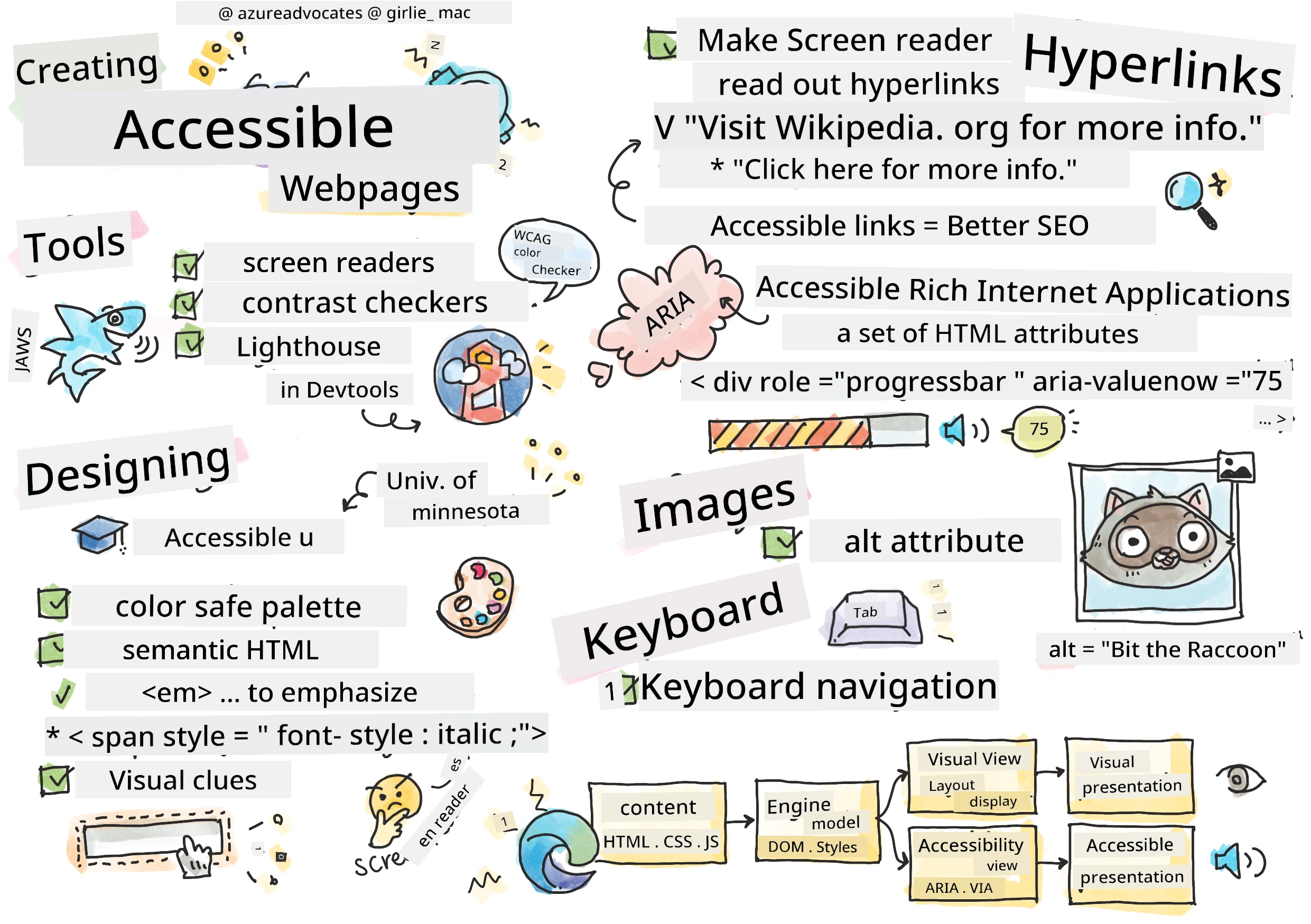
> Sketchnote by [Tomomi Imura](https://twitter.com/girlie_mac)
```mermaid
journey
title Your Accessibility Learning Adventure
section Foundation
Understanding Users: 5: You
Testing Tools: 4: You
POUR Principles: 5: You
section Build Skills
Semantic HTML: 4: You
Visual Design: 5: You
ARIA Techniques: 4: You
section Master Practice
Keyboard Navigation: 5: You
Form Accessibility: 4: You
Real-world Testing: 5: You
```
## Pre-Lecture Quiz
[Pre-lecture quiz](https://ff-quizzes.netlify.app/web/)
> Di power wey dey inside di Web na im universality be. Make everybody fit access am no matter say dem get any disability na very important tin.
>
> \- Sir Timothy Berners-Lee, W3C Director and inventor of di World Wide Web
Dis one fit surprise you: wen you dey build accessible website dem, you no dey help only people wey get disability—na him dey make di web beta for everybody!
You don ever notice those curb cuts for street corner dem? Dem originally design am for wheelchair users, but now dem dey help people wey get stroller, delivery people wey dey carry dolly, travelers wey dey carry rolling luggage, plus cyclists too. Na so accessible web design dey work—solution wey help one group fit help everybody. E sweet no be?
For dis lesson, we go explore how to create website dem wey actually work for everybody, no matter how dem dey use di web. You go learn beta methods wey dem don already put for web standards, you go try testing tools, plus you go see how accessibility fit make your sites dey easy to use for all users.
By di end of dis lesson, you go get confidence to make accessibility part of how you dey develop. You ready to see how correct design choices fit open di web to billions of people? Make we start!
```mermaid
mindmap
root((Web Accessibility))
Users
Screen readers
Keyboard navigation
Voice control
Magnification
Technologies
HTML semantics
ARIA attributes
CSS focus indicators
Keyboard events
Benefits
Wider audience
Better SEO
Legal compliance
Universal design
Testing
Automated tools
Manual testing
User feedback
Real assistive tech
```
> You fit take dis lesson for [Microsoft Learn](https://docs.microsoft.com/learn/modules/web-development-101/accessibility/?WT.mc_id=academic-77807-sagibbon)!
## Understanding Assistive Technologies
Before we begin to code, make we take small time understand how people wey get different abilities dey experience di web. No be just theory—understanding how dem dey navigate for real life go make you beta developer!
Assistive technologies na beta tools wey dey help people with disability interact with websites in ways wey fit surprise you. Once you understand how these technologies dey work, e go sweet you to create accessible web experience. Na like sey you dey see your code through another person eye.
### Screen readers
[Screen readers](https://en.wikipedia.org/wiki/Screen_reader) na technology wey strong wella wey dey turn digital text into speech or braille output. Although na beta for people with visual impairment, dem still help people wey get learning disabilities like dyslexia.
I like to think sey screen reader be like smart narrator wey dey read book to you. E dey read content aloud in correct order, e dey announcement interactive elements like "button" or "link," plus e get keyboard shortcuts wey make you fit jump around on top page. But na here e serious—screen reader fit only shine if we build website get correct structure and good content. Na you as developer go do dis work!
**Popular screen readers wey dey for different platforms:**
- **Windows**: [NVDA](https://www.nvaccess.org/about-nvda/) (free and di most popular), [JAWS](https://webaim.org/articles/jaws/), [Narrator](https://support.microsoft.com/windows/complete-guide-to-narrator-e4397a0d-ef4f-b386-d8ae-c172f109bdb1/?WT.mc_id=academic-77807-sagibbon) (in-built)
- **macOS/iOS**: [VoiceOver](https://support.apple.com/guide/voiceover/welcome/10) (in-built and powerful)
- **Android**: [TalkBack](https://support.google.com/accessibility/android/answer/6283677) (in-built)
- **Linux**: [Orca](https://wiki.gnome.org/Projects/Orca) (free, open source)
**How screen readers dey navigate web content:**
Screen readers get plenty ways wey dem fit use navigate wey dey make am easy for experienced users:
- **Sequential reading**: E dey read from top reach bottom like sey you dey follow book
- **Landmark navigation**: You fit jump between page parts (header, nav, main, footer)
- **Heading navigation**: You fit skip between headings make you understand page structure
- **Link lists**: E fit generate list of all links make e quick to find
- **Form controls**: E fit navigate straight to input fields and buttons
> 💡 **One tin wey shock me**: 68% of screen reader users dey navigate mostly by headings ([WebAIM Survey](https://webaim.org/projects/screenreadersurvey9/#finding)). This one mean sey your heading structure na like road map for users—if you do am well, you dey help people find their way quick for your content!
### Building your testing workflow
Here beta news—effective accessibility testing no suppose stress you! You go want combine automated tools (dem strong to catch obvious wahala) with some hands-on testing. Here na plan wey I don find wey dey catch most mata without waste your whole day:
**Important manual testing workflow:**
```mermaid
flowchart TD
A[🚀 Strat Testin] --> B{⌨️ Keyboard Navigation}
B --> C[Tab tru all interactive elements]
C --> D{🎧 Screen Reader Testin}
D --> E[Test wit NVDA/VoiceOver]
E --> F{🔍 Zoom Testin}
F --> G[Zoom to 200% an test functionality]
G --> H{🎨 Color/Contrast Check}
H --> I[Make sure all text meet contrast ratios]
I --> J{👁️ Focus Management}
J --> K[Make sure focus indicators dey visible]
K --> L[✅ Testin Don Finish]
style A fill:#e3f2fd
style L fill:#e8f5e8
style B fill:#fff3e0
style D fill:#f3e5f5
style F fill:#e0f2f1
style H fill:#fce4ec
style J fill:#e8eaf6
```
**Step-by-step testing checklist:**
1. **Keyboard navigation**: Use only Tab, Shift+Tab, Enter, Space, and Arrow keys
2. **Screen reader testing**: Turn on NVDA, VoiceOver, or Narrator and try navigate with eyes close
3. **Zoom testing**: Test for 200% and 400% zoom levels
4. **Color contrast verification**: Check all text and UI parts well
5. **Focus indicator testing**: Make sure all interactive parts get visible focus states
✅ **Start with Lighthouse**: Open your browser DevTools, run Lighthouse accessibility audit, then use the results guide your manual testing focus.
### Zoom and magnification tools
You sabi how sometimes you dey pinch to zoom for your phone wen text too small, or you dey squint your eye for laptop screen wen sun too bright? Plenty people dey use magnification tools every day to make content readable. This one include people with low vision, old people, and anybody wey don try read website for outside.
Modern zoom technology no just make things big again. If you understand how these tools dey work, e go help you create responsive design wey still dey function and fine at any magnification level.
**Modern browser zoom features:**
- **Page zoom**: E dey scale all content proportional (text, pictures, layout) - na di best method
- **Text-only zoom**: E increase font size but keep layout original
- **Pinch-to-zoom**: Mobile gesture wey support temporary magnification
- **Browser support**: All modern browsers fit zoom up to 500% without breaking anything
**Special magnification software:**
- **Windows**: [Magnifier](https://support.microsoft.com/windows/use-magnifier-to-make-things-on-the-screen-easier-to-see-414948ba-8b1c-d3bd-8615-0e5e32204198) (in-built), [ZoomText](https://www.freedomscientific.com/training/zoomtext/getting-started/)
- **macOS/iOS**: [Zoom](https://www.apple.com/accessibility/mac/vision/) (in-built with advanced features)
> ⚠️ **Design Consideration**: WCAG talk say make content still dey work well wen zoom reach 200%. For that level, horizontal scrolling suppose dey small, and all interactive things suppose still dey accessible.
✅ **Test your responsive design**: Zoom your browser to 200% and 400%. Your layout still dey adapt well? You fit still access all functionality without too much scrolling?
## Modern Accessibility Testing Tools
Now wey you don understand how people dey use assistive technologies navigate web, make we look tools wey go help you build and test accessible website dem.
Think am like dis: automated tools good to catch obvious wahala (like missing alt text), but hands-on testing make sure your site feel beta to use for real life. Both together go give you surety say your sites dey work for everybody.
### Color contrast testing
Beta news: color contrast na one of di commonest accessibility issues, but e easy wella to fix. Good contrast dey help everybody—from people wey get visual problems to people wey dey try read their phones for beach sun.
**WCAG contrast requirements:**
| Text Type | WCAG AA (Minimum) | WCAG AAA (Enhanced) |
|-----------|-------------------|---------------------|
| **Normal text** (under 18pt) | 4.5:1 contrast ratio | 7:1 contrast ratio |
| **Large text** (18pt+ or 14pt+ bold) | 3:1 contrast ratio | 4.5:1 contrast ratio |
| **UI components** (buttons, form borders) | 3:1 contrast ratio | 3:1 contrast ratio |
**Important testing tools:**
- [Colour Contrast Analyser](https://www.tpgi.com/color-contrast-checker/) - Desktop app wey get color picker
- [WebAIM Contrast Checker](https://webaim.org/resources/contrastchecker/) - Web-based with instant feedback
- [Stark](https://www.getstark.co/) - Design tool plugin for Figma, Sketch, Adobe XD
- [Accessible Colors](https://accessible-colors.com/) - Find accessible color palettes
✅ **Build better color palettes**: Start with your brand colors and use contrast checkers to make accessible variations. Write them down as your design system's accessible color tokens.
### Comprehensive accessibility auditing
The best accessibility testing use plenty approach join. No one tool fit catch everything, so to build testing routine with different methods go make sure say you cover all tins.
**Browser-based testing (inside DevTools):**
- **Chrome/Edge**: Lighthouse accessibility audit + Accessibility panel
- **Firefox**: Accessibility Inspector with detailed tree view
- **Safari**: Audit tab inside Web Inspector with VoiceOver simulation
**Professional testing extensions:**
- [axe DevTools](https://www.deque.com/axe/devtools/) - Industry-standard automated testing tool
- [WAVE](https://wave.webaim.org/extension/) - Visual feedback with error highlights
- [Accessibility Insights](https://accessibilityinsights.io/) - Microsoft comprehensive testing suite
**Command-line and CI/CD integration:**
- [axe-core](https://github.com/dequelabs/axe-core) - JavaScript library for automated testing
- [Pa11y](https://pa11y.org/) - Command-line accessibility testing tool
- [Lighthouse CI](https://github.com/GoogleChrome/lighthouse-ci) - Automated accessibility scoring
> 🎯 **Testing Goal**: Try to aim Lighthouse accessibility score of 95+ as your baseline. Remember, automated tools fit only catch about 30-40% of accessibility issues—manual testing still dey very necessary!
### 🧠 **Testing Skills Check: You Ready to See Issues?**
**Make we check how you dey feel about accessibility testing:**
- Which testing method you feel say e easier to use now?
- You fit imagine to use keyboard only navigation for full day?
- Which one accessibility barrier you personally don experience online?
```mermaid
pie title "Accessibility Wahala Wey Different Method Don Catch"
"Automated Tools" : 35
"Manual Testing" : 40
"User Feedback" : 25
```
> **Confidence booster**: Professional accessibility testers dey use exactly these methods join. You dey learn top industry practices!
## Building Accessibility from the Ground Up
To succeed for accessibility na to build am from ground floor. I know say e dey tempting to talk "I go add accessibility later," but na like try add ramp to house after e don built. Possible? Yes. Easy? No be so.
Think of accessibility like planning house—e beta make you include wheelchair access for your first architectural plan than to add am later.
### The POUR principles: Your accessibility foundation
Web Content Accessibility Guidelines (WCAG) dey based on four important principles wey spell POUR. No worry—dem no be hard academic tins! Dem be real practical guidance to make content wey work for everybody.
Once you understand POUR, decisions about accessibility go dey easier. Na like checklist wey dey guide your design choices. Make we break am:
```mermaid
flowchart LR
A[🔍 WE FIT SEE AM Abi people fit sense am?] --> B[🎮 WE FIT USE AM Abi people fit use am?]
B --> C[📖 WE FIT SABI AM Abi people fit understand am?]
C --> D[💪 STRONG TO USE E dey work for everywhere?]
A1[Alt text Captions Contrast] --> A
B1[Keyboard access No seizures Time limits] --> B
C1[Clear language Predictable Error help] --> C
D1[Valid code Compatible Future-proof] --> D
style A fill:#e1f5fe
style B fill:#e8f5e8
style C fill:#fff3e0
style D fill:#f3e5f5
```
**🔍 Perceivable**: Information suppose to dey presentable in ways wey users fit perceive with their senses
- Provide text alternatives for non-text content (pictures, videos, sound)
- Make sure color contrast enough for all text and UI parts
- Provide captions and transcripts for multimedia content
- Design content so e still dey work when resized till 200%
- Use plenty sensory signs (no only color) to give information
**🎮 Operable**: All interface parts must fit operate with available input methods
- Make all functions accessible through keyboard navigation
- Give users enought time to read and interact with content
- Avoid content wey fit cause seizures or vestibular problems
- Help users navigate well with clear structure and landmark
- Make interactive parts get big enough target size (minimum 44px)
**📖 Understandable**: Information and UI operation must dey clear and make sense
- Use clear, simple language wey fit your audience
- Make content appear and behave in expected, consistent way
- Give clear instructions and error messages when user enter data
- Help users understand and fix mistake for forms
- Organize content with logical reading order and good info hierarchy
**💪 Robust**: Content must work properly across different technology and assistive devices
- **Use correct, semantic HTML as your foundation**
- **Make sure e fit work with current and future assistive technologies**
- **Follow web standards and best practices for markup**
- **Test for different browsers, devices, and assistive tools**
- **Arrange content so e no go spoil well when advance features no dey supported**
### 🎯 **POUR Principles Check: Make Am Stick**
**Quick reflection on di foundation dem:**
- You fit think of website feature wey no dey follow each POUR principle?
- Which principle dey feel natural to you as developer?
- How these principles fit improve design for everybody, no be only disabled users?
```mermaid
quadrantChart
title POUR Principles Impact Matrix
x-axis Low Effort --> High Effort
y-axis Low Impact --> High Impact
quadrant-1 Quick Wins
quadrant-2 Major Projects
quadrant-3 Consider Later
quadrant-4 Strategic Focus
Alt Text: [0.2, 0.9]
Color Contrast: [0.3, 0.8]
Semantic HTML: [0.4, 0.9]
Keyboard Nav: [0.6, 0.8]
ARIA Complex: [0.8, 0.7]
Screen Reader Testing: [0.7, 0.6]
```
> **Remember**: Start with high-impact, low-effort improvements. Semantic HTML and alt text dey give you the biggest accessibility boost for the least effort!
## How to Create Accessible Visual Design
Good visual design and accessibility dey work hand in hand. When you design with accessibility for mind, you go discover say these constraints go lead to cleaner, better solutions wey benefit all users.
Make we explore how to create designs wey dey nice to eye and work for everybody, no matter their visual ability or how dem dey view your content.
### Color and visual accessibility strategies
Color get power for communication, but no suppose be the only way you take convey important info. Designing wey no just rely on color go create better, inclusive experience wey go work for more situations.
**Design for color vision differences:**
About 8% of men and 0.5% of women get some form of color vision difference (dem dey call am "color blindness"). Di common type na:
- **Deuteranopia**: Wahala to sabi red and green
- **Protanopia**: Red dey look dim
- **Tritanopia**: Wahala with blue and yellow (rare)
**Inclusive color strategies:**
```css
/* ❌ Bad: Using only color to indicate status */
.error { color: red; }
.success { color: green; }
/* ✅ Good: Color plus icons and context */
.error {
color: #d32f2f;
border-left: 4px solid #d32f2f;
}
.error::before {
content: "⚠️";
margin-right: 8px;
}
.success {
color: #2e7d32;
border-left: 4px solid #2e7d32;
}
.success::before {
content: "✅";
margin-right: 8px;
}
```
**Beyond basic contrast requirements:**
- Test your color choices with color blind simulators
- Use patterns, textures, or shapes alongside color coding
- Make sure interactive states still clear even without color
- Think of how your design go look for high contrast mode
✅ **Test your color accessibility**: Use tools like [Coblis](https://www.color-blindness.com/coblis-color-blindness-simulator/) to see how your site dey show for users with different types of color vision.
### Focus indicators and interaction design
Focus indicators na the digital version of cursor—dem dey show keyboard users where dem dey for di page. Good focus indicators dey make interaction clear and easy for everybody.
**Modern focus indicator best practices:**
```css
/* Enhanced focus styles that work across browsers */
button:focus-visible {
outline: 2px solid #0066cc;
outline-offset: 2px;
box-shadow: 0 0 0 4px rgba(0, 102, 204, 0.25);
}
/* Remove focus outline for mouse users, preserve for keyboard users */
button:focus:not(:focus-visible) {
outline: none;
}
/* Focus-within for complex components */
.card:focus-within {
box-shadow: 0 0 0 3px rgba(74, 144, 164, 0.5);
border-color: #4A90A4;
}
/* Ensure focus indicators meet contrast requirements */
.custom-focus:focus-visible {
outline: 3px solid #ffffff;
outline-offset: 2px;
box-shadow: 0 0 0 6px #000000;
}
```
**Focus indicator requirements:**
- **Visibility**: Must get at least 3:1 contrast ratio with surrounding things
- **Width**: Minimum 2px thickness around the whole element
- **Persistence**: Must stay visible until focus move go another place
- **Distinction**: Must look different from other UI states
> 💡 **Design Tip**: Better focus indicators dey use outline, box-shadow, and color changes to make sure dem clear for different backgrounds and context.
✅ **Audit focus indicators**: Try tab through your website and check which elements get clear focus indicators. Any wey hard to see or missing?
### Semantic HTML: Di foundation of accessibility
Semantic HTML na like GPS system you dey give to assistive technologies for your website. When you use correct HTML element for their proper use, you dey provide screen readers, keyboards, and other tools detailed roadmap to help users navigate well.
Here be analogy wey make sense: semantic HTML na like well-organized library with clear categories and helpful signs, no be warehouse wey books scatter anyhow. Both get same books but which one you go prefer use find book? Na exactly!
```mermaid
flowchart TD
A[🏠 HTML Document] --> B[📰 header]
A --> C[🧭 nav]
A --> D[📄 main]
A --> E[📋 footer]
B --> B1[h1: Site Name Logo & branding]
C --> C1[ul: Navigation Primary links]
D --> D1[article: Content section: Subsections]
D --> D2[aside: Sidebar Related content]
E --> E1[nav: Footer links Copyright info]
D1 --> D1a[h1: Page title h2: Major sections h3: Subsections]
style A fill:#e3f2fd
style B fill:#e8f5e8
style C fill:#fff3e0
style D fill:#f3e5f5
style E fill:#e0f2f1
```
**Building blocks of accessible page structure:**
```html
Your Site Name
Article Title
Published on
First Section
Content that relates to this section...
Second Section
More related content...
```
**Why semantic HTML dey transform accessibility:**
| Semantic Element | Purpose | Screen Reader Benefit |
|------------------|---------|----------------------|
| `` | Page or section header | "Banner landmark" - quick navigation to top |
| `