|
|
5 years ago | |
|---|---|---|
| .. | ||
| images | 5 years ago | |
| solution | 5 years ago | |
| translations | 5 years ago | |
| README.md | 5 years ago | |
| assignment.md | 5 years ago | |
| notebook.ipynb | 5 years ago | |
README.md
Build a Regression Model using Scikit-Learn: Regression Two Ways
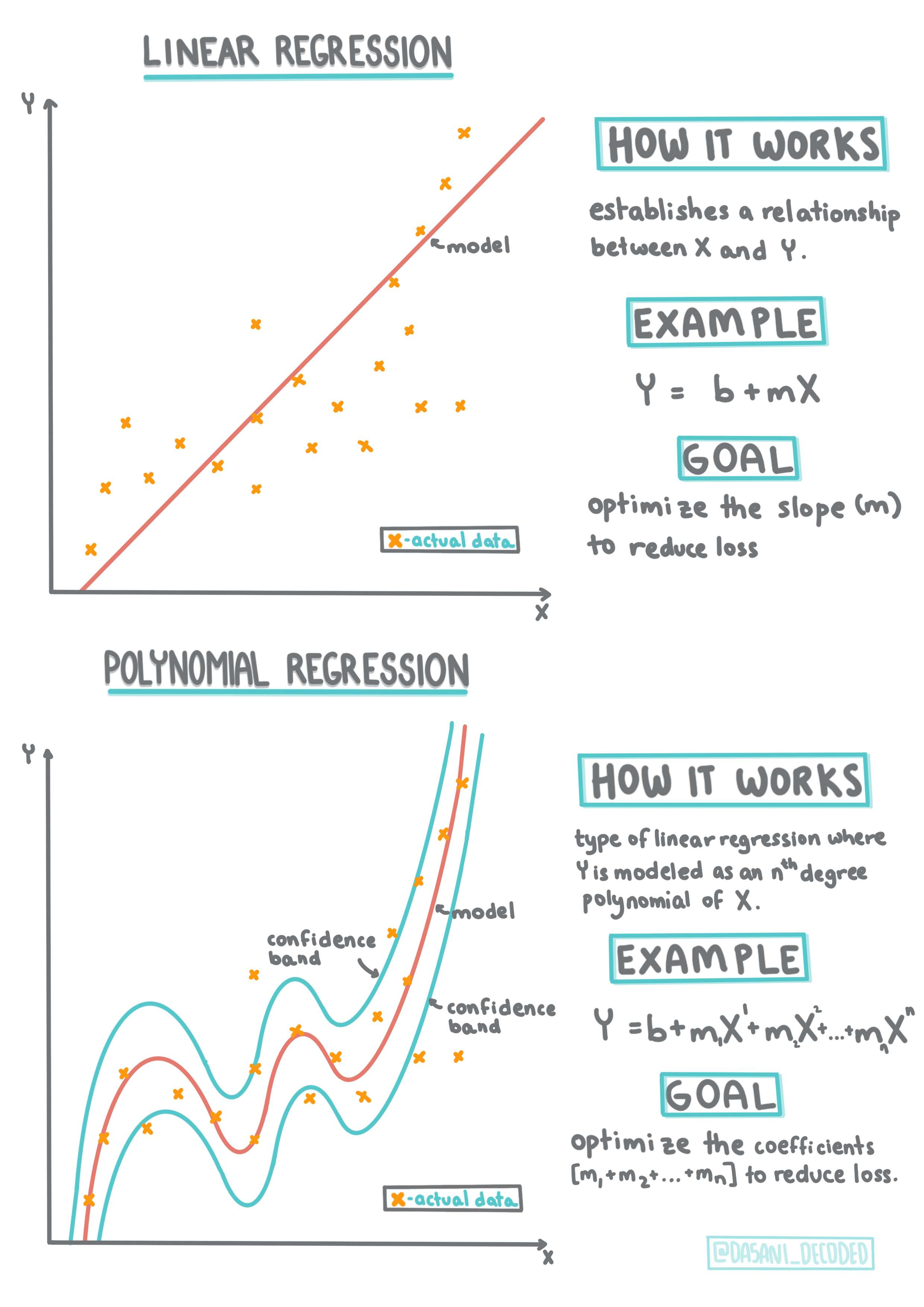
Infographic by Dasani Madipalli
Pre-lecture quiz
Introduction
So far you have explored what regression is with sample data gathered from the pumpkin pricing dataset that we will use throughout this unit. You have also visualized it using Matplotlib. Now you are ready to dive deeper into regression for ML. In this lesson, you will learn more about two types of regression: basic linear regression and polynomial regression, along with some of the math underlying these techniques.
Throughout this curriculum, we assume minimal knowledge of math, and seek to make it accessible for students coming from other fields, so watch for notes, callouts, diagrams, and other learning tools to aid in comprehension.
Prerequisite
You should be familiar by now with the structure of the pumpkin data that we are examining. You can find it preloaded and pre-cleaned in this lesson's notebook.ipynb files, with the pumpkin price displayed per bushel in a new dataframe. Make sure you can run these notebooks in kernels in VS Code.
Preparation
As a reminder, you are loading this data so as to ask questions of it. When is the best time to buy pumpkins? What price can I expect of a case of miniature pumpkins? Should I buy them in half-bushel baskets or by the 1 1/9 bushel box? Let's keep digging into this data.
In the previous lesson, you created a Pandas dataframe and populated it with part of the original dataset, standardizing the pricing by the bushel. By doing that, however, you were only able to gather about 400 datapoints and only for the fall months.
Take a look at the data that we preloaded in this lesson's accompanying notebook. The data is preloaded and an initial scatterplot is charted to show month data. Maybe we can get a little more detail about the nature of the data by cleaning it more.
A Linear Regression Line
As you learned in Lesson 1, the goal of a linear regression exercise is to be able to plot a line to show the relationship between variables and make accurate predictions on where a new datapoint would fall in relationship to that line.
🧮 Show me the math
This line has an equation:
Y = a + bX. It is typical of Least-Squares Regression to draw this type of line.
Xis the 'explanatory variable'.Yis the 'dependent variable'. The slope of the line isbandais the y-intercept, which refers to the value ofYwhenX = 0.In other words, and referring to our pumpkin data's original question: "predict the price of a pumpkin per bushel by month",
Xwould refer to the price andYwould refer to the month of sale. The math that calculates the line must demonstrate the slope of the line, which is also dependent on the intercept, or whereYis situated whenX = 0.You can observe the method of calculation for these values on the Math is Fun web site.
A common method of regression is Least-Squares Regression which means that all the datapoints surounding the regression line are squared and then added up. Ideally, that final sum is as small as possible, because we want a low number of errors, or
least-squares. We do so since we want to model a line that has the least cumulative distance from all of our data points. We also square the terms before adding them since we are concerned with its magnitude rather than its direction.One more term to understand is the Correlation Coefficient between given X and Y variables. For a scatterplot, you can quickly visualize this coefficient. A plot with datapoints scattered in a neat line have high correlation, but a plot with datapoints scattered everywhere between X and Y have a low correlation.
A good linear regression model will be one that has a high (nearer to 1 than 0) Correlation Coefficient using the Least-Squares Regression method with a line of regression.
✅ Run the notebook accompanying this lesson and look at the City to Price scatterplot. Does the data associating City to Price for pumpkin sales seem to have high or low correlation, according to your visual interpretation of the scatterplot?
Create a Linear Regression Model correlating Pumpkin Datapoints
Now that you have an understanding of the math behind this exercise, create a Regression model to see if you can predict which package of pumpkins will have the best pumpkin prices. Someone buying pumpkins for a holiday pumpkin patch might want this information to be able to optimize their purchases of pumpkin packages for the patch.
Since you'll use Scikit-Learn, there's no reason to do this by hand (although you could!). In the main data-processing block of your lesson notebook, add a library from Scikit-Learn to automatically convert all string data to numbers:
from sklearn.preprocessing import LabelEncoder

new_pumpkins.iloc[:, 0:-1] = new_pumpkins.iloc[:, 0:-1].apply(LabelEncoder().fit_transform)
new_pumpkins.iloc[:, 0:-1] = new_pumpkins.iloc[:, 0:-1].apply(LabelEncoder().fit_transform)
If you look at the new_pumpkins dataframe now, you see that all the strings are now numeric. This makes it harder for you to read but much more intelligible for Scikit-Learn!
Now you can make more educated decisions (not just based on eyeballing a scatterplot) about the data that is best suited to regression.
Try to find a good correlation between two points of your data to potentially build a good predictive model. As it turns out, there's only weak correlation between the City and Price:
print(new_pumpkins['City'].corr(new_pumpkins['Price']))
0.32363971816089226
However there's a bit better correlation between the Package and its Price. That makes sense, right? Normally, the bigger the produce box, the higher the price.
print(new_pumpkins['Package'].corr(new_pumpkins['Price']))
0.6061712937226021
A good question to ask of this data will be: 'What price can I expect of a given pumpkin package?'
Let's build this regression model
Building A Linear Model
Before building your model, do one more tidy-up of your data. Drop any null data and check once more what the data looks like.
new_pumpkins.dropna(inplace=True)
new_pumpkins.info()
Then, create a new dataframe from this minimal set and print it out:
new_columns = ['Package', 'Price']
lin_pumpkins = new_pumpkins.drop([c for c in new_pumpkins.columns if c not in new_columns], axis='columns')

lin_pumpkins
Now you can assign your X and y coordinate data:
X = lin_pumpkins.values[:, :1]
y = lin_pumpkins.values[:, 1:2]
What's going on here? You're using Python slice notation to create arrays to populate
Xandy.
Next, start the regression model-building routines:
from sklearn.linear_model import LinearRegression
from sklearn.metrics import r2_score, mean_squared_error, mean_absolute_error
from sklearn.model_selection import train_test_split


X_train, X_test, y_train, y_test = train_test_split(X, y, test_size=0.2, random_state=0)
lin_reg = LinearRegression()
lin_reg.fit(X_train,y_train)

pred = lin_reg.predict(X_test)

accuracy_score = lin_reg.score(X_train,y_train)
print('Model Accuracy: ', accuracy_score)
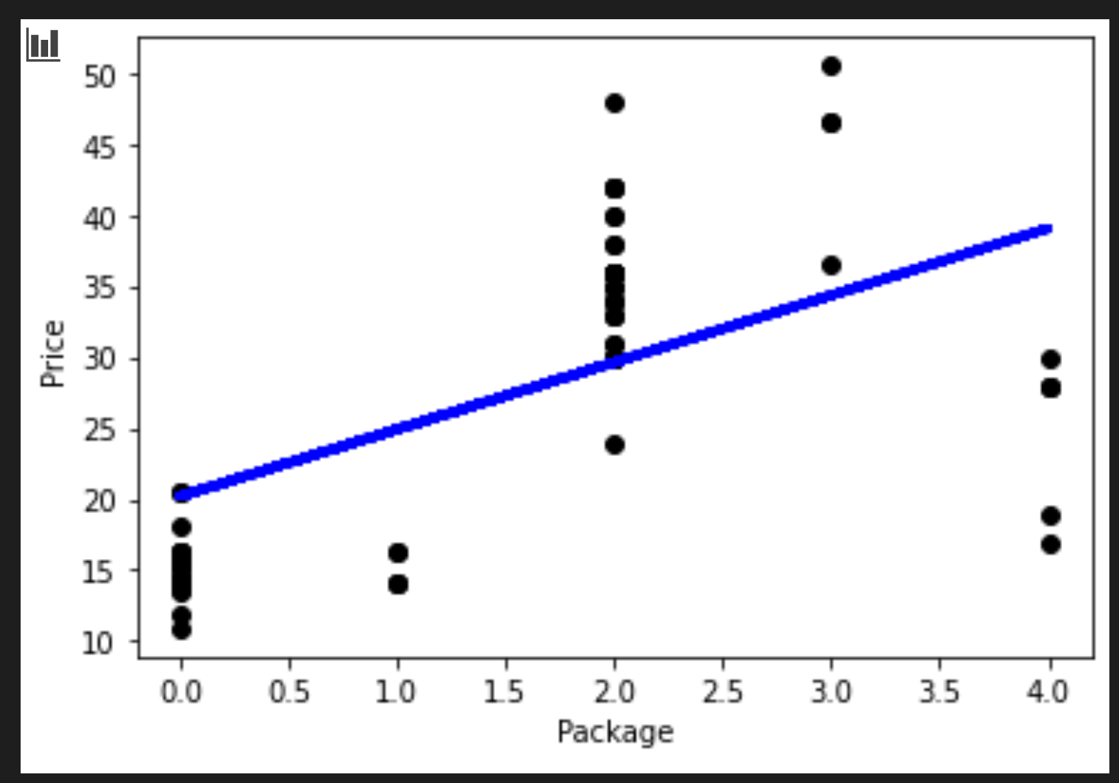
Because the correlation isn't particularly good, the model produced isn't terribly accurate.
Model Accuracy: 0.3315342327998987
You can visualize the line that's drawn in the process:
plt.scatter(X_test, y_test,  color='black')
plt.plot(X_test, pred, color='blue', linewidth=3)

plt.xlabel('Package')
plt.ylabel('Price')

plt.show()
And you can test the model against a hypothetical variety:
lin_reg.predict( np.array([ [2.75] ]) )
The returned price for this mythological Variety is:
array([[33.15655975]])
That number makes sense, if the logic of the regression line holds true.
Congratulations, you just created a model that can help predict the price of a few varieties of pumpkins. Your holiday pumpkin patch will be beautiful. But you can probably create a better model!
Polynomial Regression
Another type of Linear Regression is Polynomial Regression. While sometimes there's a linear relationship between variables - the bigger the pumpkin in volume, the higher the price - sometimes these relationships can't be plotted as a plane or straight line.
✅ Here are some more examples of data that could use Polynomial Regression
Take another look at the relationship between Variety to Price in the previous plot. Does this scatterplot seem like it should necessarily be analyzed by a straight line? Perhaps not. In this case, you can try Polynomial Regression.
✅ Polynomials are mathematical expressions that might consist of one or more variables and coefficients
Polynomial regression creates a curved line to better fit nonlinear data. Let's recreate a dataframe populated with a segment of the original pumpkin data:
new_columns = ['Variety', 'Package', 'City', 'Month', 'Price']
poly_pumpkins = new_pumpkins.drop([c for c in new_pumpkins.columns if c not in new_columns], axis='columns')

poly_pumpkins
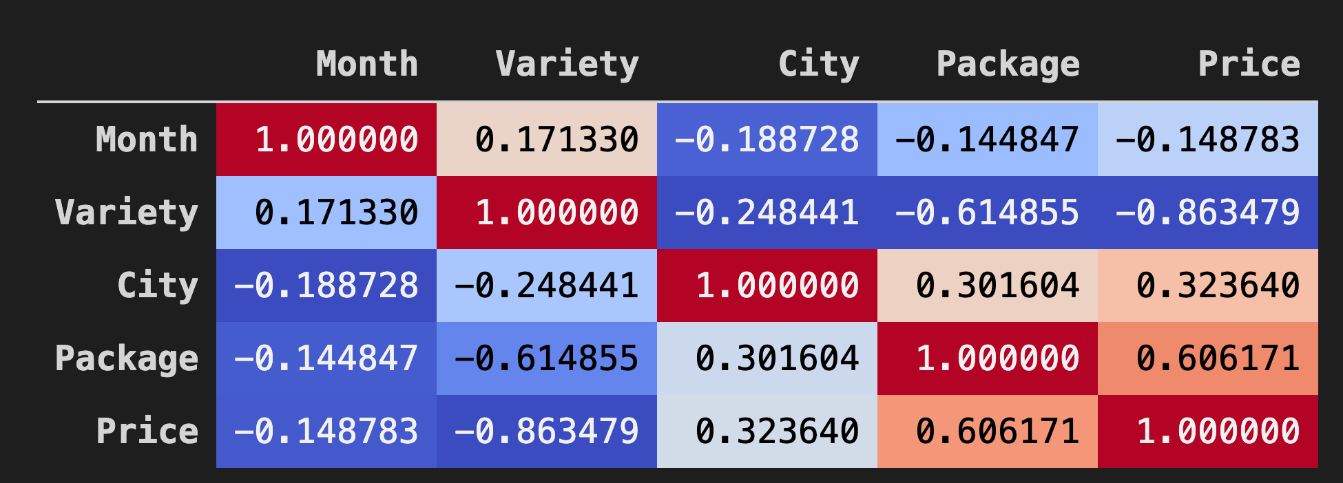
A good way to visualize the correlations between data in dataframes is to display it in a 'coolwarm' chart:
corr = poly_pumpkins.corr()
corr.style.background_gradient(cmap='coolwarm')
Looking at this chart, you can visualize the good correlation between Package and Price. So you should be able to create a somewhat better model than the last one.
Build out the X and y columns:
X=poly_pumpkins.iloc[:,3:4].values
y=poly_pumpkins.iloc[:,4:5].values
Scikit-Learn includes a helpful API for building polynomial regression models - the make_pipeline API. A 'pipeline' is created which is a chain of estimators. In this case, the pipeline includes Polynomial Features, or predictions that form a nonlinear path.
from sklearn.preprocessing import PolynomialFeatures
from sklearn.pipeline import make_pipeline

pipeline = make_pipeline(PolynomialFeatures(4), LinearRegression())

X_train, X_test, y_train, y_test = train_test_split(X, y, test_size=0.2, random_state=0)

pipeline.fit(np.array(X_train), y_train)

y_pred=pipeline.predict(X_test)
At this point, you need to create a new dataframe with sorted data so that the pipeline can create a sequence:
df = pd.DataFrame({'x': X_test[:,0], 'y': y_pred[:,0]})
df.sort_values(by='x',inplace = True)
points = pd.DataFrame(df).to_numpy()

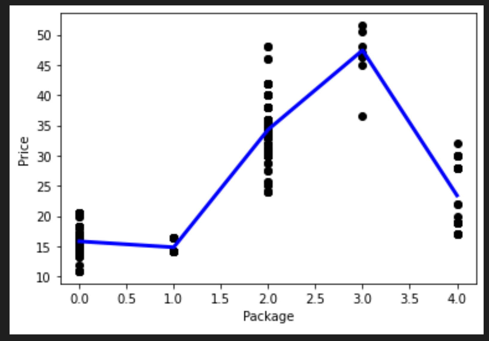
plt.plot(points[:, 0], points[:, 1],color="blue", linewidth=3)
plt.xlabel('Package')
plt.ylabel('Price')
plt.scatter(X,y, color="black")
plt.show()
You can see a curved line that fits your data better. Let's check the model's accuracy:
accuracy_score = pipeline.score(X_train,y_train)
print('Model Accuracy: ', accuracy_score)
And voila!
Model Accuracy: 0.8537946517073784
That's better! Try to predict a price:
pipeline.predict( np.array([ [2.75] ]) )
You are given this prediction:
array([[46.34509342]])
It does make sense! And, if this is a better model than the previous one, looking at the same data, you need to budget for these more expensive pumpkins!
🏆 Well done! You created two Regression models in one lesson. In the final section on Regression, you will learn about Logistic Regression to determine categories.
🚀Challenge
Test several different variables in this notebook to see how correlation corresponds to model accuracy.
Post-lecture quiz
Review & Self Study
In this lesson we learned about Linear Regression. There are other important types of Regression. Read about Stepwise, Ridge, Lasso and Elasticnet techniques. A good course to study to learn more is the Stanford Statistical Learning course
Assignment: Build a Model


