|
|
3 weeks ago | |
|---|---|---|
| .. | ||
| solution | 3 weeks ago | |
| README.md | 3 weeks ago | |
| assignment.md | 3 weeks ago | |
| notebook.ipynb | 3 weeks ago | |
README.md
Logistic regression to predict categories
Pre-lecture quiz
This lesson is available in R!
Introduction
In this final lesson on Regression, one of the foundational classic ML techniques, we will explore Logistic Regression. This technique is used to identify patterns for predicting binary categories. For example: Is this candy chocolate or not? Is this disease contagious or not? Will this customer choose this product or not?
In this lesson, you will learn:
- A new library for data visualization
- Techniques for logistic regression
✅ Deepen your understanding of this type of regression in this Learn module
Prerequisite
Having worked with the pumpkin data, we now know that there is one binary category we can focus on: Color.
Let's build a logistic regression model to predict, based on certain variables, what color a given pumpkin is likely to be (orange 🎃 or white 👻).
Why are we discussing binary classification in a lesson about regression? For simplicity, as logistic regression is technically a classification method, though it is linear-based. You’ll learn about other classification methods in the next lesson group.
Define the question
For our purposes, we will frame this as a binary question: 'White' or 'Not White'. While our dataset includes a 'striped' category, there are very few instances of it, so we will exclude it. It also disappears when we remove null values from the dataset.
🎃 Fun fact: White pumpkins are sometimes called 'ghost' pumpkins. They’re not as easy to carve as orange ones, so they’re less popular, but they look pretty cool! We could also reframe our question as: 'Ghost' or 'Not Ghost'. 👻
About logistic regression
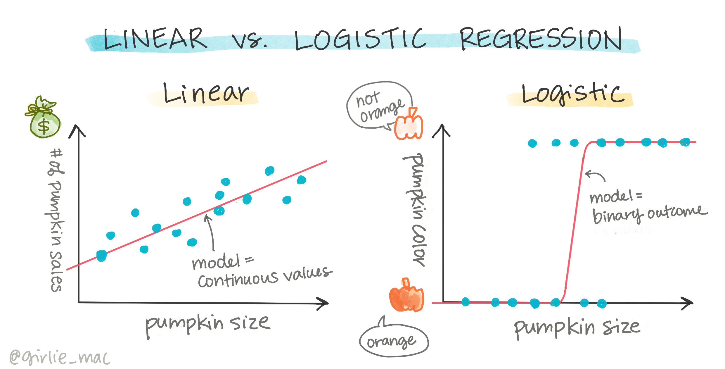
Logistic regression differs from linear regression, which you learned about earlier, in several key ways.

🎥 Click the image above for a short video overview of logistic regression.
Binary classification
Logistic regression doesn’t provide the same capabilities as linear regression. The former predicts binary categories ("white or not white"), while the latter predicts continuous values, such as estimating how much the price of a pumpkin will increase based on its origin and harvest time.
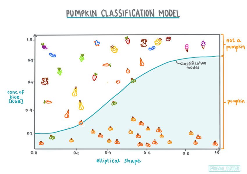
Infographic by Dasani Madipalli
Other classifications
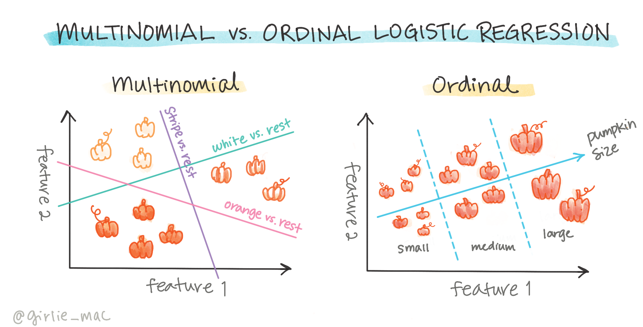
There are other types of logistic regression, such as multinomial and ordinal:
- Multinomial, which involves more than two categories, e.g., "Orange, White, and Striped."
- Ordinal, which involves ordered categories, useful for logically ranked outcomes, like pumpkin sizes (mini, small, medium, large, extra-large, extra-extra-large).
Variables DO NOT have to correlate
Unlike linear regression, which works better with highly correlated variables, logistic regression does not require variables to align. This makes it suitable for our dataset, which has relatively weak correlations.
You need a lot of clean data
Logistic regression performs better with larger datasets. Our small dataset is not ideal for this task, so keep that in mind.
🎥 Click the image above for a short video overview of preparing data for logistic regression.
✅ Consider what types of data are well-suited for logistic regression.
Exercise - tidy the data
First, clean the data by removing null values and selecting specific columns:
-
Add the following code:
columns_to_select = ['City Name','Package','Variety', 'Origin','Item Size', 'Color']
pumpkins = full_pumpkins.loc[:, columns_to_select]

pumpkins.dropna(inplace=True)
You can always preview your new dataframe:
pumpkins.info
Visualization - categorical plot
By now, you’ve loaded the starter notebook with pumpkin data and cleaned it to retain a dataset with a few variables, including Color. Let’s visualize the dataframe in the notebook using a new library: Seaborn, which is built on Matplotlib (used earlier).
Seaborn provides interesting ways to visualize data. For example, you can compare distributions of Variety and Color using a categorical plot.
-
Create a categorical plot using the
catplotfunction, specifying a color mapping for each pumpkin category (orange or white):import seaborn as sns palette = { 'ORANGE': 'orange', 'WHITE': 'wheat', } sns.catplot( data=pumpkins, y="Variety", hue="Color", kind="count", palette=palette, )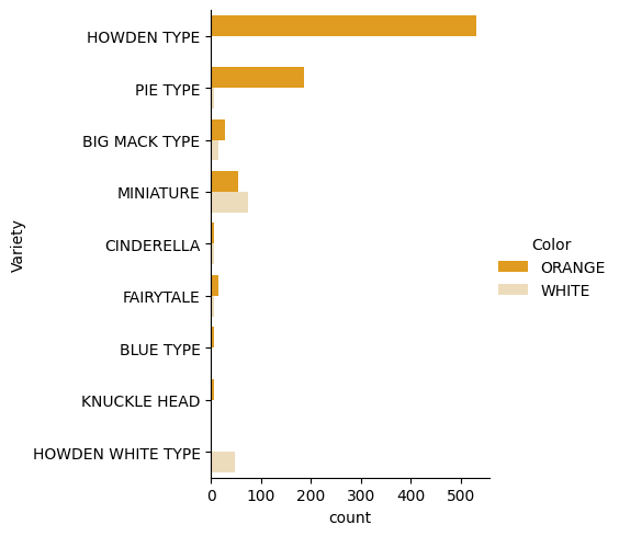
By observing the data, you can see how
Colorrelates toVariety.✅ Based on this categorical plot, what interesting patterns or questions come to mind?
Data pre-processing: feature and label encoding
The pumpkins dataset contains string values in all columns. While categorical data is intuitive for humans, machines work better with numerical data. Encoding is a crucial step in pre-processing, as it converts categorical data into numerical data without losing information. Good encoding leads to better models.
For feature encoding, there are two main types:
-
Ordinal encoder: Suitable for ordinal variables, which have a logical order (e.g.,
Item Size). It maps each category to a number based on its order.from sklearn.preprocessing import OrdinalEncoder item_size_categories = [['sml', 'med', 'med-lge', 'lge', 'xlge', 'jbo', 'exjbo']] ordinal_features = ['Item Size'] ordinal_encoder = OrdinalEncoder(categories=item_size_categories) -
Categorical encoder: Suitable for nominal variables, which lack a logical order (e.g., all features except
Item Size). This uses one-hot encoding, where each category is represented by a binary column.from sklearn.preprocessing import OneHotEncoder categorical_features = ['City Name', 'Package', 'Variety', 'Origin'] categorical_encoder = OneHotEncoder(sparse_output=False)
Then, ColumnTransformer combines multiple encoders into a single step and applies them to the appropriate columns.
    from sklearn.compose import ColumnTransformer

    ct = ColumnTransformer(transformers=[
        ('ord', ordinal_encoder, ordinal_features),
        ('cat', categorical_encoder, categorical_features)
        ])

    ct.set_output(transform='pandas')
    encoded_features = ct.fit_transform(pumpkins)
For label encoding, we use Scikit-learn’s LabelEncoder class to normalize labels to values between 0 and n_classes-1 (here, 0 and 1).
    from sklearn.preprocessing import LabelEncoder

    label_encoder = LabelEncoder()
    encoded_label = label_encoder.fit_transform(pumpkins['Color'])
After encoding the features and label, merge them into a new dataframe encoded_pumpkins.
encoded_pumpkins = encoded_features.assign(Color=encoded_label)
✅ What are the benefits of using an ordinal encoder for the Item Size column?
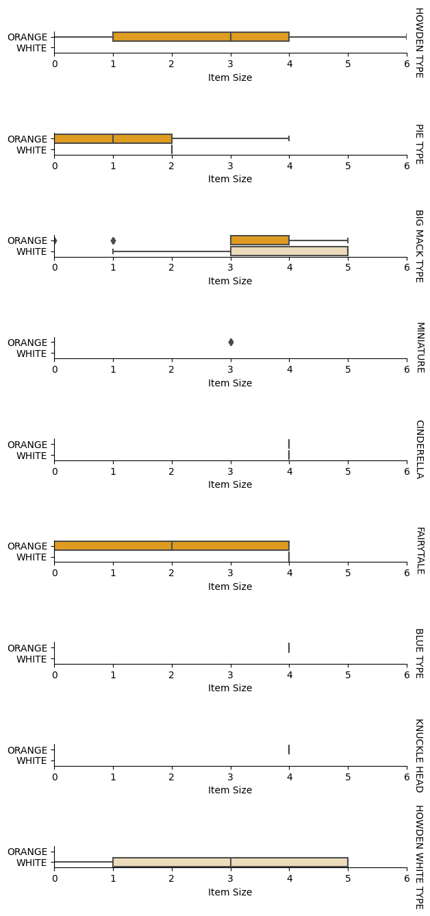
Analyze relationships between variables
With pre-processed data, analyze relationships between features and the label to assess how well the model might predict the label. Visualization is the best way to do this. Use Seaborn’s catplot to explore relationships between Item Size, Variety, and Color. Use the encoded Item Size column and the unencoded Variety column for better visualization.
    palette = {
    'ORANGE': 'orange',
    'WHITE': 'wheat',
    }
    pumpkins['Item Size'] = encoded_pumpkins['ord__Item Size']

    g = sns.catplot(
        data=pumpkins,
        x="Item Size", y="Color", row='Variety',
        kind="box", orient="h",
        sharex=False, margin_titles=True,
        height=1.8, aspect=4, palette=palette,
    )
    g.set(xlabel="Item Size", ylabel="").set(xlim=(0,6))
    g.set_titles(row_template="{row_name}")
Use a swarm plot
Since Color is a binary category (White or Not), it requires a specialized approach for visualization. Seaborn offers various ways to visualize relationships between variables.
-
Try a 'swarm' plot to show the distribution of values:
palette = {
0: 'orange',
1: 'wheat'
}
sns.swarmplot(x="Color", y="ord__Item Size", data=encoded_pumpkins, palette=palette)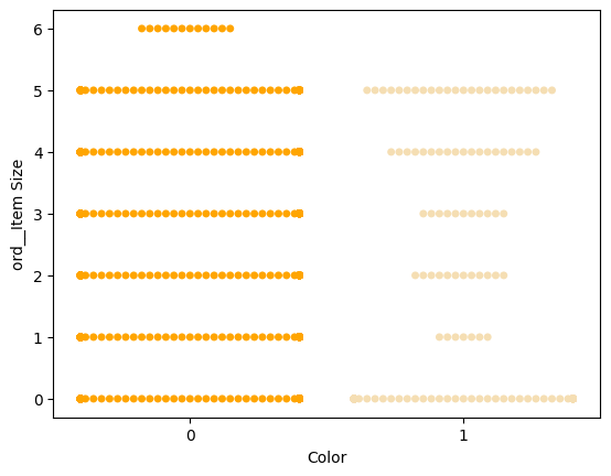
Note: The code above may generate a warning because Seaborn struggles to represent a large number of data points in a swarm plot. You can reduce marker size using the 'size' parameter, but this may affect readability.
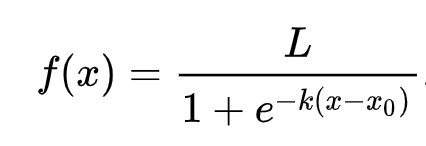
🧮 Show Me The Math
Logistic regression relies on 'maximum likelihood' using sigmoid functions. A sigmoid function maps values to a range between 0 and 1, forming an 'S'-shaped curve (logistic curve). Its formula is:
The midpoint of the sigmoid is at x=0, L is the curve’s maximum value, and k determines steepness. If the function’s output exceeds 0.5, the label is classified as '1'; otherwise, it’s classified as '0'.
Build your model
Building a binary classification model is straightforward with Scikit-learn.
🎥 Click the image above for a short video overview of building a logistic regression model.
-
Select the variables for your classification model and split the data into training and test sets using
train_test_split():from sklearn.model_selection import train_test_split X = encoded_pumpkins[encoded_pumpkins.columns.difference(['Color'])] y = encoded_pumpkins['Color'] X_train, X_test, y_train, y_test = train_test_split(X, y, test_size=0.2, random_state=0) -
Train your model using
fit()with the training data, and print the results:from sklearn.metrics import f1_score, classification_report from sklearn.linear_model import LogisticRegression model = LogisticRegression() model.fit(X_train, y_train) predictions = model.predict(X_test) print(classification_report(y_test, predictions)) print('Predicted labels: ', predictions) print('F1-score: ', f1_score(y_test, predictions))Check your model’s performance. It’s not bad, considering the dataset has only about 1,000 rows:
                   precision    recall  f1-score   support

                0       0.94      0.98      0.96       166
                1       0.85      0.67      0.75        33

    accuracy                                0.92       199
    macro avg           0.89      0.82      0.85       199
    weighted avg        0.92      0.92      0.92       199

    Predicted labels:  [0 0 0 0 0 0 0 0 0 0 0 0 0 0 0 0 0 0 0 0 1 0 0 1 0 0 0 0 0 0 0 0 1 0 0 0 0
    0 0 0 0 0 1 0 1 0 0 1 0 0 0 0 0 1 0 1 0 1 0 1 0 0 0 0 0 0 0 0 0 0 0 0 0 0
    1 0 0 0 0 0 0 0 1 0 0 0 0 0 0 0 1 0 0 0 0 0 0 0 0 1 0 1 0 0 0 0 0 0 0 1 0
    0 0 0 0 0 0 0 0 0 0 0 0 0 0 0 0 0 0 0 0 0 1 0 0 0 0 0 0 0 0 1 0 0 0 1 1 0
    0 0 0 0 1 0 0 0 0 0 1 0 0 0 0 0 0 0 0 0 0 0 0 0 0 0 0 0 0 0 0 0 0 0 0 0 1
    0 0 0 1 0 0 0 0 0 0 0 0 1 1]
    F1-score:  0.7457627118644068
Better comprehension via a confusion matrix
While you can evaluate your model using classification report terms, a confusion matrix can provide a clearer picture of its performance.
🎓 A 'confusion matrix' (or 'error matrix') is a table that compares true vs. false positives and negatives, helping gauge prediction accuracy.
-
Use
confusion_matrix()to generate the matrix:from sklearn.metrics import confusion_matrix confusion_matrix(y_test, predictions)View your model’s confusion matrix:
array([[162,   4],
       [ 11,  22]])
In Scikit-learn, confusion matrix rows (axis 0) represent actual labels, while columns (axis 1) represent predicted labels.
| 0 | 1 | |
|---|---|---|
| 0 | TN | FP |
| 1 | FN | TP |
Here’s what the matrix means:
- True Negative (TN): The model predicts 'not white,' and the pumpkin is actually 'not white.'
- False Negative (FN): The model predicts 'not white,' but the pumpkin is actually 'white.'
- False Positive (FP): The model predicts 'white,' but the pumpkin is actually 'not white.'
- True Positive (TP): The model predicts 'white,' and the pumpkin is actually 'white.'
Ideally, you want more true positives and true negatives, and fewer false positives and false negatives, indicating better model performance. How does the confusion matrix relate to precision and recall? Remember, the classification report printed above showed precision (0.85) and recall (0.67).
Precision = tp / (tp + fp) = 22 / (22 + 4) = 0.8461538461538461
Recall = tp / (tp + fn) = 22 / (22 + 11) = 0.6666666666666666
✅ Q: According to the confusion matrix, how did the model do?
A: Not bad; there are a good number of true negatives but also a few false negatives.
Let's revisit the terms we saw earlier with the help of the confusion matrix's mapping of TP/TN and FP/FN:
🎓 Precision: TP/(TP + FP)
The fraction of relevant instances among the retrieved instances (e.g., which labels were well-labeled).
🎓 Recall: TP/(TP + FN)
The fraction of relevant instances that were retrieved, whether well-labeled or not.
🎓 f1-score: (2 * precision * recall)/(precision + recall)
A weighted average of the precision and recall, with the best being 1 and the worst being 0.
🎓 Support:
The number of occurrences of each label retrieved.
🎓 Accuracy: (TP + TN)/(TP + TN + FP + FN)
The percentage of labels predicted accurately for a sample.
🎓 Macro Avg:
The calculation of the unweighted mean metrics for each label, not taking label imbalance into account.
🎓 Weighted Avg:
The calculation of the mean metrics for each label, taking label imbalance into account by weighting them by their support (the number of true instances for each label).
✅ Can you think which metric you should watch if you want your model to reduce the number of false negatives?
Visualize the ROC curve of this model

🎥 Click the image above for a short video overview of ROC curves
Let's do one more visualization to see the so-called 'ROC' curve:
from sklearn.metrics import roc_curve, roc_auc_score
import matplotlib
import matplotlib.pyplot as plt
%matplotlib inline

y_scores = model.predict_proba(X_test)
fpr, tpr, thresholds = roc_curve(y_test, y_scores[:,1])

fig = plt.figure(figsize=(6, 6))
plt.plot([0, 1], [0, 1], 'k--')
plt.plot(fpr, tpr)
plt.xlabel('False Positive Rate')
plt.ylabel('True Positive Rate')
plt.title('ROC Curve')
plt.show()
Using Matplotlib, plot the model's Receiving Operating Characteristic or ROC. ROC curves are often used to get a view of the output of a classifier in terms of its true vs. false positives. "ROC curves typically feature true positive rate on the Y axis, and false positive rate on the X axis." Thus, the steepness of the curve and the space between the midpoint line and the curve matter: you want a curve that quickly heads up and over the line. In our case, there are false positives to start with, and then the line heads up and over properly:
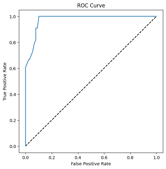
Finally, use Scikit-learn's roc_auc_score API to compute the actual 'Area Under the Curve' (AUC):
auc = roc_auc_score(y_test,y_scores[:,1])
print(auc)
The result is 0.9749908725812341. Given that the AUC ranges from 0 to 1, you want a big score, since a model that is 100% correct in its predictions will have an AUC of 1; in this case, the model is pretty good.
In future lessons on classifications, you will learn how to iterate to improve your model's scores. But for now, congratulations! You've completed these regression lessons!
🚀Challenge
There's a lot more to unpack regarding logistic regression! But the best way to learn is to experiment. Find a dataset that lends itself to this type of analysis and build a model with it. What do you learn? tip: try Kaggle for interesting datasets.
Post-lecture quiz
Review & Self Study
Read the first few pages of this paper from Stanford on some practical uses for logistic regression. Think about tasks that are better suited for one or the other type of regression tasks that we have studied up to this point. What would work best?
Assignment
Disclaimer:
This document has been translated using the AI translation service Co-op Translator. While we strive for accuracy, please note that automated translations may contain errors or inaccuracies. The original document in its native language should be regarded as the authoritative source. For critical information, professional human translation is recommended. We are not responsible for any misunderstandings or misinterpretations resulting from the use of this translation.