|
|
3 weeks ago | |
|---|---|---|
| .. | ||
| solution | 3 weeks ago | |
| README.md | 3 weeks ago | |
| assignment.md | 3 weeks ago | |
| notebook.ipynb | 3 weeks ago | |
README.md
Build a regression model using Scikit-learn: prepare and visualize data
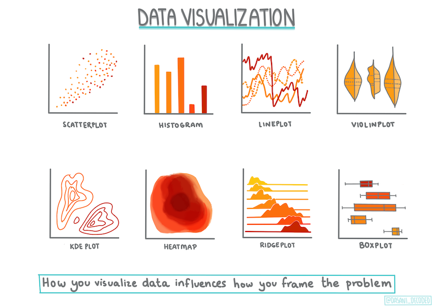
Infographic by Dasani Madipalli
Pre-lecture quiz
This lesson is available in R!
Introduction
Now that you have the tools needed to start building machine learning models with Scikit-learn, you're ready to begin asking questions of your data. When working with data and applying ML solutions, it's crucial to know how to ask the right questions to unlock the full potential of your dataset.
In this lesson, you will learn:
- How to prepare your data for model building.
- How to use Matplotlib for data visualization.
Asking the right question of your data
The type of question you want answered will determine the ML algorithms you use. The quality of the answer you get will largely depend on the nature of your data.
Take a look at the data provided for this lesson. You can open this .csv file in VS Code. A quick glance reveals blanks, a mix of strings and numeric data, and a peculiar column called 'Package' with values like 'sacks', 'bins', and others. The data is, frankly, a bit messy.
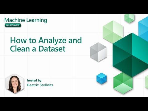
🎥 Click the image above for a short video on preparing the data for this lesson.
It's rare to receive a dataset that's completely ready for building a machine learning model. In this lesson, you'll learn how to prepare a raw dataset using standard Python libraries. You'll also explore techniques for visualizing the data.
Case study: 'the pumpkin market'
In this folder, you'll find a .csv file in the root data folder called US-pumpkins.csv, which contains 1757 rows of data about the pumpkin market, grouped by city. This raw data was extracted from the Specialty Crops Terminal Markets Standard Reports provided by the United States Department of Agriculture.
Preparing data
This data is in the public domain and can be downloaded in separate files for each city from the USDA website. To simplify things, we've combined all the city data into one spreadsheet, so the data has already been partially prepared. Next, let's examine the data more closely.
The pumpkin data - early conclusions
What do you notice about this data? As mentioned earlier, there's a mix of strings, numbers, blanks, and odd values that need to be understood.
What question can you ask of this data using a regression technique? For example: "Predict the price of a pumpkin for sale during a given month." Looking at the data again, you'll need to make some adjustments to structure it properly for this task.
Exercise - analyze the pumpkin data
Let's use Pandas (short for Python Data Analysis), a powerful tool for shaping data, to analyze and prepare the pumpkin data.
First, check for missing dates
Start by checking for missing dates:
- Convert the dates to a month format (these are US dates, so the format is
MM/DD/YYYY). - Extract the month into a new column.
Open the notebook.ipynb file in Visual Studio Code and import the spreadsheet into a new Pandas dataframe.
-
Use the
head()function to view the first five rows.import pandas as pd pumpkins = pd.read_csv('../data/US-pumpkins.csv') pumpkins.head()✅ What function would you use to view the last five rows?
-
Check for missing data in the current dataframe:
pumpkins.isnull().sum()There is missing data, but it might not affect the task at hand.
-
To simplify your dataframe, select only the columns you need using the
locfunction. This function extracts rows (first parameter) and columns (second parameter) from the original dataframe. The:expression below means "all rows."columns_to_select = ['Package', 'Low Price', 'High Price', 'Date'] pumpkins = pumpkins.loc[:, columns_to_select]
Second, determine average price of pumpkin
Think about how to calculate the average price of a pumpkin in a given month. Which columns would you use for this task? Hint: you'll need three columns.
Solution: Take the average of the Low Price and High Price columns to populate a new Price column, and convert the Date column to show only the month. Fortunately, based on the earlier check, there is no missing data for dates or prices.
-
To calculate the average, add the following code:
price = (pumpkins['Low Price'] + pumpkins['High Price']) / 2

month = pd.DatetimeIndex(pumpkins['Date']).month
✅ Feel free to print any data you'd like to check using
print(month). -
Copy your converted data into a new Pandas dataframe:
new_pumpkins = pd.DataFrame({'Month': month, 'Package': pumpkins['Package'], 'Low Price': pumpkins['Low Price'],'High Price': pumpkins['High Price'], 'Price': price})Printing your dataframe will show a clean, organized dataset ready for building your regression model.
But wait! There's something odd here
Looking at the Package column, pumpkins are sold in various configurations. Some are sold in '1 1/9 bushel' measures, others in '1/2 bushel' measures, some per pumpkin, some per pound, and some in large boxes of varying sizes.
Pumpkins seem very hard to weigh consistently
Examining the original data, anything with Unit of Sale equal to 'EACH' or 'PER BIN' also has the Package type listed as per inch, per bin, or 'each'. Pumpkins are difficult to weigh consistently, so let's filter the data to include only pumpkins with the string 'bushel' in their Package column.
-
Add a filter at the top of the file, under the initial .csv import:
pumpkins = pumpkins[pumpkins['Package'].str.contains('bushel', case=True, regex=True)]If you print the data now, you'll see only the 415 rows containing pumpkins sold by the bushel.
But wait! There's one more thing to do
Did you notice that the bushel amount varies per row? You'll need to normalize the pricing to show the price per bushel. Perform some calculations to standardize it.
-
Add these lines after the block creating the new_pumpkins dataframe:
new_pumpkins.loc[new_pumpkins['Package'].str.contains('1 1/9'), 'Price'] = price/(1 + 1/9)

new_pumpkins.loc[new_pumpkins['Package'].str.contains('1/2'), 'Price'] = price/(1/2)
✅ According to The Spruce Eats, a bushel's weight depends on the type of produce, as it's a volume measurement. "A bushel of tomatoes, for example, is supposed to weigh 56 pounds... Leaves and greens take up more space with less weight, so a bushel of spinach is only 20 pounds." It's all quite complex! For simplicity, let's price by the bushel without converting to pounds. This study of bushels highlights the importance of understanding your data!
Now, you can analyze pricing per unit based on bushel measurements. If you print the data again, you'll see it's standardized.
✅ Did you notice that pumpkins sold by the half-bushel are very expensive? Can you figure out why? Hint: Smaller pumpkins are pricier than larger ones, likely because more of them fit into a bushel, leaving less unused space compared to one large hollow pumpkin.
Visualization Strategies
A data scientist's role often involves demonstrating the quality and characteristics of the data they're working with. This is done by creating visualizations—plots, graphs, and charts—that reveal relationships and gaps that might otherwise be hard to identify.
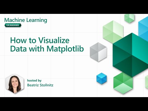
🎥 Click the image above for a short video on visualizing the data for this lesson.
Visualizations can also help determine the most suitable machine learning technique for the data. For example, a scatterplot that follows a line suggests the data is a good candidate for linear regression.
One data visualization library that works well in Jupyter notebooks is Matplotlib (introduced in the previous lesson).
Gain more experience with data visualization in these tutorials.
Exercise - experiment with Matplotlib
Try creating some basic plots to display the new dataframe you just created. What insights can a simple line plot provide?
-
Import Matplotlib at the top of the file, under the Pandas import:
import matplotlib.pyplot as plt -
Rerun the entire notebook to refresh.
-
At the bottom of the notebook, add a cell to plot the data as a box:
price = new_pumpkins.Price
month = new_pumpkins.Month
plt.scatter(price, month)
plt.show()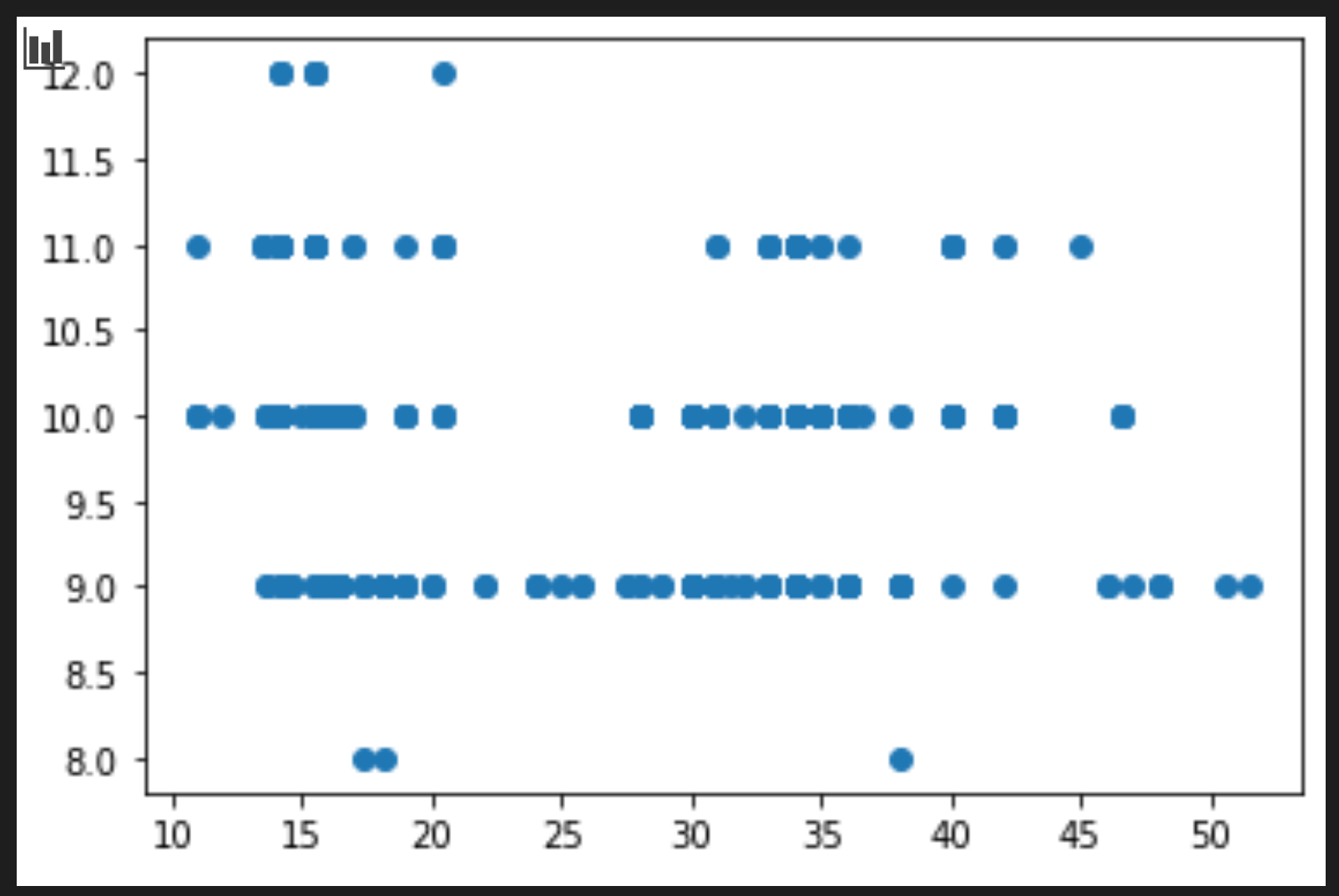
Is this plot useful? Does anything about it surprise you?
It's not particularly useful, as it simply displays the data as a spread of points for each month.
Make it useful
To create more meaningful charts, you often need to group the data. Let's try creating a plot where the y-axis shows the months and the data demonstrates the distribution.
-
Add a cell to create a grouped bar chart:
new_pumpkins.groupby(['Month'])['Price'].mean().plot(kind='bar')
plt.ylabel("Pumpkin Price")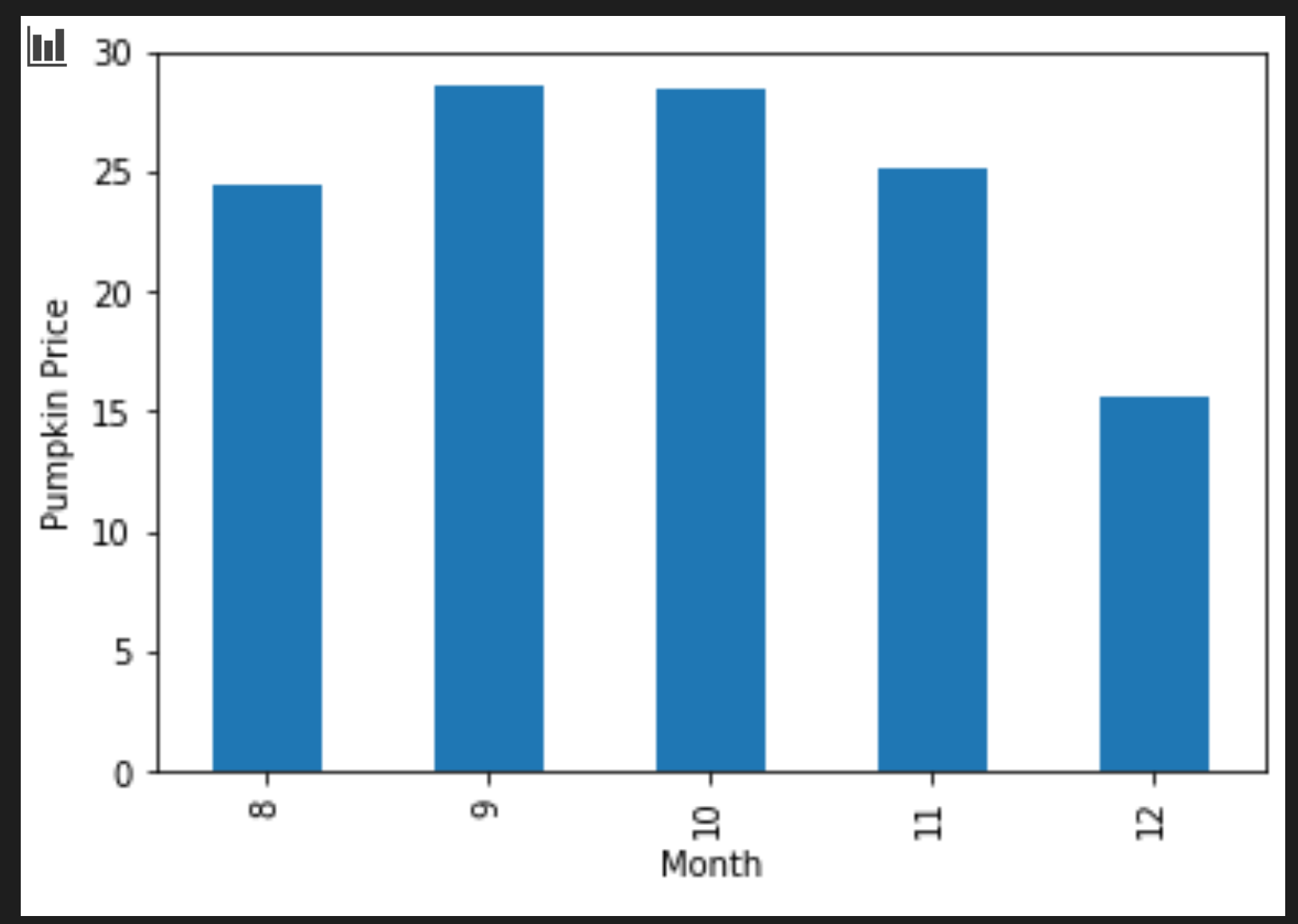
This visualization is more useful! It suggests that pumpkin prices peak in September and October. Does this match your expectations? Why or why not?
🚀Challenge
Explore the different types of visualizations offered by Matplotlib. Which types are most suitable for regression problems?
Post-lecture quiz
Review & Self Study
Investigate the various ways to visualize data. Make a list of available libraries and note which are best for specific tasks, such as 2D vs. 3D visualizations. What do you discover?
Assignment
Disclaimer:
This document has been translated using the AI translation service Co-op Translator. While we strive for accuracy, please note that automated translations may contain errors or inaccuracies. The original document in its native language should be regarded as the authoritative source. For critical information, professional human translation is recommended. We are not responsible for any misunderstandings or misinterpretations resulting from the use of this translation.