
 copilot-swe-agent[bot]
83e22ba951
copilot-swe-agent[bot]
83e22ba951
|
3 months ago | |
|---|---|---|
| .. | ||
| images | 3 months ago | |
| solution | 3 months ago | |
| README.md | 3 months ago | |
| assignment.md | 5 years ago | |
| notebook.ipynb | 5 years ago | |
README.md
Build a regression model using Scikit-learn: prepare and visualize data
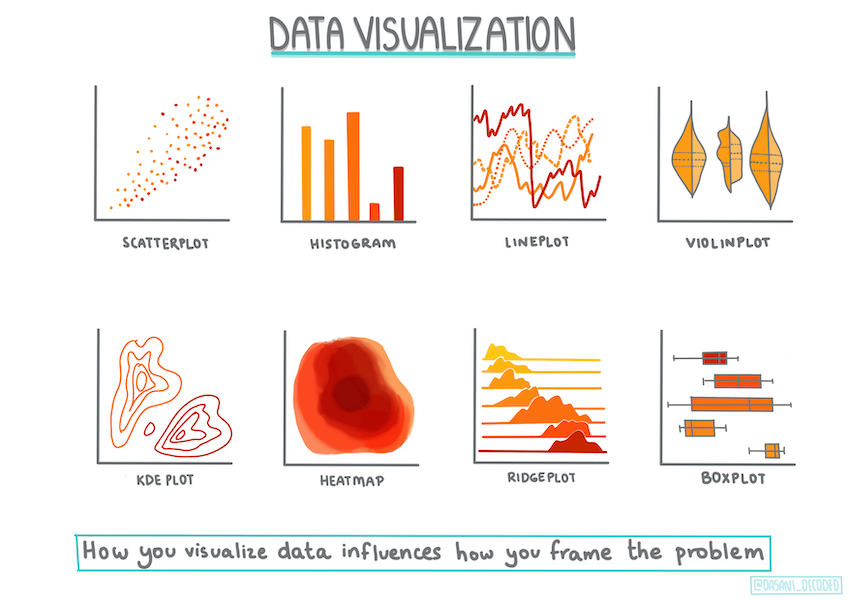
Infographic by Dasani Madipalli
Pre-lecture quiz
This lesson is available in R!
Introduction
Now that you are set up with the tools you need to start tackling machine learning model building with Scikit-learn, you are ready to start asking questions of your data. As you work with data and apply ML solutions, it's very important to understand how to ask the right question to properly unlock the potentials of your dataset.
In this lesson, you will learn:
- How to prepare your data for model-building.
- How to use Matplotlib for data visualization.
- How to use Seaborn for more expressive data visualization.
Asking the right question of your data
The question you need answered will determine what type of ML algorithms you will leverage. And the quality of the answer you get back will be heavily dependent on the nature of your data.
Take a look at the data provided for this lesson. You can open this .csv file in VS Code. A quick skim immediately shows that there are blanks and a mix of strings and numeric data. There's also a strange column called 'Package' where the data is a mix between 'sacks', 'bins' and other values. The data, in fact, is a bit of a mess.
🎥 Click the image above for a short video working through preparing the data for this lesson.
In fact, it is not very common to be gifted a dataset that is completely ready to use to create a ML model out of the box. In this lesson, you will learn how to prepare a raw dataset using standard Python libraries. You will also learn various techniques to visualize the data.
Case study: 'the pumpkin market'
In this folder you will find a .csv file in the root data folder called US-pumpkins.csv which includes 1757 lines of data about the market for pumpkins, sorted into groupings by city. This is raw data extracted from the Specialty Crops Terminal Markets Standard Reports distributed by the United States Department of Agriculture.
Preparing data
This data is in the public domain. It can be downloaded in many separate files, per city, from the USDA web site. To avoid too many separate files, we have concatenated all the city data into one spreadsheet, thus we have already prepared the data a bit. Next, let's take a closer look at the data.
The pumpkin data - early conclusions
What do you notice about this data? You already saw that there is a mix of strings, numbers, blanks and strange values that you need to make sense of.
What question can you ask of this data, using a Regression technique? What about "Predict the price of a pumpkin for sale during a given month". Looking again at the data, there are some changes you need to make to create the data structure necessary for the task.
Exercise - analyze the pumpkin data
Let's use Pandas, (the name stands for Python Data Analysis) a tool very useful for shaping data, to analyze and prepare this pumpkin data.
First, check for missing dates
You will first need to take steps to check for missing dates:
- Convert the dates to a month format (these are US dates, so the format is
MM/DD/YYYY). - Extract the month to a new column.
Open the notebook.ipynb file in Visual Studio Code and import the spreadsheet in to a new Pandas dataframe.
-
Use the
head()function to view the first five rows.import pandas as pd pumpkins = pd.read_csv('../data/US-pumpkins.csv') pumpkins.head()✅ What function would you use to view the last five rows?
-
Check if there is missing data in the current dataframe:
pumpkins.isnull().sum()There is missing data, but maybe it won't matter for the task at hand.
-
To make your dataframe easier to work with, select only the columns you need, using the
locfunction which extracts from the original dataframe a group of rows (passed as first parameter) and columns (passed as second parameter). The expression:in the case below means "all rows".columns_to_select = ['Package', 'Low Price', 'High Price', 'Date'] pumpkins = pumpkins.loc[:, columns_to_select]
Second, determine average price of pumpkin
Think about how to determine the average price of a pumpkin in a given month. What columns would you pick for this task? Hint: you'll need 3 columns.
Solution: take the average of the Low Price and High Price columns to populate the new Price column, and convert the Date column to only show the month. Fortunately, according to the check above, there is no missing data for dates or prices.
-
To calculate the average, add the following code:
price = (pumpkins['Low Price'] + pumpkins['High Price']) / 2

month = pd.DatetimeIndex(pumpkins['Date']).month
✅ Feel free to print any data you'd like to check using
print(month). -
Now, copy your converted data into a fresh Pandas dataframe:
new_pumpkins = pd.DataFrame({'Month': month, 'Package': pumpkins['Package'], 'Low Price': pumpkins['Low Price'],'High Price': pumpkins['High Price'], 'Price': price})Printing out your dataframe will show you a clean, tidy dataset on which you can build your new regression model.
But wait! There's something odd here
If you look at the Package column, pumpkins are sold in many different configurations. Some are sold in '1 1/9 bushel' measures, and some in '1/2 bushel' measures, some per pumpkin, some per pound, and some in big boxes with varying widths.
Pumpkins seem very hard to weigh consistently
Digging into the original data, it's interesting that anything with Unit of Sale equalling 'EACH' or 'PER BIN' also have the Package type per inch, per bin, or 'each'. Pumpkins seem to be very hard to weigh consistently, so let's filter them by selecting only pumpkins with the string 'bushel' in their Package column.
-
Add a filter at the top of the file, under the initial .csv import:
pumpkins = pumpkins[pumpkins['Package'].str.contains('bushel', case=True, regex=True)]If you print the data now, you can see that you are only getting the 415 or so rows of data containing pumpkins by the bushel.
But wait! There's one more thing to do
Did you notice that the bushel amount varies per row? You need to normalize the pricing so that you show the pricing per bushel, so do some math to standardize it.
-
Add these lines after the block creating the new_pumpkins dataframe:
new_pumpkins.loc[new_pumpkins['Package'].str.contains('1 1/9'), 'Price'] = price/(1 + 1/9)

new_pumpkins.loc[new_pumpkins['Package'].str.contains('1/2'), 'Price'] = price/(1/2)
✅ According to The Spruce Eats, a bushel's weight depends on the type of produce, as it's a volume measurement. "A bushel of tomatoes, for example, is supposed to weigh 56 pounds... Leaves and greens take up more space with less weight, so a bushel of spinach is only 20 pounds." It's all pretty complicated! Let's not bother with making a bushel-to-pound conversion, and instead price by the bushel. All this study of bushels of pumpkins, however, goes to show how very important it is to understand the nature of your data!
Now, you can analyze the pricing per unit based on their bushel measurement. If you print out the data one more time, you can see how it's standardized.
✅ Did you notice that pumpkins sold by the half-bushel are very expensive? Can you figure out why? Hint: little pumpkins are way pricier than big ones, probably because there are so many more of them per bushel, given the unused space taken by one big hollow pie pumpkin.
Visualization Strategies
Part of the data scientist's role is to demonstrate the quality and nature of the data they are working with. To do this, they often create interesting visualizations, or plots, graphs, and charts, showing different aspects of data. In this way, they are able to visually show relationships and gaps that are otherwise hard to uncover.
🎥 Click the image above for a short video working through visualizing the data for this lesson.
Visualizations can also help determine the machine learning technique most appropriate for the data. A scatterplot that seems to follow a line, for example, indicates that the data is a good candidate for a linear regression exercise.
One data visualization library that works well in Jupyter notebooks is Matplotlib (which you also saw in the previous lesson).
Get more experience with data visualization in these tutorials.
Exercise - experiment with Matplotlib
Try to create some basic plots to display the new dataframe you just created. What would a basic line plot show?
-
Import Matplotlib at the top of the file, under the Pandas import:
import matplotlib.pyplot as plt -
Rerun the entire notebook to refresh.
-
At the bottom of the notebook, add a cell to plot the data as a box:
price = new_pumpkins.Price
month = new_pumpkins.Month
plt.scatter(price, month)
plt.show()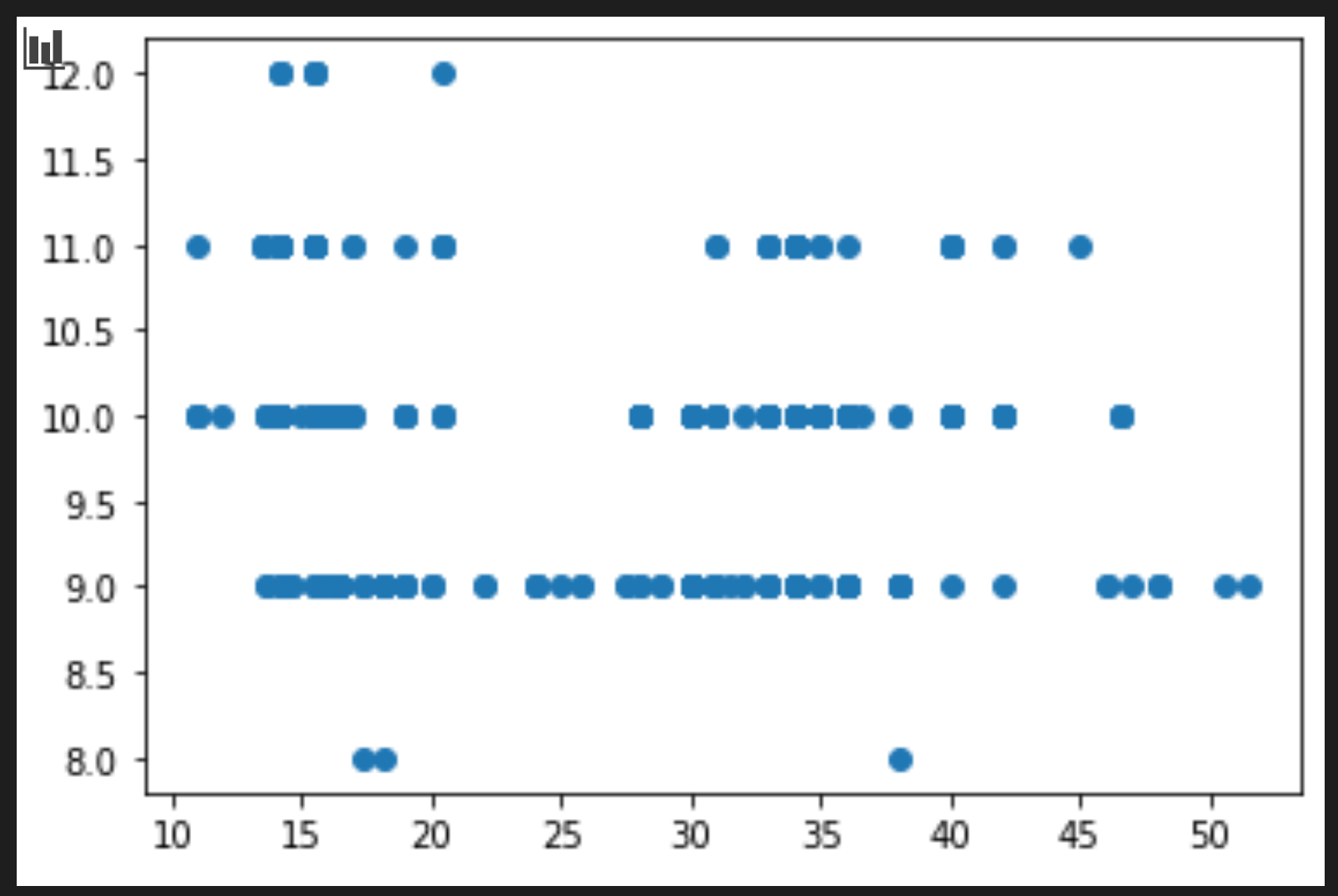
Is this a useful plot? Does anything about it surprise you?
It's not particularly useful as all it does is display in your data as a spread of points in a given month.
Make it useful
To get charts to display useful data, you usually need to group the data somehow. Let's try creating a plot where the y axis shows the months and the data demonstrates the distribution of data.
-
Add a cell to create a grouped bar chart:
new_pumpkins.groupby(['Month'])['Price'].mean().plot(kind='bar')
plt.ylabel("Pumpkin Price")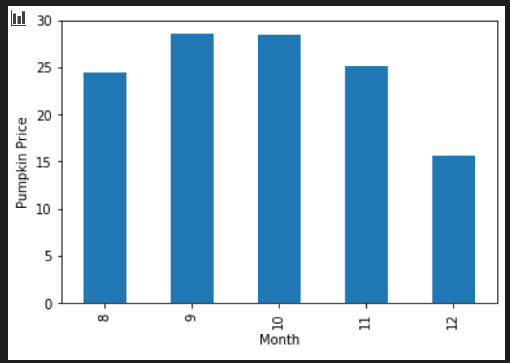
This is a more useful data visualization! It seems to indicate that the highest price for pumpkins occurs in September and October. Does that meet your expectation? Why or why not?
Exercise - experiment with Seaborn
Matplotlib is powerful, but it can take a lot of code to produce a polished chart. Seaborn is a library built on top of Matplotlib that is designed for statistical data visualization. It works directly with Pandas dataframes, applies attractive default styles, and lets you create informative plots with far less code. Because Seaborn returns Matplotlib objects, you can still use everything you already know about Matplotlib to fine-tune the result.
If you don't already have Seaborn installed, install it with
pip install seaborn.
-
Import Seaborn at the top of the notebook, under the other imports. It is conventionally imported as
sns:import seaborn as sns
Scatter plots to show relationships
A big part of exploring data before building a model is looking for relationships between variables. A scatter plot is one of the best tools for this: if the points seem to follow a line, the two variables may be correlated, which is a good sign that a linear regression model could work.
-
Recreate the price-to-month scatter plot from before, this time using Seaborn's
relplot()(relational plot), which works directly with your dataframe columns:sns.relplot(x="Price", y="Month", data=new_pumpkins)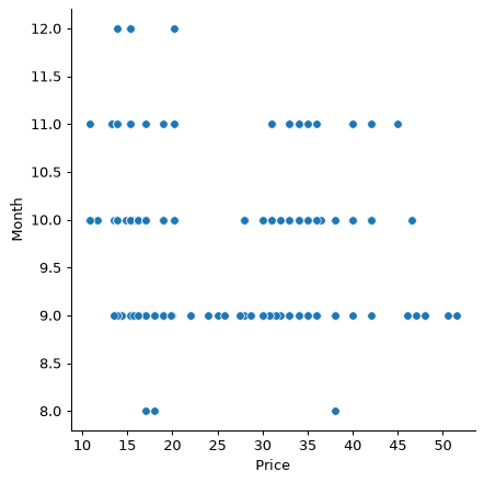
Notice how you pass the column names and the dataframe, and Seaborn takes care of the axis labels for you.
-
You can switch to a line plot by passing
kind="line". Seaborn even draws a shaded band showing the confidence interval around the line:sns.relplot(x="Price", y="Month", kind="line", data=new_pumpkins)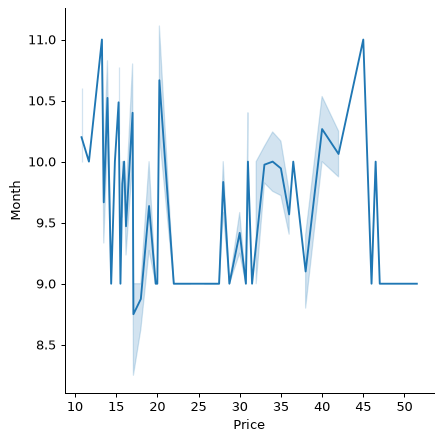
This particular data is quite noisy, so a line plot isn't the clearest choice here — but it shows how easily you can change chart types in Seaborn.
Bar charts to show distributions
Earlier you grouped the data by hand to create a bar chart with Matplotlib. Seaborn's catplot() (categorical plot) can do the grouping and aggregation for you. By default kind="bar" shows the mean of each category along with a black line indicating the confidence interval.
-
Create a bar chart of average price per month:
sns.catplot(x="Month", y="Price", data=new_pumpkins, kind="bar")
This confirms what you saw with Matplotlib — prices peak around September and October — but Seaborn also visualizes how much the price varies within each month.
Heatmaps to show correlations
Scatter plots compare two variables at a time. When you have several numeric columns, a heatmap lets you view the strength of the relationship between every pair of columns at once. This is a common way to spot which features are most correlated before choosing what to feed into a model (and the same kind of chart is later used to display confusion matrices in classification).
-
Build a correlation matrix with Pandas, then draw it with Seaborn's
heatmap(). Theannot=Trueoption prints the correlation values on each cell:correlations = new_pumpkins[['Month', 'Low Price', 'High Price', 'Price']].corr() sns.heatmap(correlations, annot=True, cmap="coolwarm")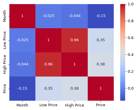
Values close to
1(or-1) mean the columns are strongly linearly correlated. Notice howLow PriceandHigh Priceare almost perfectly correlated.Month, on the other hand, shows only a weak linear correlation with price — even though the bar chart above revealed a clear seasonal peak in September and October. That's an important lesson: the correlation coefficient only measures straight-line relationships, so it can miss seasonal or otherwise non-linear patterns. ✅ Why is it useful to look at both a heatmap and charts like the bar chart before deciding which columns to use?
Matplotlib or Seaborn?
Both libraries are worth knowing:
- Matplotlib gives you fine-grained control over every element of a chart and is the foundation almost every other Python plotting library builds on.
- Seaborn provides higher-level functions and attractive defaults for statistical charts, works directly with dataframes, and is often quicker for exploratory data analysis.
A common workflow is to reach for Seaborn to explore your data quickly, then drop down to Matplotlib when you need to customize the details.
🚀Challenge
Explore the different types of visualization that Matplotlib and Seaborn offer. Which types are most appropriate for regression problems?
Post-lecture quiz
Review & Self Study
Take a look at the many ways to visualize data. Make a list of the various libraries available and note which are best for given types of tasks, for example 2D visualizations vs. 3D visualizations. What do you discover?