# 叢集分析簡介
叢集分析是一種[無監督學習](https://wikipedia.org/wiki/Unsupervised_learning)方法,假設資料集未標註標籤或其輸入與預定義輸出不匹配。它使用多種演算法來排序未標註的資料,根據資料中的模式提供分群。
[](https://youtu.be/ty2advRiWJM "No One Like You by PSquare")
> 🎥 點擊上方圖片觀看影片。在學習使用叢集分析的機器學習時,享受一些奈及利亞舞廳音樂-這是 PSquare 於 2014 年的高評價歌曲。
## [課前小測驗](https://ff-quizzes.netlify.app/en/ml/)
### 簡介
[叢集分析](https://link.springer.com/referenceworkentry/10.1007%2F978-0-387-30164-8_124)對資料探索非常有用。讓我們看看它是否能幫助發現奈及利亞觀眾消費音樂的趨勢和模式。
✅ 花一分鐘想想叢集分析的用途。在現實生活中,當你需要分揀家人衣物時就會用到叢集分析 🧦👕👖🩲。在資料科學中,叢集分析用於分析用戶偏好,或辨別任何未標記資料集的特性。叢集分析在某種程度上幫助理解混亂,例如整理襪子抽屜。
[](https://youtu.be/esmzYhuFnds "Introduction to Clustering")
> 🎥 點擊上方圖片觀看影片:MIT 的 John Guttag 介紹叢集分析
在專業環境中,叢集分析可用來確定市場區隔,例如決定哪些年齡層購買哪些商品。另一個用途是異常檢測,例如從信用卡交易資料中偵測詐騙。或者你可能會用叢集分析判斷醫學掃描中是否有腫瘤。
✅ 花一分鐘思考你可能在哪些銀行、電子商務或商業場景中遇過叢集分析。
> 🎓 有趣的是,叢集分析起源於 1930 年代的人類學和心理學領域。你能想像它當時如何被使用嗎?
另外,你也可以用來對搜尋結果分組-例如購物連結、圖片或評論。叢集分析在你有龐大資料但想降低維度並進行更細緻分析時很有用,因此它可用於建構其他模型前的資料探索。
✅ 一旦你的資料被組成叢集,便會指派叢集 ID,這種技術也有助於保護資料隱私;你可以用叢集 ID 來代替更揭露身分的資料點。你能想到其他用叢集 ID 而非叢集中其他元素來識別的原因嗎?
在這個[學習模組](https://docs.microsoft.com/learn/modules/train-evaluate-cluster-models?WT.mc_id=academic-77952-leestott)深化你對叢集技術的理解。
## 叢集分析入門
[Scikit-learn 提供多種](https://scikit-learn.org/stable/modules/clustering.html)叢集方法,所選擇的方法取決於你的使用案例。根據文件,每種方法都有不同優勢。以下為 Scikit-learn 支援的方法及其適用情境的簡化表格:
| 方法名稱 | 適用情況 |
| :--------------------------- | :--------------------------------------------------------------------- |
| K-Means | 通用,歸納式 |
| 親和力傳播 (Affinity propagation) | 許多、不均勻的叢集,歸納式 |
| 平均漂移 (Mean-shift) | 許多、不均勻的叢集,歸納式 |
| 光譜叢集 (Spectral clustering) | 少量、均勻的叢集,傳導式 |
| Ward 階層叢集 (Ward hierarchical clustering) | 許多、有約束的叢集,傳導式 |
| 凝聚式叢集 (Agglomerative clustering) | 許多、有約束、非歐氏距離,傳導式 |
| DBSCAN | 非平坦幾何、不均勻的叢集,傳導式 |
| OPTICS | 非平坦幾何、不均勻且密度變化的叢集,傳導式 |
| 高斯混合 (Gaussian mixtures) | 平坦幾何,歸納式 |
| BIRCH | 含異常值的大資料集,歸納式 |
> 🎓 叢集如何產生很大程度上取決於你如何將資料點劃分成群組。我們解析一些詞彙:
>
> 🎓 [「傳導式」與「歸納式」](https://wikipedia.org/wiki/Transduction_(machine_learning))
>
> 傳導推理是根據特定測試案例映射的觀察訓練案例衍生而來。歸納推理則是從訓練案例總結出一般規則,再應用於測試案例。
>
> 例如:假設資料集中只有部分標籤,有的是「唱片」,有的是「CD」,有些未標籤。你的工作是為未標籤部分指定標籤。若選擇歸納式方法,你會訓練一個模型以找出「唱片」與「CD」,並將標籤套用於未標籤資料,然而這方法難以分類實際為「卡帶」的資料。傳導式則能有效處理此未知資料,會先將相似的資料分群,然後給群組標籤,譬如「圓形音樂物品」與「方形音樂物品」。
>
> 🎓 [「非平坦」與「平坦」幾何](https://datascience.stackexchange.com/questions/52260/terminology-flat-geometry-in-the-context-of-clustering)
>
> 取自數學術語,非平坦與平坦幾何指的是用「平坦」([歐氏幾何](https://wikipedia.org/wiki/Euclidean_geometry))或「非平坦」(非歐氏)幾何方法來測距離。
>
> 「平坦」指歐氏幾何(部分為平面幾何),非平坦指非歐氏幾何。幾何跟機器學習有何關?由於兩者根源於數學,必須有共同方法量度叢集中的點距離,且依資料特性會用「平坦」或「非平坦」量度。[歐氏距離](https://wikipedia.org/wiki/Euclidean_distance)是兩點間線段長度,[非歐氏距離](https://wikipedia.org/wiki/Non-Euclidean_geometry)則沿曲線測量。若你資料視覺化後似乎不在一平面上,可能要用特殊演算法處理。
>
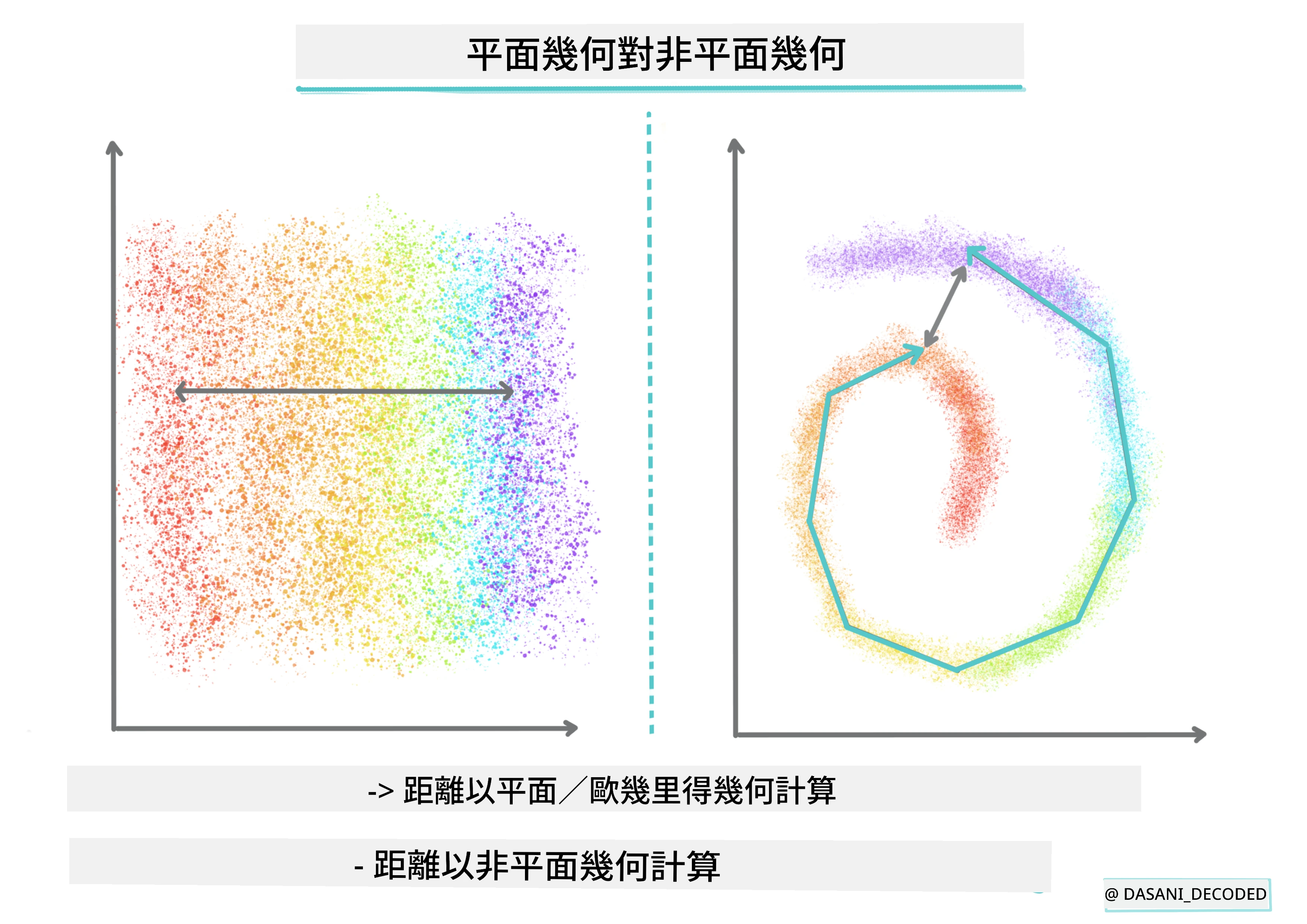
> 圖表由 [Dasani Madipalli](https://twitter.com/dasani_decoded) 製作
>
> 🎓 [「距離」](https://web.stanford.edu/class/cs345a/slides/12-clustering.pdf)
>
> 叢集由距離矩陣定義,例如點與點之間的距離。這距離可用數種方式量度。歐氏叢集由點值平均定義,包含「中心點」或質心,距離即為點與質心間距離。非歐氏距離指「聚類中心點」(clustroids),即最接近其他點的點,且聚類中心點可由不同方式定義。
>
> 🎓 [「有約束」](https://wikipedia.org/wiki/Constrained_clustering)
>
> [有約束叢集](https://web.cs.ucdavis.edu/~davidson/Publications/ICDMTutorial.pdf)將半監督學習引入此無監督方法。點間關係標記為「不得連結」或「必須連結」,為資料集建立規則。
>
> 例如:若演算法無約束於未標註或半標註資料,自主產生的叢集可能品質不佳。上述例子中,叢集可能分為「圓形音樂物品」、「方形音樂物品」、「三角形物品」和「餅乾」。如果給予約束,例如「項目必須用塑膠製成」、「項目必須能產生音樂」等,能促使演算法做出更佳決定。
>
> 🎓「密度」
>
> 「雜訊」資料視為密集。叢集中點與點間距離可能略有差異,稱為密度或擁擠度,因此需要用適合的叢集方法分析。[本文](https://www.kdnuggets.com/2020/02/understanding-density-based-clustering.html)示範用 K-Means 與 HDBSCAN 演算法分析不均勻密度的噪聲資料。
## 叢集演算法
有超過 100 種叢集演算法,其用法取決於資料特性。讓我們討論幾種主要的:
- 階層叢集。若一物件依與鄰近物件的距離被分類,而非與較遠物件距離,叢集即以成員間的相對距離形成。Scikit-learn 的凝聚式叢集屬階層型。
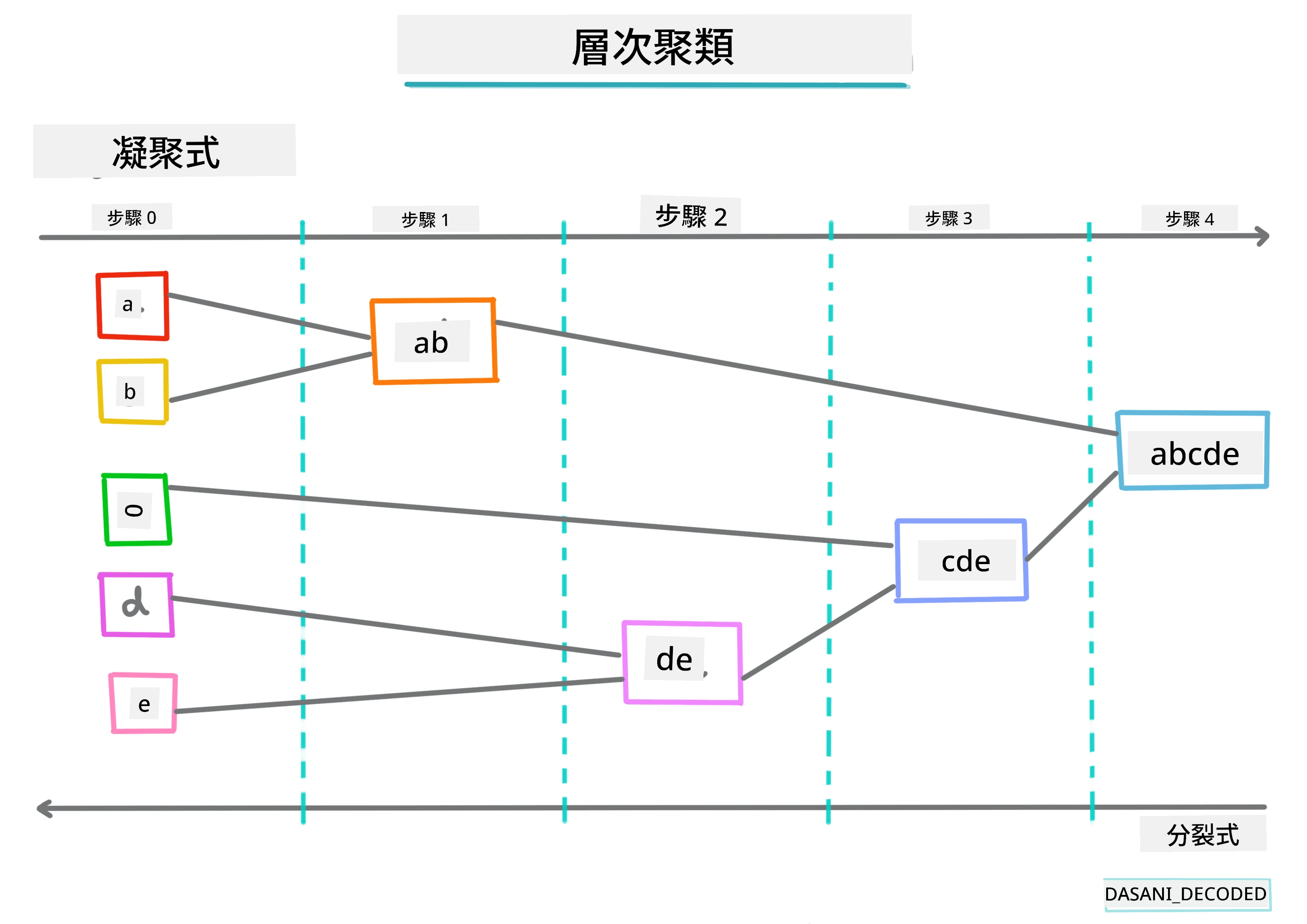
> 圖表由 [Dasani Madipalli](https://twitter.com/dasani_decoded) 製作
- 質心叢集。此熱門演算法必須指定「k」值,表示要形成的叢集數,接著演算法決定叢集中心點並將資料聚集於此。 [K-means 叢集](https://wikipedia.org/wiki/K-means_clustering) 是一種質心叢集。中心由最近的平均值決定,因此名為質心。其目標是將離質心的平方距離最小化。
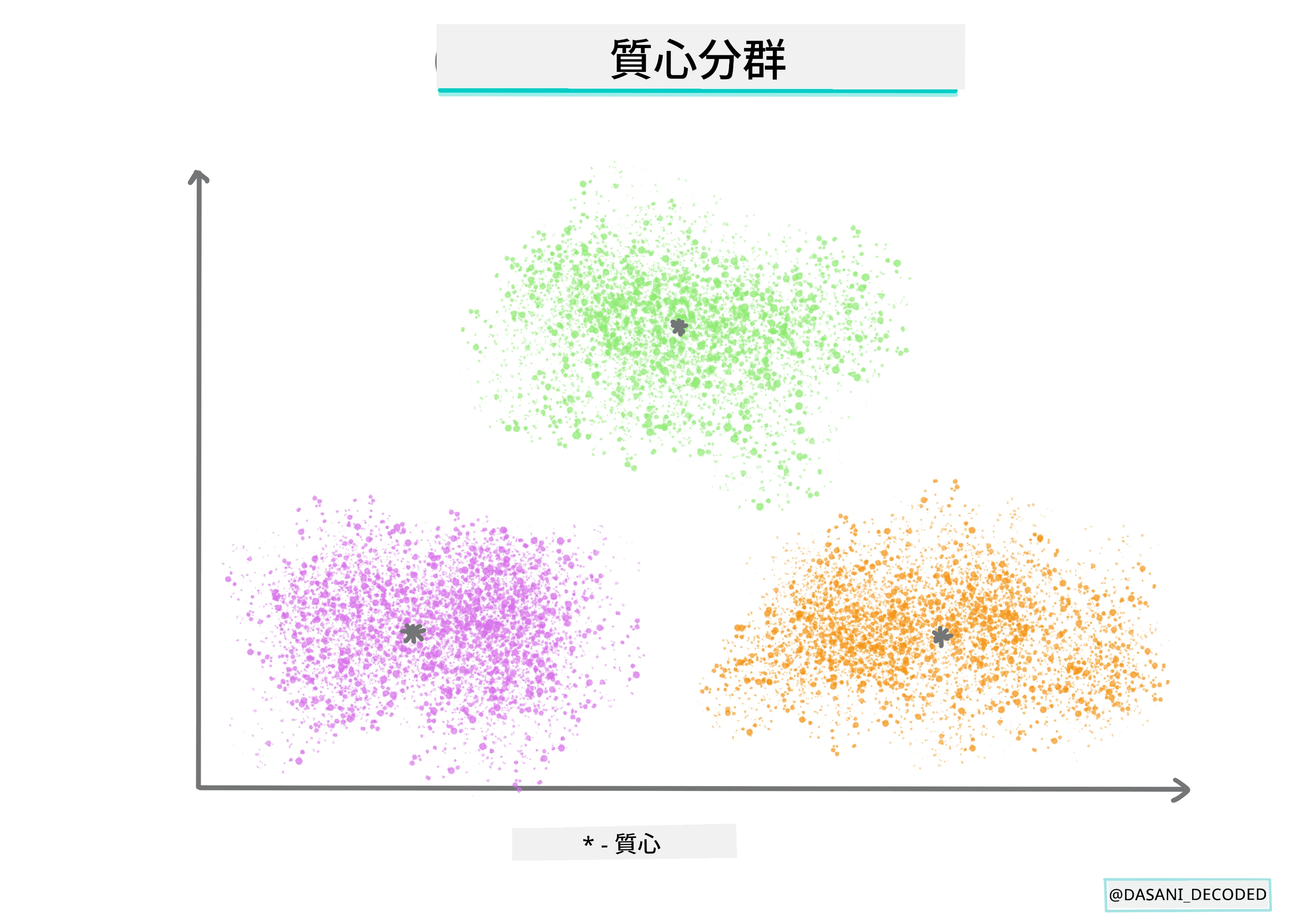
> 圖表由 [Dasani Madipalli](https://twitter.com/dasani_decoded) 製作
- 分布式叢集。基於統計模型,該方法確定資料點屬於某叢集的概率,然後相應分配。高斯混合方法為此類型。
- 密度式叢集。資料點依密度或彼此環繞的分布編入叢集。距群組離得遠的資料點被視為異常或噪聲。DBSCAN、Mean-shift 與 OPTICS 歸類於此。
- 格網叢集。針對多維資料集,建立格網,將資料分配至格網格格中,以此形成叢集。
## 練習 - 對你的資料進行叢集分析
叢集技術仰賴良好的視覺化,讓我們先從視覺化音樂資料開始。此練習幫助我們決定哪種叢集方法最適合此資料性質。
1. 開啟此資料夾內的 [_notebook.ipynb_](https://github.com/microsoft/ML-For-Beginners/blob/main/5-Clustering/1-Visualize/notebook.ipynb) 檔案。
1. 匯入 `Seaborn` 套件以良好視覺化資料。
```python
!pip install seaborn
```
1. 將 [_nigerian-songs.csv_](https://github.com/microsoft/ML-For-Beginners/blob/main/5-Clustering/data/nigerian-songs.csv) 的歌曲資料附加並載入資料框。準備匯入函式庫並輸出資料以便探索:
```python
import matplotlib.pyplot as plt
import pandas as pd
df = pd.read_csv("../data/nigerian-songs.csv")
df.head()
```
查看資料前幾行:
| | name | album | artist | artist_top_genre | release_date | length | popularity | danceability | acousticness | energy | instrumentalness | liveness | loudness | speechiness | tempo | time_signature |
| --- | ------------------------ | ---------------------------- | ------------------- | ---------------- | ------------ | ------ | ---------- | ------------ | ------------ | ------ | ---------------- | -------- | -------- | ----------- | ------- | -------------- |
| 0 | Sparky | Mandy & The Jungle | Cruel Santino | alternative r&b | 2019 | 144000 | 48 | 0.666 | 0.851 | 0.42 | 0.534 | 0.11 | -6.699 | 0.0829 | 133.015 | 5 |
| 1 | shuga rush | EVERYTHING YOU HEARD IS TRUE | Odunsi (The Engine) | afropop | 2020 | 89488 | 30 | 0.71 | 0.0822 | 0.683 | 0.000169 | 0.101 | -5.64 | 0.36 | 129.993 | 3 |
| 2 | LITT! | LITT! | AYLØ | indie r&b | 2018 | 207758 | 40 | 0.836 | 0.272 | 0.564 | 0.000537 | 0.11 | -7.127 | 0.0424 | 130.005 | 4 |
| 3 | Confident / Feeling Cool | Enjoy Your Life | Lady Donli | nigerian pop | 2019 | 175135 | 14 | 0.894 | 0.798 | 0.611 | 0.000187 | 0.0964 | -4.961 | 0.113 | 111.087 | 4 |
| 4 | wanted you | rare. | Odunsi (The Engine) | afropop | 2018 | 152049 | 25 | 0.702 | 0.116 | 0.833 | 0.91 | 0.348 | -6.044 | 0.0447 | 105.115 | 4 |
1. 獲取 dataframe 的一些資訊,調用 `info()`:
```python
df.info()
```
輸出類似如下:
```output
RangeIndex: 530 entries, 0 to 529
Data columns (total 16 columns):
# Column Non-Null Count Dtype
--- ------ -------------- -----
0 name 530 non-null object
1 album 530 non-null object
2 artist 530 non-null object
3 artist_top_genre 530 non-null object
4 release_date 530 non-null int64
5 length 530 non-null int64
6 popularity 530 non-null int64
7 danceability 530 non-null float64
8 acousticness 530 non-null float64
9 energy 530 non-null float64
10 instrumentalness 530 non-null float64
11 liveness 530 non-null float64
12 loudness 530 non-null float64
13 speechiness 530 non-null float64
14 tempo 530 non-null float64
15 time_signature 530 non-null int64
dtypes: float64(8), int64(4), object(4)
memory usage: 66.4+ KB
```
1. 再次檢查是否有空值,調用 `isnull()` 並驗證總和為 0:
```python
df.isnull().sum()
```
看起來沒有問題:
```output
name 0
album 0
artist 0
artist_top_genre 0
release_date 0
length 0
popularity 0
danceability 0
acousticness 0
energy 0
instrumentalness 0
liveness 0
loudness 0
speechiness 0
tempo 0
time_signature 0
dtype: int64
```
1. 描述數據:
```python
df.describe()
```
| | release_date | length | popularity | danceability | acousticness | energy | instrumentalness | liveness | loudness | speechiness | tempo | time_signature |
| ----- | ------------ | ----------- | ---------- | ------------ | ------------ | -------- | ---------------- | -------- | --------- | ----------- | ---------- | -------------- |
| count | 530 | 530 | 530 | 530 | 530 | 530 | 530 | 530 | 530 | 530 | 530 | 530 |
| mean | 2015.390566 | 222298.1698 | 17.507547 | 0.741619 | 0.265412 | 0.760623 | 0.016305 | 0.147308 | -4.953011 | 0.130748 | 116.487864 | 3.986792 |
| std | 3.131688 | 39696.82226 | 18.992212 | 0.117522 | 0.208342 | 0.148533 | 0.090321 | 0.123588 | 2.464186 | 0.092939 | 23.518601 | 0.333701 |
| min | 1998 | 89488 | 0 | 0.255 | 0.000665 | 0.111 | 0 | 0.0283 | -19.362 | 0.0278 | 61.695 | 3 |
| 25% | 2014 | 199305 | 0 | 0.681 | 0.089525 | 0.669 | 0 | 0.07565 | -6.29875 | 0.0591 | 102.96125 | 4 |
| 50% | 2016 | 218509 | 13 | 0.761 | 0.2205 | 0.7845 | 0.000004 | 0.1035 | -4.5585 | 0.09795 | 112.7145 | 4 |
| 75% | 2017 | 242098.5 | 31 | 0.8295 | 0.403 | 0.87575 | 0.000234 | 0.164 | -3.331 | 0.177 | 125.03925 | 4 |
| max | 2020 | 511738 | 73 | 0.966 | 0.954 | 0.995 | 0.91 | 0.811 | 0.582 | 0.514 | 206.007 | 5 |
> 🤔 如果我們使用的是無監督學習的分群演算法,不需要標記資料,那為什麼會展示有標籤的數據?在資料探索階段,這些標籤很有用,但對於分群演算法本身來說不必要。您也可以直接移除列標題,並用列號來參考資料。
觀察數據的整體值。注意人氣(popularity)可能為「0」,表示歌曲沒有排名。我們稍後會移除這些。
1. 用長條圖找出最受歡迎的曲風:
```python
import seaborn as sns
top = df['artist_top_genre'].value_counts()
plt.figure(figsize=(10,7))
sns.barplot(x=top[:5].index,y=top[:5].values)
plt.xticks(rotation=45)
plt.title('Top genres',color = 'blue')
```
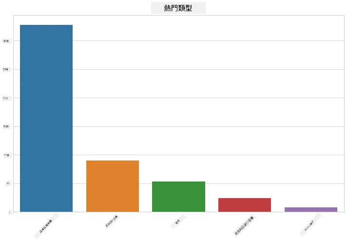
✅ 若想看到更多頂尖值,將頂部的 `[:5]` 改成更大的數值,或移除以查看全部。
注意,當頂尖曲風顯示「Missing」表示 Spotify 沒有分類,所以我們將其移除。
1. 移除缺失資料:
```python
df = df[df['artist_top_genre'] != 'Missing']
top = df['artist_top_genre'].value_counts()
plt.figure(figsize=(10,7))
sns.barplot(x=top.index,y=top.values)
plt.xticks(rotation=45)
plt.title('Top genres',color = 'blue')
```
現在重新檢查曲風:
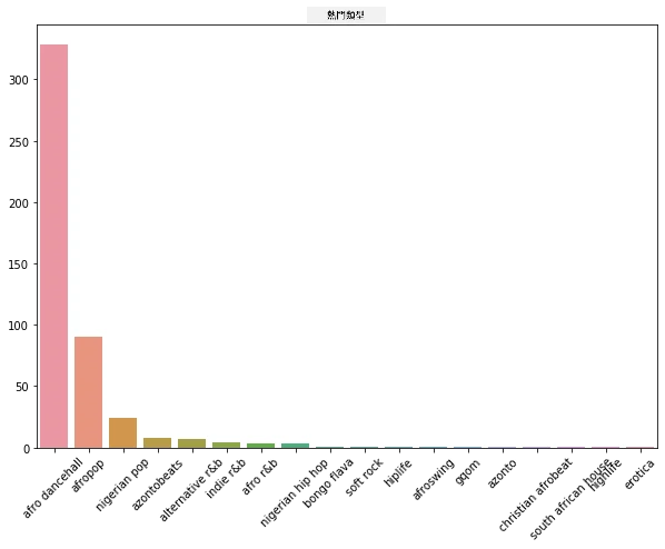
1. 明顯地,前三個曲風主導此資料集。我們只聚焦於 `afro dancehall`、`afropop` 和 `nigerian pop`,並且額外篩選去除人氣為0的資料(代表沒有人氣排名,可視為雜訊):
```python
df = df[(df['artist_top_genre'] == 'afro dancehall') | (df['artist_top_genre'] == 'afropop') | (df['artist_top_genre'] == 'nigerian pop')]
df = df[(df['popularity'] > 0)]
top = df['artist_top_genre'].value_counts()
plt.figure(figsize=(10,7))
sns.barplot(x=top.index,y=top.values)
plt.xticks(rotation=45)
plt.title('Top genres',color = 'blue')
```
1. 快速測試資料是否存在明顯的相關性:
```python
corrmat = df.corr(numeric_only=True)
f, ax = plt.subplots(figsize=(12, 9))
sns.heatmap(corrmat, vmax=.8, square=True)
```
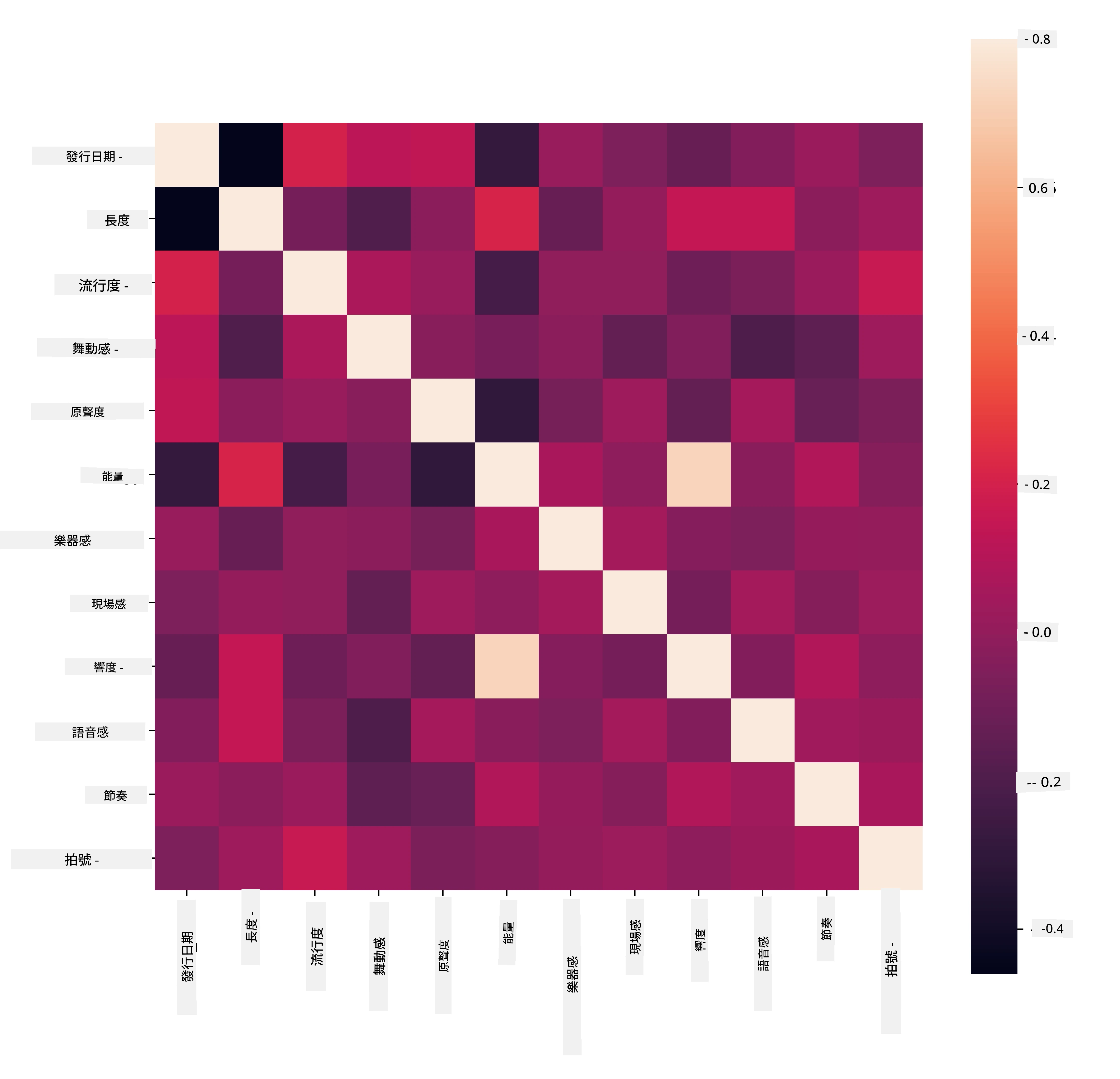
唯一強相關是 `energy` 與 `loudness`,這並不奇怪,因為大聲音樂通常較有活力。除此之外,相關性都相當弱。看看分群演算法會如何解讀這些資料會很有趣。
> 🎓 注意,相關不代表因果關係!我們有相關證據,但沒有因果證明。一個[有趣的網站](https://tylervigen.com/spurious-correlations)有些圖像突顯了這點。
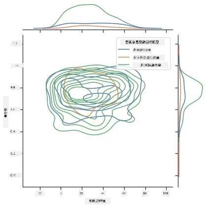
這組資料中,歌曲的人氣和舞曲感是否存在聚合趨勢?使用 FacetGrid 顯示有同心圓重合,不論曲風。難道尼日利亞人在這類流派的舞曲感有共通偏好?
✅ 試試不同的資料點(能量、響度、語音成分)或多種不同音樂風格。你會發現什麼?看看 `df.describe()` 表了解資料點的分布。
### 練習 - 資料分布
這三個曲風在人氣與舞曲感的感知上是否顯著不同?
1. 檢視前三大曲風在人氣和舞曲感兩軸的資料分布。
```python
sns.set_theme(style="ticks")
g = sns.jointplot(
data=df,
x="popularity", y="danceability", hue="artist_top_genre",
kind="kde",
)
```
你會發現在一個共同收斂點附近存在同心圓分布。
> 🎓 這個示例使用 KDE(核密度估計)圖,運用連續概率密度曲線來代表資料,方便我們解讀多分布資料。
大致上,三種曲風在人氣及舞曲感上大致對齊。要在這種鬆散對齊的資料中找出群集會是個挑戰:
1. 繪製散點圖:
```python
sns.FacetGrid(df, hue="artist_top_genre", height=5) \
.map(plt.scatter, "popularity", "danceability") \
.add_legend()
```
同軸的散點圖展現類似收斂模式
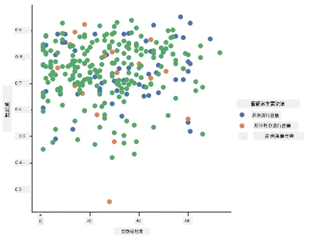
一般而言,在分群時可用散點圖顯示資料群集,熟練此視覺化十分重要。下節課會用這套篩選資料,用 k-means 分群找出有趣的重疊群體。
---
## 🚀挑戰
為下節課做準備,製作一張關於各種分群演算法的圖表,說明在生產環境中可能會用到的演算法。這些分群嘗試解決那些問題?
## [課後小測驗](https://ff-quizzes.netlify.app/en/ml/)
## 複習與自學
在應用分群演算法前,如同我們學到的,了解你的資料集性質十分重要。可閱讀更多此主題 [這裡](https://www.kdnuggets.com/2019/10/right-clustering-algorithm.html)
[這篇有用的文章](https://www.freecodecamp.org/news/8-clustering-algorithms-in-machine-learning-that-all-data-scientists-should-know/)介紹不同分群演算法的行為,依不同資料形狀而異。
## 作業
[研究其他分群視覺化方式](assignment.md)
---
**免責聲明**:
本文件由 AI 翻譯服務 [Co-op Translator](https://github.com/Azure/co-op-translator) 翻譯而成。雖然我們致力於確保準確性,但請注意,機器自動翻譯可能包含錯誤或不準確之處。原始文件的母語版本應被視為權威來源。對於重要資訊,建議進行專業人工翻譯。我們不對因使用本翻譯而產生的任何誤解或誤釋承擔責任。