|
|
5 years ago | |
|---|---|---|
| .. | ||
| images | 5 years ago | |
| solution | 5 years ago | |
| translations | 5 years ago | |
| README.md | 5 years ago | |
| assignment.md | 5 years ago | |
| notebook.ipynb | 5 years ago | |
README.md
Visualizing Proportions
In this lesson, you will use a different nature-focused dataset to visualize proportions, such as how many different types of fungi populate a given dataset about mushrooms. Let's explore these fascinating fungi using a dataset sourced from Audubon listing details about 23 species of gilled mushrooms in the Agaricus and Lepiota families. You will experiment with tasty visualizations such as:
- Pie charts 🥧
- Waffle charts 🧇
- Donut charts 🍩 as well as
- Stacked bar charts
Pre-Lecture Quiz
Pre-lecture quiz
Get to know your mushrooms 🍄
Mushrooms are very interesting. Let's import a dataset to study them.
import pandas as pd
import matplotlib.pyplot as plt
mushrooms = pd.read_csv('../../data/mushrooms.csv')
mushrooms.head()
A table is printed out with some great data for analysis:
| class | cap-shape | cap-surface | cap-color | bruises | odor | gill-attachment | gill-spacing | gill-size | gill-color | stalk-shape | stalk-root | stalk-surface-above-ring | stalk-surface-below-ring | stalk-color-above-ring | stalk-color-below-ring | veil-type | veil-color | ring-number | ring-type | spore-print-color | population | habitat |
|---|---|---|---|---|---|---|---|---|---|---|---|---|---|---|---|---|---|---|---|---|---|---|
| Poisonous | Convex | Smooth | Brown | Bruises | Pungent | Free | Close | Narrow | Black | Enlarging | Equal | Smooth | Smooth | White | White | Partial | White | One | Pendant | Black | Scattered | Urban |
| Edible | Convex | Smooth | Yellow | Bruises | Almond | Free | Close | Broad | Black | Enlarging | Club | Smooth | Smooth | White | White | Partial | White | One | Pendant | Brown | Numerous | Grasses |
| Edible | Bell | Smooth | White | Bruises | Anise | Free | Close | Broad | Brown | Enlarging | Club | Smooth | Smooth | White | White | Partial | White | One | Pendant | Brown | Numerous | Meadows |
| Poisonous | Convex | Scaly | White | Bruises | Pungent | Free | Close | Narrow | Brown | Enlarging | Equal | Smooth | Smooth | White | White | Partial | White | One | Pendant | Black | Scattered | Urban |
Right away, you notice that all the data is textual. You will have to edit this data to be able to use it in a chart. Most of the data, in fact, is represented as an object:
print(mushrooms.select_dtypes(["object"]).columns)
The output is:
Index(['class', 'cap-shape', 'cap-surface', 'cap-color', 'bruises', 'odor',
       'gill-attachment', 'gill-spacing', 'gill-size', 'gill-color',
       'stalk-shape', 'stalk-root', 'stalk-surface-above-ring',
       'stalk-surface-below-ring', 'stalk-color-above-ring',
       'stalk-color-below-ring', 'veil-type', 'veil-color', 'ring-number',
       'ring-type', 'spore-print-color', 'population', 'habitat'],
      dtype='object')
Take this data and convert the 'class' column to a category:
cols = mushrooms.select_dtypes(["object"]).columns
mushrooms[cols] = mushrooms[cols].astype('category')
Now, if you print out the mushrooms data, you can see that it has been grouped into categories according to the poisonous/edible class:
| cap-shape | cap-surface | cap-color | bruises | odor | gill-attachment | gill-spacing | gill-size | gill-color | stalk-shape | ... | stalk-surface-below-ring | stalk-color-above-ring | stalk-color-below-ring | veil-type | veil-color | ring-number | ring-type | spore-print-color | population | habitat | |
|---|---|---|---|---|---|---|---|---|---|---|---|---|---|---|---|---|---|---|---|---|---|
| class | |||||||||||||||||||||
| Edible | 4208 | 4208 | 4208 | 4208 | 4208 | 4208 | 4208 | 4208 | 4208 | 4208 | ... | 4208 | 4208 | 4208 | 4208 | 4208 | 4208 | 4208 | 4208 | 4208 | 4208 |
| Poisonous | 3916 | 3916 | 3916 | 3916 | 3916 | 3916 | 3916 | 3916 | 3916 | 3916 | ... | 3916 | 3916 | 3916 | 3916 | 3916 | 3916 | 3916 | 3916 | 3916 | 3916 |
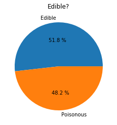
If you follow the order presented in this table to create your class category labels, you can build a pie chart:
labels=['Edible','Poisonous']
plt.pie(edibleclass['population'],labels=labels,autopct='%.1f %%')
plt.title('Edible?')
plt.show()
Voila, a pie chart showing the proportions of this data according to these two classes of mushroom. It's quite important to get the order of labels correct, especially here, so be sure to verify the order the label array is built!
🚀 Challenge
Post-Lecture Quiz
Post-lecture quiz