
 leestott
7d2708a767
leestott
7d2708a767
|
1 year ago | |
|---|---|---|
| .. | ||
| solution | 1 year ago | |
| starter | 1 year ago | |
| README.md | 1 year ago | |
| assignment.md | 1 year ago | |
README.md
Making Meaningful Visualizations
 |
|---|
| Meaningful Visualizations - Sketchnote by @nitya |
"If you torture the data long enough, it will confess to anything" -- Ronald Coase
One of the essential skills for a data scientist is the ability to create meaningful data visualizations that help answer questions. Before visualizing your data, you need to ensure it has been cleaned and prepared, as you learned in previous lessons. Once that's done, you can start deciding how best to present the data.
In this lesson, you will explore:
- How to select the appropriate chart type
- How to avoid misleading visualizations
- How to use color effectively
- How to style charts for better readability
- How to create animated or 3D visualizations
- How to design creative visualizations
Pre-Lecture Quiz
Choose the right chart type
In earlier lessons, you experimented with creating various data visualizations using Matplotlib and Seaborn. Generally, you can use the right type of chart based on the question you're trying to answer, as shown in this table:
| You need to: | You should use: |
|---|---|
| Show data trends over time | Line |
| Compare categories | Bar, Pie |
| Compare totals | Pie, Stacked Bar |
| Show relationships | Scatter, Line, Facet, Dual Line |
| Show distributions | Scatter, Histogram, Box |
| Show proportions | Pie, Donut, Waffle |
✅ Depending on the structure of your data, you might need to convert it from text to numeric to make certain charts work.
Avoid deception
Even when a data scientist carefully selects the right chart for the data, there are many ways data can be presented misleadingly to support a particular narrative, often at the expense of the data's integrity. There are countless examples of deceptive charts and infographics!
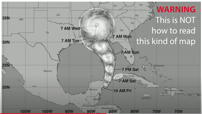
🎥 Click the image above to watch a conference talk about misleading charts.
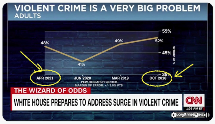
This chart flips the X-axis to show the opposite of the truth based on the dates:
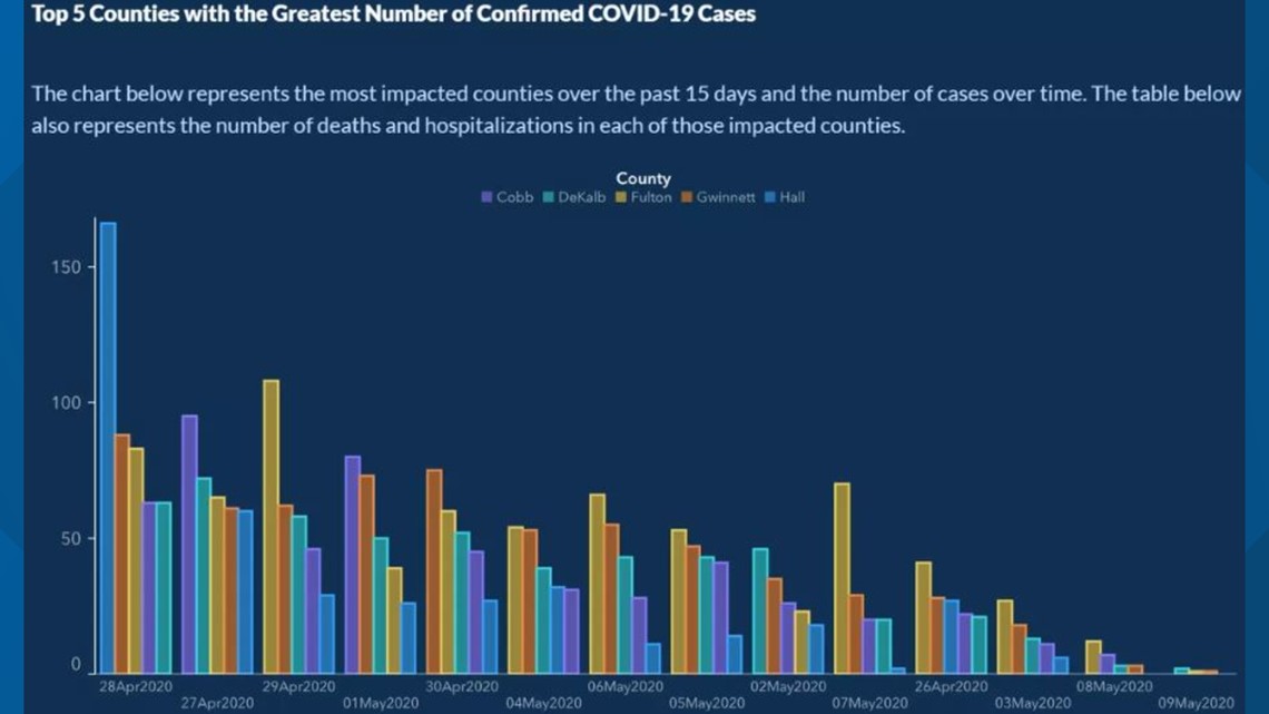
This chart is even more misleading. At first glance, it appears that COVID cases have declined over time in various counties. However, upon closer inspection, the dates have been rearranged to create a false downward trend.
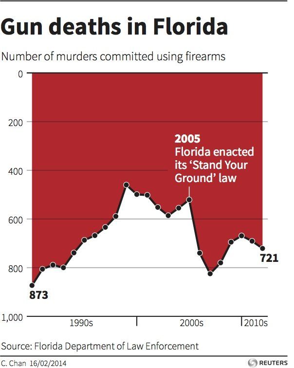
This infamous example uses both color and a flipped Y-axis to mislead viewers. Instead of showing that gun deaths increased after the passage of gun-friendly legislation, the chart tricks the eye into believing the opposite:
This peculiar chart demonstrates how proportions can be manipulated, often to humorous effect:

Another deceptive tactic is comparing things that aren't truly comparable. A fascinating website showcases 'spurious correlations,' such as the divorce rate in Maine being linked to margarine consumption. A Reddit group also collects examples of poor data usage.
It's crucial to understand how easily the eye can be tricked by misleading charts. Even with good intentions, a poorly chosen chart type—like a pie chart with too many categories—can lead to confusion.
Color
The 'Florida gun violence' chart above illustrates how color can add another layer of meaning to visualizations, especially when charts aren't created using libraries like Matplotlib or Seaborn, which offer pre-vetted color palettes. If you're designing a chart manually, take some time to study color theory.
✅ Keep accessibility in mind when designing charts. Some users may be colorblind—does your chart work well for those with visual impairments?
Be cautious when selecting colors for your chart, as they can convey unintended meanings. For example, the 'pink ladies' in the 'height' chart above add a distinctly 'feminine' connotation, which contributes to the chart's oddness.
While color meanings can vary across cultures and change depending on the shade, here are some general associations:
| Color | Meaning |
|---|---|
| red | power |
| blue | trust, loyalty |
| yellow | happiness, caution |
| green | ecology, luck, envy |
| purple | happiness |
| orange | vibrance |
If you're tasked with creating a chart with custom colors, ensure that your choices align with the intended message and that the chart remains accessible.
Styling your charts for readability
Charts lose their value if they're not easy to read! Take time to adjust the width and height of your chart to ensure it scales well with your data. For example, if you're displaying data for all 50 states, consider showing them vertically on the Y-axis to avoid horizontal scrolling.
Label your axes, include a legend if necessary, and provide tooltips for better data comprehension.
If your data includes verbose text on the X-axis, you can angle the text for improved readability. Matplotlib also supports 3D plotting if your data warrants it. Advanced visualizations can be created using mpl_toolkits.mplot3d.
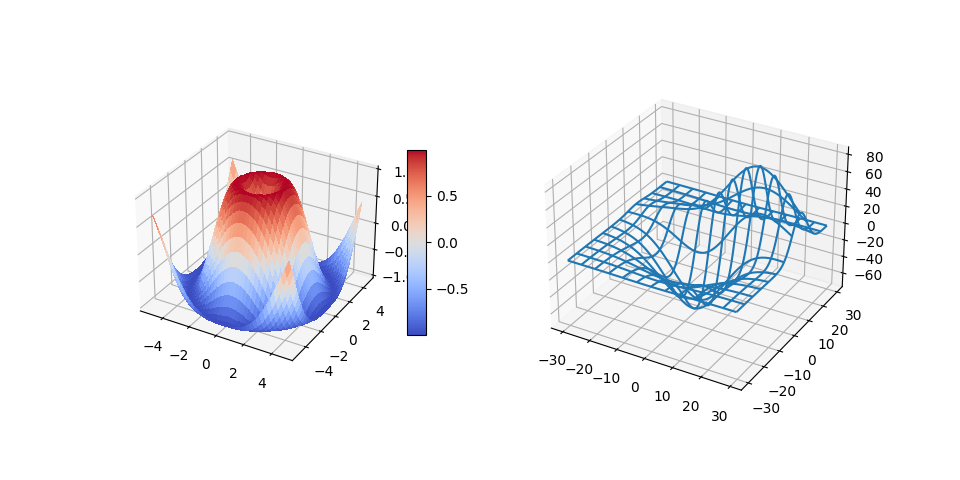
Animation and 3D chart display
Some of the most compelling data visualizations today are animated. Shirley Wu has created stunning examples using D3, such as 'film flowers,' where each flower represents a movie. Another example is 'Bussed Out,' an interactive visualization for the Guardian that combines Greensock and D3 with a scrollytelling article format to illustrate how NYC addresses homelessness by bussing people out of the city.
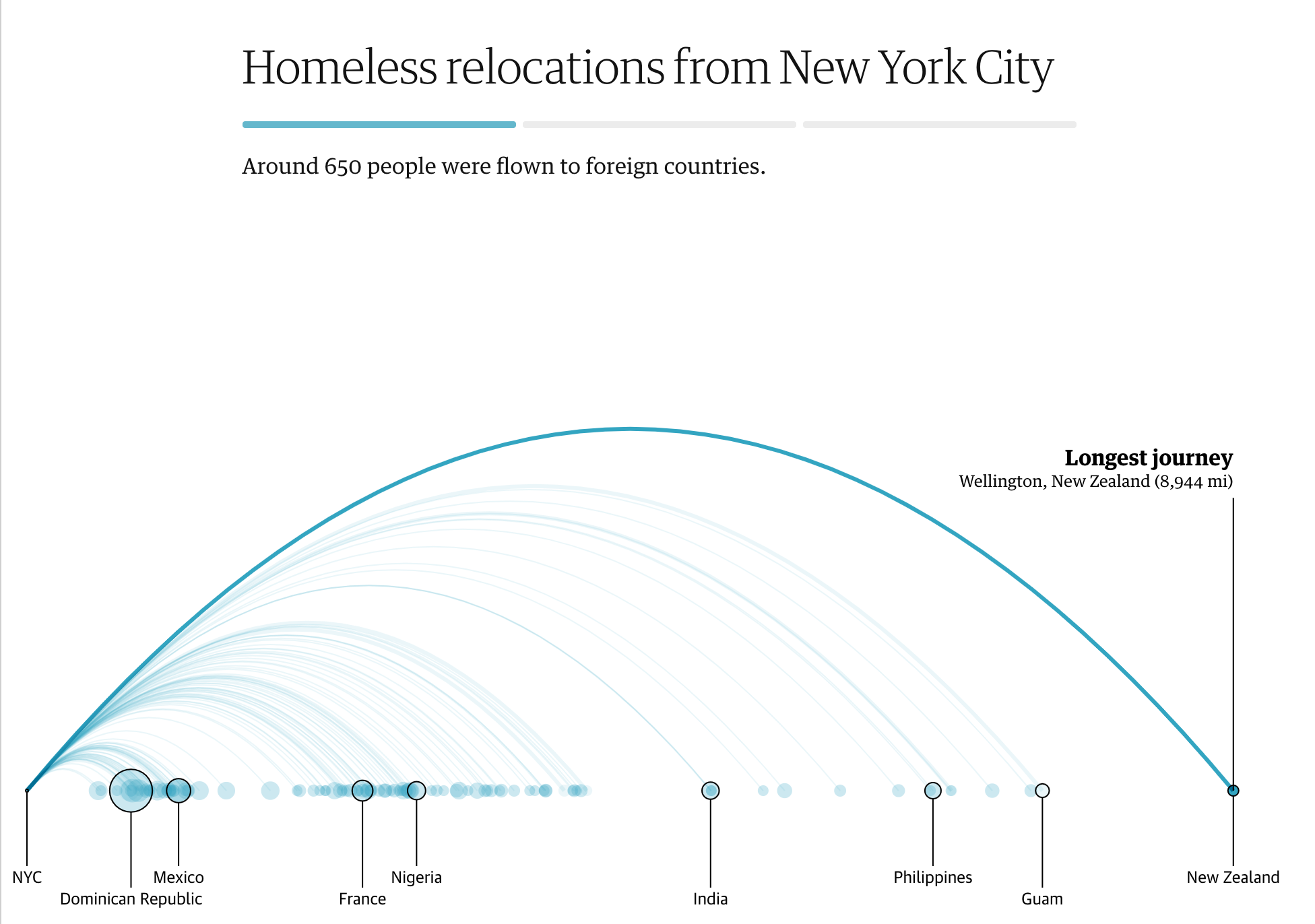
"Bussed Out: How America Moves its Homeless" from the Guardian. Visualizations by Nadieh Bremer & Shirley Wu
While this lesson doesn't delve deeply into these powerful visualization libraries, you can experiment with D3 in a Vue.js app to create an animated social network visualization of the book "Dangerous Liaisons."
"Les Liaisons Dangereuses" is an epistolary novel, presented as a series of letters. Written in 1782 by Choderlos de Laclos, it tells the story of the morally corrupt social maneuvers of two French aristocrats, the Vicomte de Valmont and the Marquise de Merteuil. Both meet their downfall, but not before causing significant social damage. The novel unfolds through letters written to various individuals in their circles, plotting revenge or simply creating chaos. Create a visualization of these letters to identify the key players in the narrative.
You will complete a web app that displays an animated view of this social network. It uses a library designed to create a network visualization with Vue.js and D3. Once the app is running, you can drag the nodes around to rearrange the data visually.
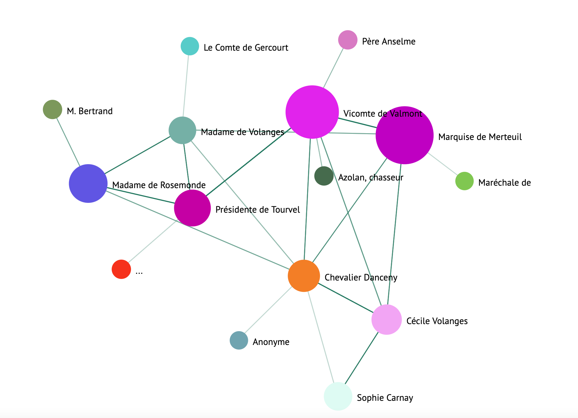
Project: Build a chart to show a network using D3.js
This lesson folder includes a
solutionfolder where you can find the completed project for reference.
-
Follow the instructions in the README.md file in the starter folder's root. Ensure you have NPM and Node.js installed on your machine before setting up the project's dependencies.
-
Open the
starter/srcfolder. Inside, you'll find anassetsfolder containing a .json file with all the letters from the novel, annotated with 'to' and 'from' fields. -
Complete the code in
components/Nodes.vueto enable the visualization. Locate the method calledcreateLinks()and add the following nested loop.
Loop through the .json object to extract the 'to' and 'from' data for the letters, building the links object for the visualization library:
//loop through letters
      let f = 0;
      let t = 0;
      for (var i = 0; i < letters.length; i++) {
          for (var j = 0; j < characters.length; j++) {

            if (characters[j] == letters[i].from) {
              f = j;
            }
            if (characters[j] == letters[i].to) {
              t = j;
            }
        }
        this.links.push({ sid: f, tid: t });
      }
Run your app from the terminal (npm run serve) and enjoy the visualization!
🚀 Challenge
Explore the internet to find examples of misleading visualizations. How does the author mislead the viewer, and is it intentional? Try correcting the visualizations to show how they should look.
Post-lecture quiz
Review & Self Study
Here are some articles about misleading data visualizations:
https://gizmodo.com/how-to-lie-with-data-visualization-1563576606
http://ixd.prattsi.org/2017/12/visual-lies-usability-in-deceptive-data-visualizations/
Check out these interesting visualizations of historical assets and artifacts:
Read this article on how animation can enhance your visualizations:
https://medium.com/@EvanSinar/use-animation-to-supercharge-data-visualization-cd905a882ad4
Assignment
Build your own custom visualization
Disclaimer:
This document has been translated using the AI translation service Co-op Translator. While we strive for accuracy, please note that automated translations may contain errors or inaccuracies. The original document in its native language should be regarded as the authoritative source. For critical information, professional human translation is recommended. We are not responsible for any misunderstandings or misinterpretations resulting from the use of this translation.