|
|
3 weeks ago | |
|---|---|---|
| .. | ||
| README.md | 3 weeks ago | |
| assignment.md | 3 weeks ago | |
README.md
အချိုးအစားများကို မြင်သာအောင် ဖော်ပြခြင်း
 |
|---|
| အချိုးအစားများကို မြင်သာအောင် ဖော်ပြခြင်း - Sketchnote by @nitya |
ယခင်သင်ခန်းစာတွင် သင်သည် Minnesota ရှိ ငှက်များအကြောင်း ဒေတာတစ်ခုအကြောင်း စိတ်ဝင်စားဖွယ် အချက်အလက်များကို လေ့လာခဲ့ပါသည်။ သင်သည် အချို့သော အမှားပါဝင်သော ဒေတာများကို အချိုးအစားများကို မြင်သာအောင် ဖော်ပြခြင်းဖြင့် ရှာဖွေခဲ့ပြီး ငှက်အမျိုးအစားများ၏ အရှည်အများဆုံးအရေအတွက်အလိုက် ကွာခြားချက်များကို ကြည့်ရှုခဲ့ပါသည်။
Pre-lecture quiz
ငှက်များ၏ ဒေတာကို လေ့လာခြင်း
ဒေတာကို နက်နက်ရှိုင်းရှိုင်း လေ့လာရန် နောက်ထပ်နည်းလမ်းတစ်ခုမှာ ဒေတာ၏ အချိုးအစား (distribution) ကို ကြည့်ရှုခြင်းဖြစ်သည်။ ဥပမာအားဖြင့်, Minnesota ရှိ ငှက်များအတွက် အများဆုံး အတောင်အရှည် (maximum wingspan) သို့မဟုတ် အများဆုံး ကိုယ်အလေးချိန် (maximum body mass) ၏ အချိုးအစားကို သိလိုသည်ဟု ဆိုပါစို့။
ယခု ဒေတာအစုတွင် အချိုးအစားများအကြောင်း အချက်အလက်အချို့ကို ရှာဖွေကြည့်ရအောင်။ သင့် R console တွင် ggplot2 နှင့် database ကို သွင်းပါ။ ယခင်ခေါင်းစဉ်တွင် ပြုလုပ်ခဲ့သလို database မှ အမှားပါဝင်သော ဒေတာများကို ဖယ်ရှားပါ။
library(ggplot2)

birds <- read.csv("../../data/birds.csv",fileEncoding="UTF-8-BOM")

birds_filtered <- subset(birds, MaxWingspan < 500)
head(birds_filtered)
| Name | ScientificName | Category | Order | Family | Genus | ConservationStatus | MinLength | MaxLength | MinBodyMass | MaxBodyMass | MinWingspan | MaxWingspan | |
|---|---|---|---|---|---|---|---|---|---|---|---|---|---|
| 0 | Black-bellied whistling-duck | Dendrocygna autumnalis | Ducks/Geese/Waterfowl | Anseriformes | Anatidae | Dendrocygna | LC | 47 | 56 | 652 | 1020 | 76 | 94 |
| 1 | Fulvous whistling-duck | Dendrocygna bicolor | Ducks/Geese/Waterfowl | Anseriformes | Anatidae | Dendrocygna | LC | 45 | 53 | 712 | 1050 | 85 | 93 |
| 2 | Snow goose | Anser caerulescens | Ducks/Geese/Waterfowl | Anseriformes | Anatidae | Anser | LC | 64 | 79 | 2050 | 4050 | 135 | 165 |
| 3 | Ross's goose | Anser rossii | Ducks/Geese/Waterfowl | Anseriformes | Anatidae | Anser | LC | 57.3 | 64 | 1066 | 1567 | 113 | 116 |
| 4 | Greater white-fronted goose | Anser albifrons | Ducks/Geese/Waterfowl | Anseriformes | Anatidae | Anser | LC | 64 | 81 | 1930 | 3310 | 130 | 165 |
ယေဘူယျအားဖြင့်, ဒေတာ၏ အချိုးအစားကို မြန်ဆန်စွာ ကြည့်ရှုရန် scatter plot တစ်ခုကို ယခင်သင်ခန်းစာတွင် ပြုလုပ်ခဲ့သကဲ့သို့ ပြုလုပ်နိုင်ပါသည်။
ggplot(data=birds_filtered, aes(x=Order, y=MaxLength,group=1)) +
  geom_point() +
  ggtitle("Max Length per order") + coord_flip()
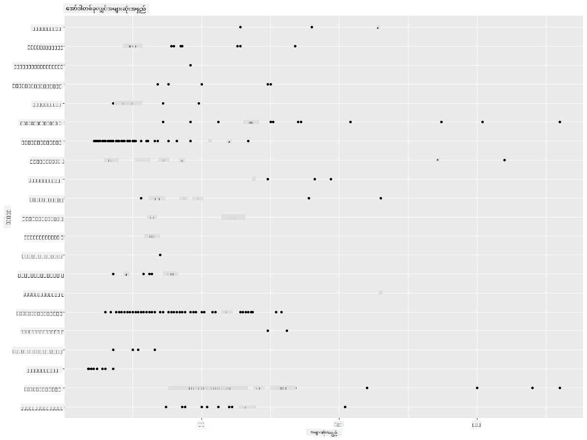
ဤအရာသည် ငှက်အမျိုးအစား (Order) အလိုက် ကိုယ်အရှည်၏ ယေဘူယျ အချိုးအစားကို ပြသပေးပါသည်။ သို့သော် ဒေတာ၏ အမှန်တကယ် အချိုးအစားကို ဖော်ပြရန် အကောင်းဆုံးနည်းလမ်းမဟုတ်ပါ။ ဤအလုပ်ကို Histogram တစ်ခု ဖန်တီးခြင်းဖြင့် 通常 ပြုလုပ်ပါသည်။
Histogram များနှင့် အလုပ်လုပ်ခြင်း
ggplot2 သည် Histogram များကို အသုံးပြု၍ ဒေတာ၏ အချိုးအစားကို မြင်သာအောင် ဖော်ပြရန် အလွန်ကောင်းမွန်သော နည်းလမ်းများကို ပေးသည်။ ဤအမျိုးအစား၏ chart သည် bar chart တစ်ခုနှင့် ဆင်တူပြီး bar များ၏ မြင့်တက်နိမ့်ကျမှုမှတစ်ဆင့် အချိုးအစားကို မြင်နိုင်သည်။ Histogram တစ်ခု ဖန်တီးရန် သင်သည် ကိန်းဂဏန်းဒေတာလိုအပ်ပါသည်။ Histogram တစ်ခု ဖန်တီးရန်, chart ၏ အမျိုးအစားကို 'hist' ဟု သတ်မှတ်ပါ။ ဤ chart သည် dataset ၏ အများဆုံး ကိုယ်အလေးချိန် (MaxBodyMass) ၏ အချိုးအစားကို ပြသသည်။ ဒေတာကို သေးငယ်သော bins များအဖြစ် ခွဲခြားခြင်းဖြင့် ဒေတာတန်ဖိုးများ၏ အချိုးအစားကို ပြသနိုင်သည်။
ggplot(data = birds_filtered, aes(x = MaxBodyMass)) +
  geom_histogram(bins=10)+ylab('Frequency')
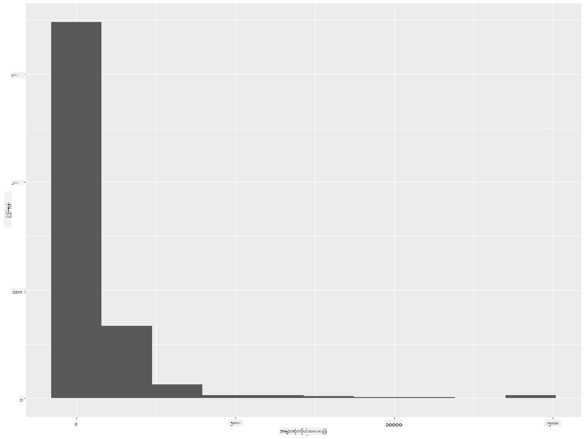
သင်မြင်နိုင်သည့်အတိုင်း, ဤ dataset တွင်ပါဝင်သော ငှက် 400+ များ၏ အများစုသည် Max Body Mass 2000 အောက်တွင် ရှိသည်။ bins parameter ကို 30 အထိ မြှင့်တင်ခြင်းဖြင့် ဒေတာအကြောင်းပိုမို နက်နက်ရှိုင်းရှိုင်း သိရှိနိုင်သည်။
ggplot(data = birds_filtered, aes(x = MaxBodyMass)) + geom_histogram(bins=30)+ylab('Frequency')
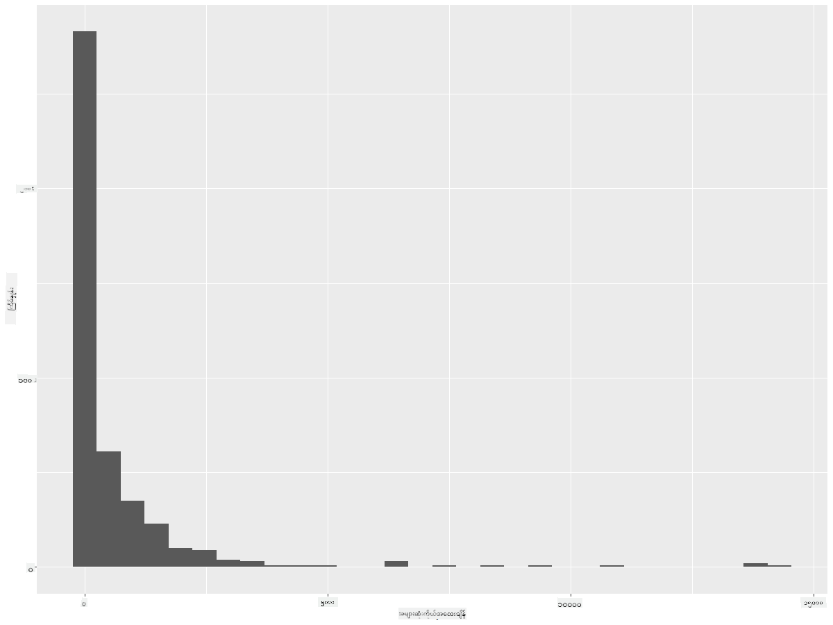
ဤ chart သည် အချိုးအစားကို ပိုမိုအသေးစိတ်ပြသသည်။ ပိုမိုလက်ဝဲဘက်သို့ မဆွဲထားသော chart တစ်ခုကို ဖန်တီးရန် သတ်မှတ်ထားသော အကွာအဝေးအတွင်းရှိ ဒေတာကိုသာ ရွေးချယ်ပါ။
ကိုယ်အလေးချိန် 60 အောက်ရှိ ငှက်များကိုသာ ရွေးချယ်ပြီး 30 bins ပြပါ:
birds_filtered_1 <- subset(birds_filtered, MaxBodyMass > 1 & MaxBodyMass < 60)
ggplot(data = birds_filtered_1, aes(x = MaxBodyMass)) +
  geom_histogram(bins=30)+ylab('Frequency')

✅ အခြား filter များနှင့် ဒေတာအချက်အလက်များကို စမ်းကြည့်ပါ။ ဒေတာ၏ အပြည့်အစုံသော အချိုးအစားကို မြင်ရန် ['MaxBodyMass'] filter ကို ဖယ်ရှားပြီး label ထည့်ထားသော အချိုးအစားများကို ပြပါ။
Histogram သည် အရောင်နှင့် label အဆင်ပြေမှုများကိုလည်း စမ်းသပ်နိုင်သည်။
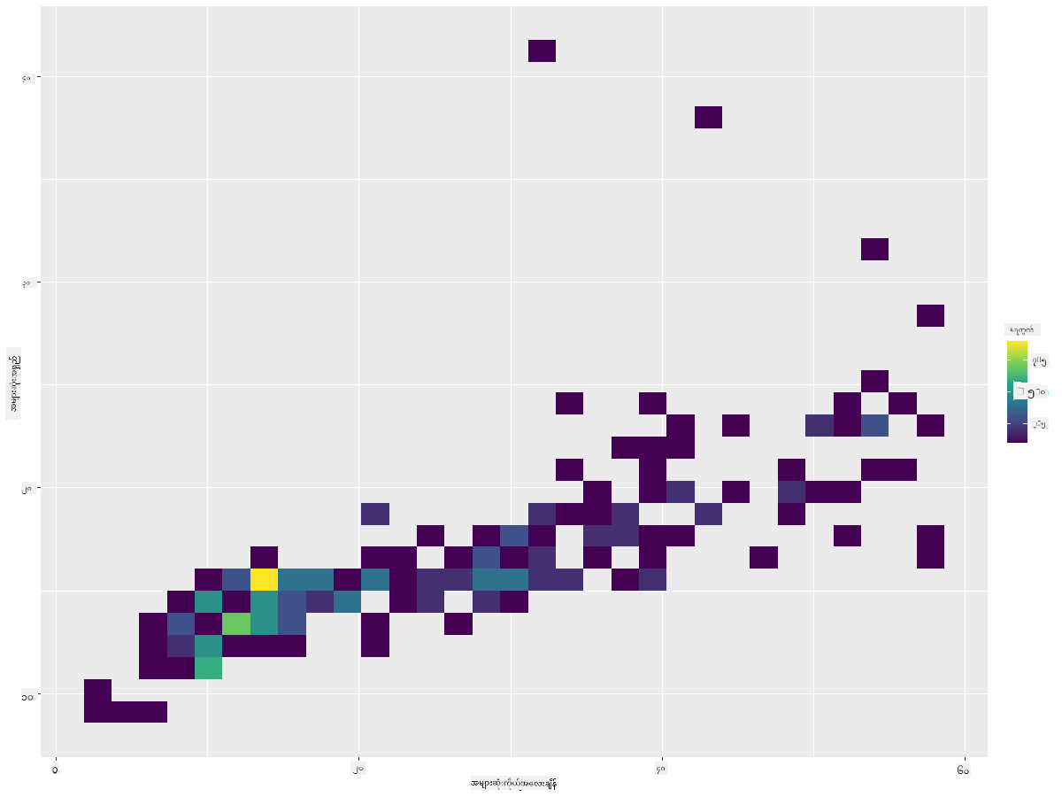
2D histogram တစ်ခု ဖန်တီး၍ အချိုးအစားနှစ်ခုအကြား ဆက်စပ်မှုကို နှိုင်းယှဉ်ကြည့်ပါ။ MaxBodyMass နှင့် MaxLength ကို နှိုင်းယှဉ်ကြည့်ပါ။ ggplot2 သည် အလင်းရောင်ပိုမိုတောက်ပသောအရောင်များကို အသုံးပြု၍ ဆက်စပ်မှုကို ပြသရန် built-in နည်းလမ်းကို ပေးသည်။
ggplot(data=birds_filtered_1, aes(x=MaxBodyMass, y=MaxLength) ) +
  geom_bin2d() +scale_fill_continuous(type = "viridis")
ဤအချိုးအစားနှစ်ခုအကြား မျှော်မှန်းထားသော အချိုးအစားတစ်ခုအတိုင်း ဆက်စပ်မှုရှိသည်ဟု မြင်ရပြီး တစ်နေရာတွင် အထူးအားကောင်းသော ဆက်စပ်မှုရှိသည်။
Histogram များသည် ယေဘူယျအားဖြင့် ကိန်းဂဏန်းဒေတာအတွက် အလွန်ကောင်းမွန်သည်။ သို့သော် စာသားဒေတာအလိုက် အချိုးအစားကို ကြည့်ရန်လိုပါက ဘာလုပ်ရမည်နည်း?
စာသားဒေတာကို အသုံးပြု၍ ဒေတာအချိုးအစားများကို လေ့လာခြင်း
ဤ dataset တွင် ငှက်အမျိုးအစား (category)၊ genus၊ species၊ family နှင့် ထိန်းသိမ်းရေးအခြေအနေ (conservation status) အကြောင်း အချက်အလက်ကောင်းများလည်း ပါဝင်သည်။ ထိန်းသိမ်းရေးအခြေအနေအကြောင်းကို လေ့လာကြည့်ရအောင်။ ငှက်များကို ထိန်းသိမ်းရေးအခြေအနေအလိုက် အချိုးအစားဘယ်လိုရှိသလဲ?
✅ Dataset တွင် conservation status ကို ဖော်ပြရန် အတိုကောက်အချို့ကို အသုံးပြုထားသည်။ ဤအတိုကောက်များသည် IUCN Red List Categories မှ ရယူထားခြင်းဖြစ်သည်။ ဤအဖွဲ့သည် အမျိုးအစားများ၏ အခြေအနေကို catalog ပြုလုပ်သည်။
- CR: အလွန်အန္တရာယ်ရှိသော (Critically Endangered)
- EN: အန္တရာယ်ရှိသော (Endangered)
- EX: မျိုးသုဉ်းသွားသော (Extinct)
- LC: အန္တရာယ်နည်းသော (Least Concern)
- NT: အနီးကပ် အန္တရာယ်ရှိသော (Near Threatened)
- VU: အန္တရာယ်ရှိနိုင်သော (Vulnerable)
ဤအတိုကောက်များသည် စာသားတန်ဖိုးများဖြစ်သောကြောင့် Histogram ဖန်တီးရန် transform ပြုလုပ်ရန် လိုအပ်ပါသည်။ FilteredBirds dataframe ကို အသုံးပြု၍ ထိန်းသိမ်းရေးအခြေအနေကို အနည်းဆုံး အတောင်အရှည် (Minimum Wingspan) နှင့်အတူ ပြပါ။ ဘာတွေမြင်ရလဲ?
birds_filtered_1$ConservationStatus[birds_filtered_1$ConservationStatus == 'EX'] <- 'x1'
birds_filtered_1$ConservationStatus[birds_filtered_1$ConservationStatus == 'CR'] <- 'x2'
birds_filtered_1$ConservationStatus[birds_filtered_1$ConservationStatus == 'EN'] <- 'x3'
birds_filtered_1$ConservationStatus[birds_filtered_1$ConservationStatus == 'NT'] <- 'x4'
birds_filtered_1$ConservationStatus[birds_filtered_1$ConservationStatus == 'VU'] <- 'x5'
birds_filtered_1$ConservationStatus[birds_filtered_1$ConservationStatus == 'LC'] <- 'x6'

ggplot(data=birds_filtered_1, aes(x = MinWingspan, fill = ConservationStatus)) +
  geom_histogram(position = "identity", alpha = 0.4, bins = 20) +
  scale_fill_manual(name="Conservation Status",values=c("red","green","blue","pink"),labels=c("Endangered","Near Threathened","Vulnerable","Least Concern"))
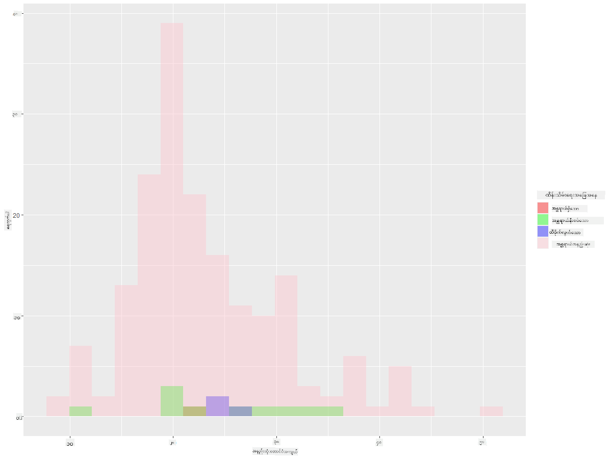
အနည်းဆုံး အတောင်အရှည်နှင့် ထိန်းသိမ်းရေးအခြေအနေအကြား ဆက်စပ်မှုကောင်းမရှိဟု မြင်ရသည်။ ဤနည်းလမ်းကို အသုံးပြု၍ dataset ၏ အခြား element များကို စမ်းကြည့်ပါ။ အခြား filter များကိုလည်း စမ်းကြည့်ပါ။ ဆက်စပ်မှုတစ်ခုကို ရှာဖွေတွေ့ရှိနိုင်ပါသလား?
Density plots
ယခင်ကြည့်ရှုခဲ့သော histogram များသည် 'stepped' ဖြစ်ပြီး arc အတိုင်း မဖြောင့်မပြတ်ဖြစ်ကြောင်း သင်သတိပြုမိနိုင်ပါသည်။ ပိုမိုဖြောင့်မပြတ်သော density chart ကို ပြသရန် density plot ကို စမ်းကြည့်နိုင်ပါသည်။
ယခု density plot များနှင့် အလုပ်လုပ်ကြည့်ရအောင်!
ggplot(data = birds_filtered_1, aes(x = MinWingspan)) +
  geom_density()
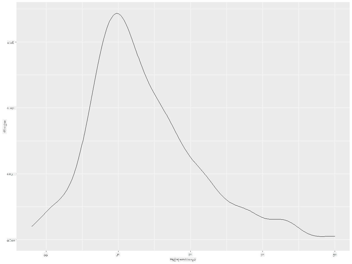
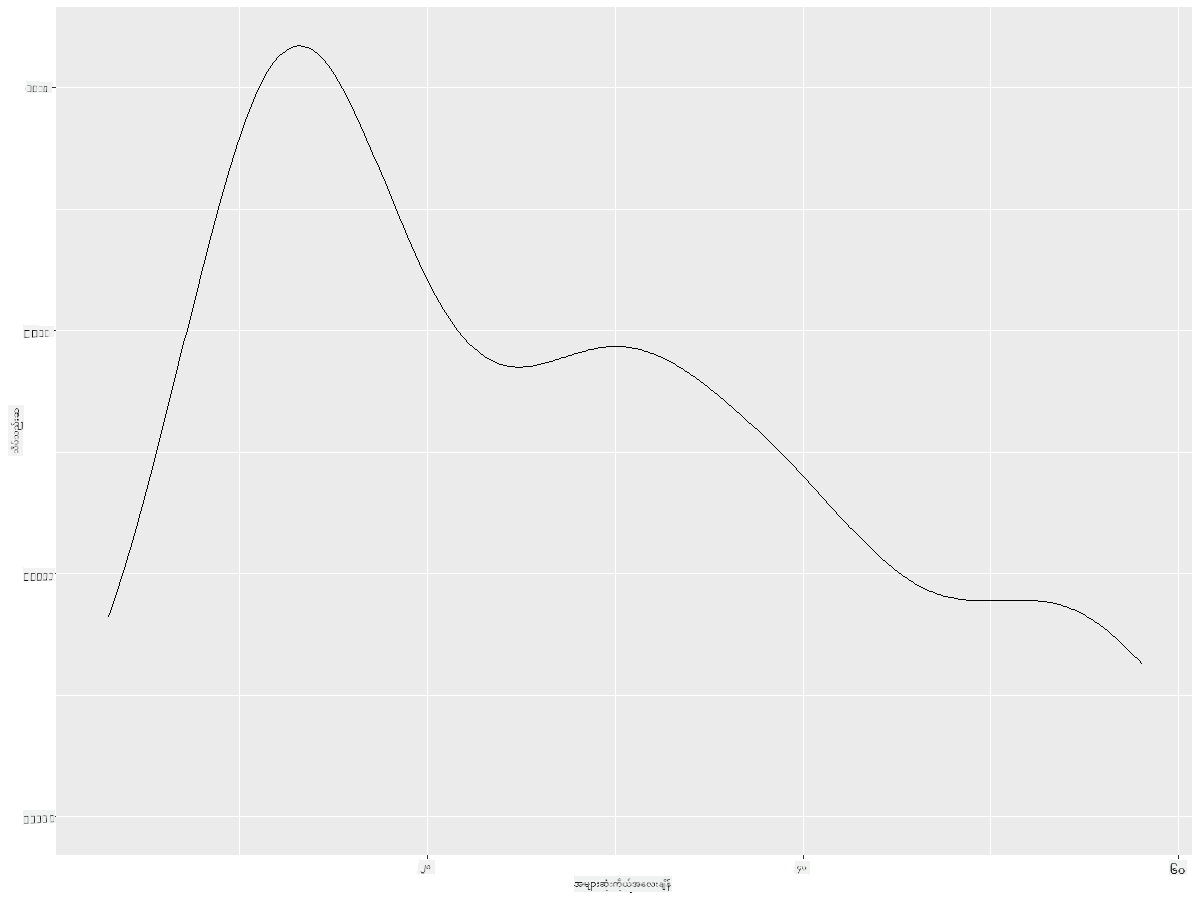
ဤ plot သည် အနည်းဆုံး အတောင်အရှည် (Minimum Wingspan) ဒေတာအတွက် ယခင် histogram ကို ပြန်လည်တူညီစေသည်။ သို့သော် ပိုမိုဖြောင့်မပြတ်ဖြစ်သည်။ ဒုတိယ chart တွင် မြင်ရသော jagged MaxBodyMass လိုင်းကို ပြန်လည်ဖန်တီး၍ ဤနည်းလမ်းဖြင့် အလွန်ကောင်းစွာ ဖြောင့်မပြတ်စေနိုင်သည်။
ggplot(data = birds_filtered_1, aes(x = MaxBodyMass)) +
  geom_density()
ပိုမိုဖြောင့်မပြတ်သော လိုင်းတစ်ခုလိုအပ်သော်လည်း အလွန်ဖြောင့်မပြတ်စေလိုမည်ဆိုပါက adjust parameter ကို ပြင်ဆင်ပါ:
ggplot(data = birds_filtered_1, aes(x = MaxBodyMass)) +
  geom_density(adjust = 1/5)
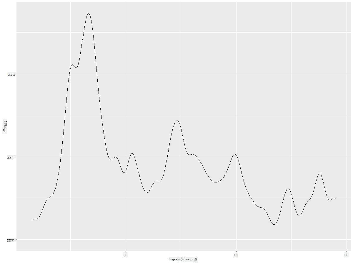
✅ ဤအမျိုးအစား plot အတွက် ရနိုင်သော parameter များအကြောင်း ဖတ်ရှုပြီး စမ်းကြည့်ပါ!
ဤအမျိုးအစား chart သည် အလွန်ရှင်းလင်းသော visualizations များကို ပေးသည်။ ဥပမာအားဖြင့်, ငှက်အမျိုးအစား (Order) အလိုက် အများဆုံး ကိုယ်အလေးချိန် (Max Body Mass) density ကို ပြသရန် ကုဒ်အကြောင်းအနည်းငယ်ဖြင့် ပြသနိုင်သည်။
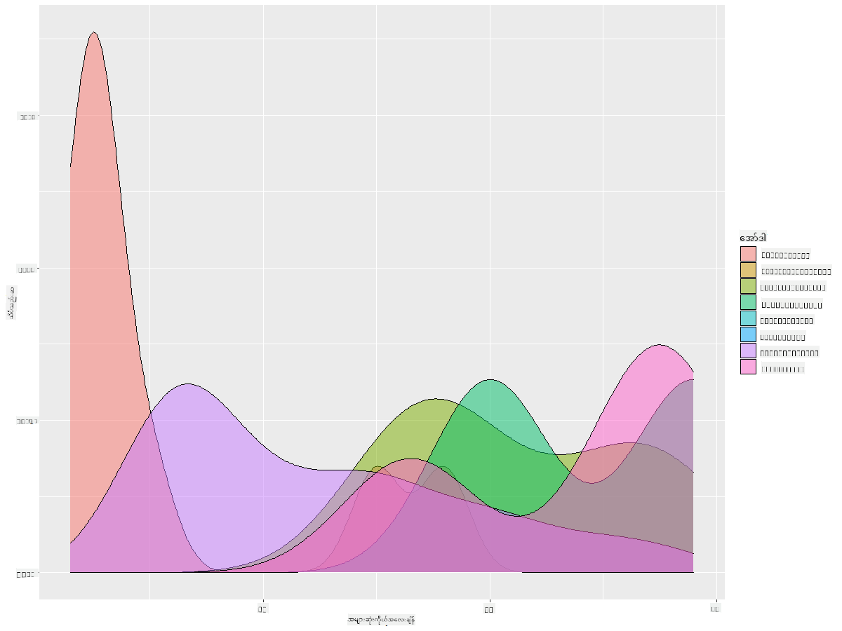
ggplot(data=birds_filtered_1,aes(x = MaxBodyMass, fill = Order)) +
  geom_density(alpha=0.5)
🚀 စိန်ခေါ်မှု
Histogram များသည် ယေဘူယျ scatterplots, bar charts, သို့မဟုတ် line charts ထက် ပိုမိုတိုးတက်သော chart အမျိုးအစားဖြစ်သည်။ အင်တာနက်တွင် Histogram များကို အသုံးပြုထားသော ကောင်းမွန်သော ဥပမာများကို ရှာဖွေကြည့်ပါ။ ၎င်းတို့ကို ဘယ်လိုအသုံးပြုထားသလဲ၊ ဘာကို ပြသထားသလဲ၊ ၎င်းတို့ကို ဘယ်နယ်ပယ်များ သို့မဟုတ် ဘယ်လိုအရာများတွင် အသုံးပြုလေ့ရှိသလဲ?
Post-lecture quiz
ပြန်လည်သုံးသပ်ခြင်းနှင့် ကိုယ်တိုင်လေ့လာခြင်း
ဤသင်ခန်းစာတွင် သင်သည် ggplot2 ကို အသုံးပြု၍ ပိုမိုတိုးတက်သော chart များကို ဖော်ပြရန် စတင်ခဲ့သည်။ geom_density_2d() အကြောင်း လေ့လာပါ။ ၎င်းသည် "continuous probability density curve in one or more dimensions" ဖြစ်သည်။ documentation ကို ဖတ်ရှု၍ ၎င်း၏ အလုပ်လုပ်ပုံကို နားလည်ပါ။
လုပ်ငန်း
သင့်ကျွမ်းကျင်မှုကို အသုံးချပါ
အကြောင်းကြားချက်:
ဤစာရွက်စာတမ်းကို AI ဘာသာပြန်ဝန်ဆောင်မှု Co-op Translator ကို အသုံးပြု၍ ဘာသာပြန်ထားပါသည်။ ကျွန်ုပ်တို့သည် တိကျမှုအတွက် ကြိုးစားနေသော်လည်း၊ အလိုအလျောက် ဘာသာပြန်မှုများတွင် အမှားများ သို့မဟုတ် မတိကျမှုများ ပါဝင်နိုင်သည်ကို သတိပြုပါ။ မူရင်းစာရွက်စာတမ်းကို ၎င်း၏ မူလဘာသာစကားဖြင့် အာဏာတရားရှိသော အရင်းအမြစ်အဖြစ် ရှုလေ့လာသင့်ပါသည်။ အရေးကြီးသော အချက်အလက်များအတွက် လူက ဘာသာပြန်မှု ဝန်ဆောင်မှုကို အသုံးပြုရန် အကြံပြုပါသည်။ ဤဘာသာပြန်မှုကို အသုံးပြုခြင်းမှ ဖြစ်ပေါ်လာသော အလွဲအလွတ်များ သို့မဟုတ် အနားယူမှုမှားများအတွက် ကျွန်ုပ်တို့သည် တာဝန်မယူပါ။