|
|
6 months ago | |
|---|---|---|
| .. | ||
| solution | 11 months ago | |
| README.md | 6 months ago | |
| assignment.md | 6 months ago | |
| notebook.ipynb | 11 months ago | |
README.md
အချိုးအစားများကိုမြင်နိုင်စေခြင်း
 |
|---|
| အချိုးအစားများကိုမြင်နိုင်စေခြင်း - Sketchnote by @nitya |
ယခင်သင်ခန်းစာတွင်၊ Minnesota ရှိငှက်များအကြောင်း dataset တစ်ခုမှ စိတ်ဝင်စားဖွယ်အချက်အလက်များကို သင်လေ့လာခဲ့ပါသည်။ သင်သည် outliers များကိုမြင်နိုင်စေခြင်းဖြင့် အမှားအယွင်းရှိသောဒေတာများကို ရှာဖွေခဲ့ပြီး၊ ငှက်အမျိုးအစားများ၏ အရှည်အမြင့်အများဆုံးအရေအတွက်အပေါ် မတူကွဲပြားမှုများကိုကြည့်ခဲ့ပါသည်။
Pre-lecture quiz
ငှက်များ dataset ကိုလေ့လာခြင်း
ဒေတာကိုရှာဖွေဖို့နောက်ထပ်နည်းလမ်းတစ်ခုက ဒေတာကို axis တစ်ခုတစ်လျှောက်တွင် ဘယ်လိုစီစဉ်ထားသည်ကိုကြည့်ခြင်းဖြစ်သည်။ ဥပမာအားဖြင့်၊ Minnesota ရှိငှက်များအတွက် အမြင့်ဆုံးတောင်ပံအကျယ်သို့မဟုတ် အမြင့်ဆုံးကိုယ်အလေးချိန်၏ အခြေခံအချိုးအစားကို သင်လေ့လာလိုပါက၊ ဒေတာ၏အချိုးအစားများအကြောင်းကို ရှာဖွေကြည့်ရအောင်။
ဒီသင်ခန်းစာ folder ရဲ့ root မှာရှိတဲ့ notebook.ipynb ဖိုင်ထဲမှာ Pandas, Matplotlib, နဲ့ သင့်ဒေတာကို import လုပ်ပါ။
import pandas as pd
import matplotlib.pyplot as plt
birds = pd.read_csv('../../data/birds.csv')
birds.head()
| Name | ScientificName | Category | Order | Family | Genus | ConservationStatus | MinLength | MaxLength | MinBodyMass | MaxBodyMass | MinWingspan | MaxWingspan | |
|---|---|---|---|---|---|---|---|---|---|---|---|---|---|
| 0 | Black-bellied whistling-duck | Dendrocygna autumnalis | Ducks/Geese/Waterfowl | Anseriformes | Anatidae | Dendrocygna | LC | 47 | 56 | 652 | 1020 | 76 | 94 |
| 1 | Fulvous whistling-duck | Dendrocygna bicolor | Ducks/Geese/Waterfowl | Anseriformes | Anatidae | Dendrocygna | LC | 45 | 53 | 712 | 1050 | 85 | 93 |
| 2 | Snow goose | Anser caerulescens | Ducks/Geese/Waterfowl | Anseriformes | Anatidae | Anser | LC | 64 | 79 | 2050 | 4050 | 135 | 165 |
| 3 | Ross's goose | Anser rossii | Ducks/Geese/Waterfowl | Anseriformes | Anatidae | Anser | LC | 57.3 | 64 | 1066 | 1567 | 113 | 116 |
| 4 | Greater white-fronted goose | Anser albifrons | Ducks/Geese/Waterfowl | Anseriformes | Anatidae | Anser | LC | 64 | 81 | 1930 | 3310 | 130 | 165 |
ယေဘူယျအားဖြင့်၊ scatter plot ကိုအသုံးပြုခြင်းဖြင့် ဒေတာကိုဘယ်လိုမျှတစီစဉ်ထားသည်ကို အလွယ်တကူကြည့်နိုင်သည်။ ယခင်သင်ခန်းစာတွင်လည်း ဒီနည်းကိုအသုံးပြုခဲ့ပါသည်။
birds.plot(kind='scatter',x='MaxLength',y='Order',figsize=(12,8))

plt.title('Max Length per Order')
plt.ylabel('Order')
plt.xlabel('Max Length')

plt.show()
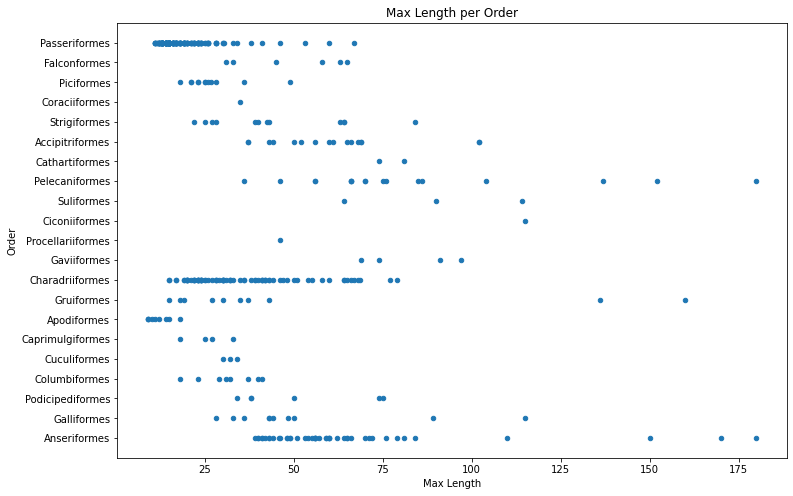
ဒါက ငှက် Order တစ်ခုချင်းစီအတွက် ကိုယ်အရှည်အချိုးအစားကို ယေဘူယျအားဖြင့်မြင်နိုင်စေသော်လည်း၊ အချိုးအစားများကိုမှန်ကန်စွာဖော်ပြရန်အတွက် အကောင်းဆုံးနည်းလမ်းမဟုတ်ပါ။ ဒီအလုပ်ကို Histogram တစ်ခုဖန်တီးခြင်းဖြင့်လုပ်ဆောင်နိုင်ပါသည်။
Histogram များနှင့်အလုပ်လုပ်ခြင်း
Matplotlib သည် Histogram များကိုအသုံးပြု၍ ဒေတာအချိုးအစားကိုမြင်နိုင်စေရန် အလွန်ကောင်းမွန်သောနည်းလမ်းများကိုပေးသည်။ ဒီအမျိုးအစား chart က bar chart တစ်ခုလိုပဲဖြစ်ပြီး၊ bar များ၏တက်ခြင်းနှင့်ကျခြင်းအားဖြင့် အချိုးအစားကိုမြင်နိုင်သည်။ Histogram တစ်ခုဖန်တီးရန် သင်Numeric data လိုအပ်ပါသည်။ Histogram တစ်ခုဖန်တီးရန်၊ chart ကို 'hist' အမျိုးအစားအဖြစ်သတ်မှတ်ပြီး plot လုပ်နိုင်ပါသည်။ ဒီ chart က dataset တစ်ခု၏ MaxBodyMass အချိုးအစားကိုဖော်ပြသည်။ ဒေတာ array ကို bin များသေးငယ်စွာခွဲခြင်းဖြင့်၊ ဒေတာ၏တန်ဖိုးများ၏အချိုးအစားကိုဖော်ပြနိုင်သည်။
birds['MaxBodyMass'].plot(kind = 'hist', bins = 10, figsize = (12,12))
plt.show()

သင်မြင်နိုင်သည့်အတိုင်း၊ ဒီ dataset ရှိငှက် 400+ အများစုသည် Max Body Mass 2000 အောက်တွင်ရှိသည်။ bins parameter ကို 30 အထိမြှင့်တင်ခြင်းဖြင့် ဒေတာအကြောင်းကိုပိုမိုနက်နက်ရှိုင်းရှိုင်းလေ့လာပါ။
birds['MaxBodyMass'].plot(kind = 'hist', bins = 30, figsize = (12,12))
plt.show()

ဒီ chart ကပိုမိုအသေးစိတ်အချိုးအစားကိုဖော်ပြသည်။ left ကိုပိုမို skewed မဖြစ်သော chart တစ်ခုဖန်တီးရန်၊ သတ်မှတ်ထားသော range အတွင်းရှိဒေတာကိုသာရွေးချယ်ပါ။
ကိုယ်အလေးချိန် 60 အောက်ရှိငှက်များကို filter လုပ်ပြီး၊ 40 bins ကိုပြပါ။
filteredBirds = birds[(birds['MaxBodyMass'] > 1) & (birds['MaxBodyMass'] < 60)]
filteredBirds['MaxBodyMass'].plot(kind = 'hist',bins = 40,figsize = (12,12))
plt.show()

✅ အခြား filter များနှင့် data point များကိုစမ်းကြည့်ပါ။ ဒေတာ၏အချိုးအစားအပြည့်အစုံကိုမြင်ရန် ['MaxBodyMass'] filter ကိုဖယ်ရှားပြီး labeled distributions ကိုပြပါ။
Histogram တွင်အရောင်နှင့် label များကိုတိုးတက်စေရန်အဆင်ပြေသော enhancement များလည်းရှိသည်။
2D histogram တစ်ခုဖန်တီးပြီး အချိုးအစားနှစ်ခုအကြားဆက်နွယ်မှုကိုနှိုင်းယှဉ်ပါ။ MaxBodyMass နှင့် MaxLength ကိုနှိုင်းယှဉ်ကြည့်ပါ။ Matplotlib သည် အလင်းရောင်ပိုမိုတောက်ပသောအရောင်များကိုအသုံးပြု၍ ဆက်စပ်မှုကိုဖော်ပြရန် built-in နည်းလမ်းကိုပေးသည်။
x = filteredBirds['MaxBodyMass']
y = filteredBirds['MaxLength']

fig, ax = plt.subplots(tight_layout=True)
hist = ax.hist2d(x, y)
တစ်ခုတည်းသော axis တစ်ခုတစ်လျှောက်တွင် မျှော်လင့်ထားသော correlation တစ်ခုရှိသည့်အပြင်၊ convergence အားကောင်းသော point တစ်ခုလည်းရှိသည်။

Histogram များသည် Numeric data အတွက် default အနေဖြင့်ကောင်းမွန်စွာအလုပ်လုပ်သည်။ Text data အရေအတွက်အချိုးအစားကိုမြင်ရန်လိုအပ်ပါက ဘာလုပ်ရမလဲ?
Text data ကိုအသုံးပြု၍ dataset ကိုလေ့လာခြင်း
ဒီ dataset တွင် ငှက်အမျိုးအစား၊ genus, species, family နှင့် conservation status အကြောင်းအချက်များလည်းပါဝင်သည်။ ဒီ conservation အချက်အလက်ကိုရှာဖွေကြည့်ရအောင်။ ငှက်များကို conservation status အရဘယ်လိုအချိုးအစားဖြင့်ခွဲထားသလဲ?
✅ Dataset တွင် conservation status ကိုဖော်ပြရန် အတိုကောက်များစွာအသုံးပြုထားသည်။ ဒီအတိုကောက်များသည် IUCN Red List Categories မှရရှိပြီး၊ species များ၏အခြေအနေကို catalog လုပ်ထားသောအဖွဲ့အစည်းဖြစ်သည်။
- CR: အလွန်အန္တရာယ်ရှိသော
- EN: အန္တရာယ်ရှိသော
- EX: မျိုးတုံးသွားသော
- LC: အနည်းဆုံးအန္တရာယ်ရှိသော
- NT: အနီးကပ်အန္တရာယ်ရှိသော
- VU: အန္တရာယ်ရှိနိုင်သော
ဒီအတိုကောက်များသည် text-based values ဖြစ်သောကြောင့် histogram ဖန်တီးရန် transform လုပ်ရန်လိုအပ်ပါသည်။ filteredBirds dataframe ကိုအသုံးပြု၍၊ conservation status ကို Minimum Wingspan နှင့်အတူပြပါ။ သင်ဘာတွေမြင်ရလဲ?
x1 = filteredBirds.loc[filteredBirds.ConservationStatus=='EX', 'MinWingspan']
x2 = filteredBirds.loc[filteredBirds.ConservationStatus=='CR', 'MinWingspan']
x3 = filteredBirds.loc[filteredBirds.ConservationStatus=='EN', 'MinWingspan']
x4 = filteredBirds.loc[filteredBirds.ConservationStatus=='NT', 'MinWingspan']
x5 = filteredBirds.loc[filteredBirds.ConservationStatus=='VU', 'MinWingspan']
x6 = filteredBirds.loc[filteredBirds.ConservationStatus=='LC', 'MinWingspan']

kwargs = dict(alpha=0.5, bins=20)

plt.hist(x1, **kwargs, color='red', label='Extinct')
plt.hist(x2, **kwargs, color='orange', label='Critically Endangered')
plt.hist(x3, **kwargs, color='yellow', label='Endangered')
plt.hist(x4, **kwargs, color='green', label='Near Threatened')
plt.hist(x5, **kwargs, color='blue', label='Vulnerable')
plt.hist(x6, **kwargs, color='gray', label='Least Concern')

plt.gca().set(title='Conservation Status', ylabel='Min Wingspan')
plt.legend();

Minimum Wingspan နှင့် conservation status အကြား correlation ကောင်းမွန်သောအချက်အလက်မရှိသလိုပဲ။ ဒီနည်းလမ်းကိုအသုံးပြု၍ dataset ရှိအခြား element များကိုစမ်းကြည့်ပါ။ အခြား filter များကိုလည်းစမ်းကြည့်ပါ။ သင် correlation တစ်ခုရှာဖွေတွေ့ရှိပါသလား?
Density plots
သင်မိမိကြည့်ခဲ့သော histogram များသည် 'stepped' ဖြစ်ပြီး arc တစ်ခုအနေဖြင့်ချောမွေ့စွာမရောက်ရှိကြောင်းသတိထားမိနိုင်ပါသည်။ ချောမွေ့သော density chart ကိုဖော်ပြရန် density plot ကိုစမ်းကြည့်နိုင်သည်။
Density plots နှင့်အလုပ်လုပ်ရန်၊ plotting library အသစ်တစ်ခုဖြစ်သော Seaborn ကိုလေ့လာပါ။
Seaborn ကို load လုပ်ပြီး၊ basic density plot တစ်ခုစမ်းကြည့်ပါ။
import seaborn as sns
import matplotlib.pyplot as plt
sns.kdeplot(filteredBirds['MinWingspan'])
plt.show()
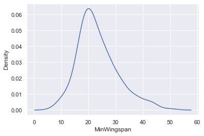
သင်မြင်နိုင်သည့်အတိုင်း၊ Minimum Wingspan data အတွက် ယခင် chart ကို echo လုပ်သလိုပဲဖြစ်သည်။ ဒါပေမယ့်ပိုချောမွေ့သည်။ Seaborn ၏ documentation အရ၊ "Histogram နှင့်နှိုင်းယှဉ်ပါက၊ KDE သည် ပိုမိုရှင်းလင်းပြီး၊ အဓိပ္ပါယ်ရှိသော plot တစ်ခုကိုဖန်တီးနိုင်သည်။ အထူးသဖြင့် distribution များစွာကိုဆွဲဆောင်သောအခါတွင်။ သို့သော်၊ underlying distribution bounded သို့မဟုတ် smooth မဖြစ်ပါက distortion များကိုဖြစ်စေနိုင်သည်။ Histogram တစ်ခုလိုပဲ၊ representation ၏အရည်အသွေးသည် smoothing parameters ကောင်းမွန်စွာရွေးချယ်မှုအပေါ်မူတည်သည်။" source အဆိုအရ၊ outliers များသည်အမြဲတမ်း chart များကိုမကောင်းစေမည်ဖြစ်သည်။
ယခင် chart တွင်ရှိသော jagged MaxBodyMass line ကိုပြန်လည်လေ့လာလိုပါက၊ ဒီနည်းလမ်းကိုအသုံးပြု၍ အလွန်ချောမွေ့စွာပြန်လည်ဖန်တီးနိုင်သည်။
sns.kdeplot(filteredBirds['MaxBodyMass'])
plt.show()

ချောမွေ့သော၊ သို့သော်အလွန်ချောမွေ့မဟုတ်သော line တစ်ခုလိုချင်ပါက bw_adjust parameter ကို edit လုပ်ပါ။
sns.kdeplot(filteredBirds['MaxBodyMass'], bw_adjust=.2)
plt.show()

✅ ဒီအမျိုးအစား plot အတွက်ရရှိနိုင်သော parameters များအကြောင်းဖတ်ရှုပြီး စမ်းကြည့်ပါ။
ဒီအမျိုးအစား chart သည် ရှင်းလင်းသော visualizations များကိုအလှပဆုံးဖော်ပြပေးသည်။ ဥပမာအားဖြင့်၊ ငှက် Order တစ်ခုချင်းစီအတွက် max body mass density ကိုဖော်ပြရန် code အချို့သာရေးလိုက်ရုံဖြင့်ပြနိုင်သည်။
sns.kdeplot(
   data=filteredBirds, x="MaxBodyMass", hue="Order",
   fill=True, common_norm=False, palette="crest",
   alpha=.5, linewidth=0,
)

Variable များစွာ၏ density ကို chart တစ်ခုထဲတွင် map လုပ်နိုင်သည်။ Conservation status နှင့်နှိုင်းယှဉ်ပြီး ငှက်၏ MaxLength နှင့် MinLength ကိုစမ်းကြည့်ပါ။
sns.kdeplot(data=filteredBirds, x="MinLength", y="MaxLength", hue="ConservationStatus")

'Vulnerable' status ရှိငှက်များ၏ length အချိုးအစားအပေါ် cluster တစ်ခုရှိသည်မှာ အဓိပ္ပါယ်ရှိမရှိကိုလေ့လာရန်တန်ဖိုးရှိနိုင်သည်။
🚀 စိန်ခေါ်မှု
Histogram များသည် scatterplots, bar charts, သို့မဟုတ် line charts များထက်ပိုမိုရှုပ်ထွေးသော chart အမျိုးအစားဖြစ်သည်။ Histogram များကိုအသုံးပြုသောကောင်းမွန်သောဥပမာများကိုအင်တာနက်တွင်ရှာဖွေပါ။ Histogram များကိုဘယ်လိုအသုံးပြုကြသည်၊ ဘာကိုဖော်ပြနိုင်သည်၊ ဘယ်လောကများတွင်အသုံးပြုလေ့ရှိသည်ဆိုတာကိုလေ့လာပါ။
Post-lecture quiz
ပြန်လည်သုံးသပ်ခြင်းနှင့် ကိုယ်တိုင်လေ့လာခြင်း
ဒီသင်ခန်းစာတွင်၊ သင်သည် Matplotlib ကိုအသုံးပြုခဲ့ပြီး Seaborn ကိုစတင်အသုံးပြုကာ ပိုမိုရှုပ်ထွေးသော chart များကိုဖော်ပြခဲ့သည်။ Seaborn ၏ kdeplot အကြောင်းလေ့လာပါ၊ "continuous probability density curve in one or more dimensions" ဖြစ်သည်။ documentation ကိုဖတ်ရှုပြီး၊ ၎င်းအလုပ်လုပ်ပုံကိုနားလည်ပါ။
လုပ်ငန်း
သင်၏ကျွမ်းကျင်မှုများကိုအသုံးပြုပါ
အကြောင်းကြားချက်:
ဤစာရွက်စာတမ်းကို AI ဘာသာပြန်ဝန်ဆောင်မှု Co-op Translator ကို အသုံးပြု၍ ဘာသာပြန်ထားပါသည်။ ကျွန်ုပ်တို့သည် တိကျမှုအတွက် ကြိုးစားနေသော်လည်း၊ အလိုအလျောက် ဘာသာပြန်ခြင်းတွင် အမှားများ သို့မဟုတ် မတိကျမှုများ ပါရှိနိုင်သည်ကို သတိပြုပါ။ မူရင်းဘာသာစကားဖြင့် ရေးသားထားသော စာရွက်စာတမ်းကို အာဏာတရ အရင်းအမြစ်အဖြစ် သတ်မှတ်သင့်ပါသည်။ အရေးကြီးသော အချက်အလက်များအတွက် လူ့ဘာသာပြန်ပညာရှင်များမှ ပရော်ဖက်ရှင်နယ် ဘာသာပြန်ခြင်းကို အကြံပြုပါသည်။ ဤဘာသာပြန်ကို အသုံးပြုခြင်းမှ ဖြစ်ပေါ်လာသော အလွဲအလွတ်များ သို့မဟုတ် အနားလွဲများအတွက် ကျွန်ုပ်တို့သည် တာဝန်မယူပါ။