|
|
3 weeks ago | |
|---|---|---|
| .. | ||
| README.md | 3 weeks ago | |
| assignment.md | 3 weeks ago | |
README.md
Visualizing Relationships: All About Honey 🍯
 |
|---|
| Visualizing Relationships - Sketchnote by @nitya |
Continuing with the nature focus of our research, let's explore fascinating ways to visualize the relationships between different types of honey, based on a dataset from the United States Department of Agriculture.
This dataset, containing around 600 entries, showcases honey production across various U.S. states. For instance, it includes data on the number of colonies, yield per colony, total production, stocks, price per pound, and the value of honey produced in each state from 1998 to 2012, with one row per year for each state.
It would be intriguing to visualize the relationship between a state's annual production and, for example, the price of honey in that state. Alternatively, you could examine the relationship between honey yield per colony across states. This time frame also includes the emergence of the devastating 'CCD' or 'Colony Collapse Disorder' first identified in 2006 (http://npic.orst.edu/envir/ccd.html), making this dataset particularly significant to study. 🐝
Pre-lecture quiz
In this lesson, you can use Seaborn, a library you've worked with before, to effectively visualize relationships between variables. One particularly useful function in Seaborn is relplot, which enables scatter plots and line plots to quickly illustrate 'statistical relationships', helping data scientists better understand how variables interact.
Scatterplots
Use a scatterplot to visualize how the price of honey has changed year over year in each state. Seaborn's relplot conveniently organizes state data and displays data points for both categorical and numeric data.
Let's begin by importing the data and Seaborn:
import pandas as pd
import matplotlib.pyplot as plt
import seaborn as sns
honey = pd.read_csv('../../data/honey.csv')
honey.head()
You'll notice that the honey dataset includes several interesting columns, such as year and price per pound. Let's explore this data, grouped by U.S. state:
| state | numcol | yieldpercol | totalprod | stocks | priceperlb | prodvalue | year |
|---|---|---|---|---|---|---|---|
| AL | 16000 | 71 | 1136000 | 159000 | 0.72 | 818000 | 1998 |
| AZ | 55000 | 60 | 3300000 | 1485000 | 0.64 | 2112000 | 1998 |
| AR | 53000 | 65 | 3445000 | 1688000 | 0.59 | 2033000 | 1998 |
| CA | 450000 | 83 | 37350000 | 12326000 | 0.62 | 23157000 | 1998 |
| CO | 27000 | 72 | 1944000 | 1594000 | 0.7 | 1361000 | 1998 |
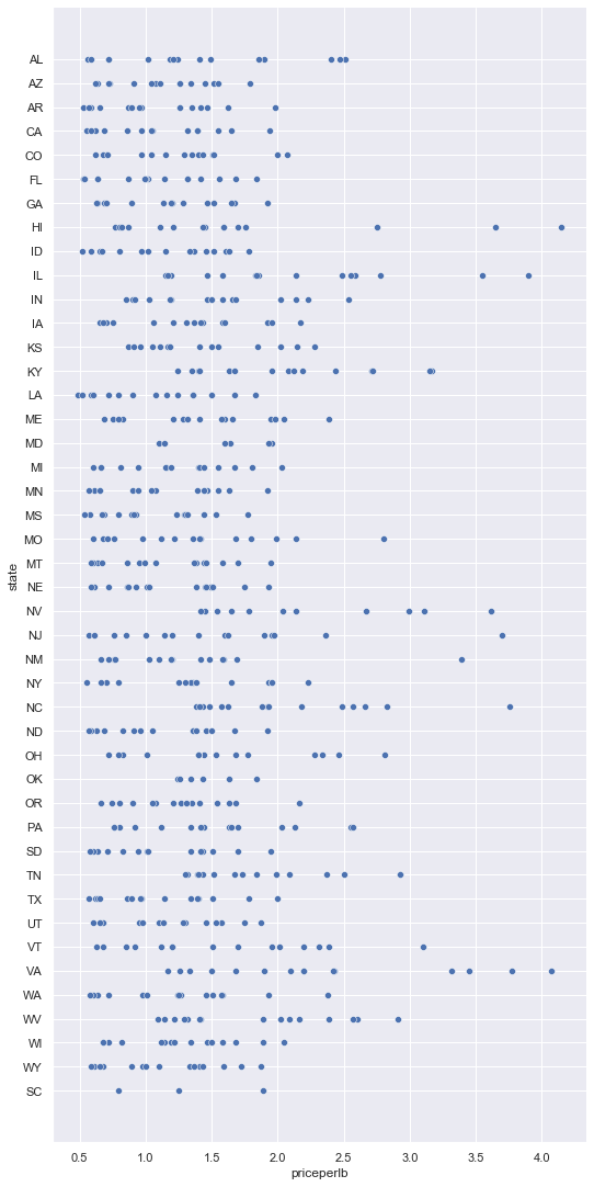
Create a basic scatterplot to show the relationship between the price per pound of honey and its U.S. state of origin. Adjust the y axis to ensure all states are visible:
sns.relplot(x="priceperlb", y="state", data=honey, height=15, aspect=.5);
Next, use a honey-inspired color scheme to illustrate how the price changes over the years. Add a 'hue' parameter to highlight year-over-year variations:
✅ Learn more about the color palettes you can use in Seaborn - try a beautiful rainbow color scheme!
sns.relplot(x="priceperlb", y="state", hue="year", palette="YlOrBr", data=honey, height=15, aspect=.5);
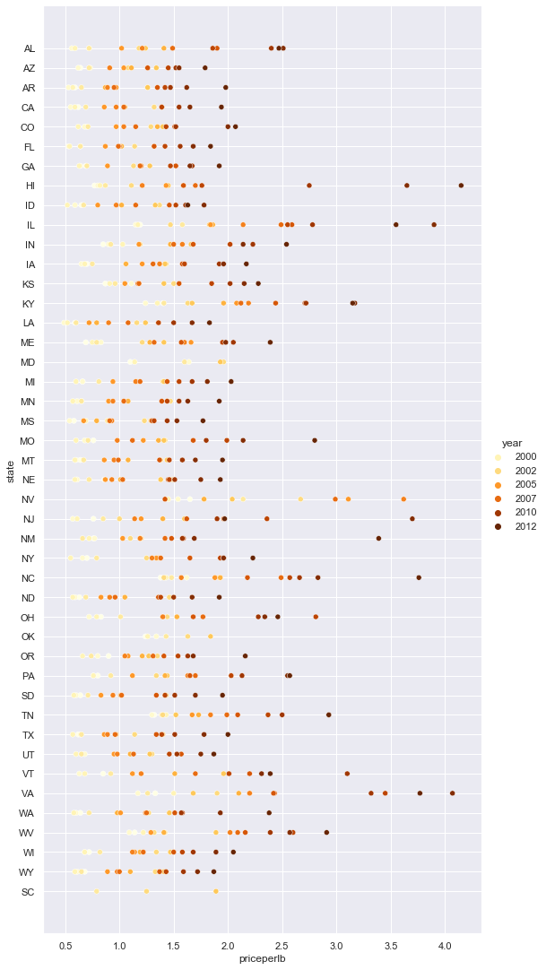
With this color scheme, you can clearly see a strong upward trend in honey prices over the years. If you examine a specific state, such as Arizona, you can observe a consistent pattern of price increases year over year, with only a few exceptions:
| state | numcol | yieldpercol | totalprod | stocks | priceperlb | prodvalue | year |
|---|---|---|---|---|---|---|---|
| AZ | 55000 | 60 | 3300000 | 1485000 | 0.64 | 2112000 | 1998 |
| AZ | 52000 | 62 | 3224000 | 1548000 | 0.62 | 1999000 | 1999 |
| AZ | 40000 | 59 | 2360000 | 1322000 | 0.73 | 1723000 | 2000 |
| AZ | 43000 | 59 | 2537000 | 1142000 | 0.72 | 1827000 | 2001 |
| AZ | 38000 | 63 | 2394000 | 1197000 | 1.08 | 2586000 | 2002 |
| AZ | 35000 | 72 | 2520000 | 983000 | 1.34 | 3377000 | 2003 |
| AZ | 32000 | 55 | 1760000 | 774000 | 1.11 | 1954000 | 2004 |
| AZ | 36000 | 50 | 1800000 | 720000 | 1.04 | 1872000 | 2005 |
| AZ | 30000 | 65 | 1950000 | 839000 | 0.91 | 1775000 | 2006 |
| AZ | 30000 | 64 | 1920000 | 902000 | 1.26 | 2419000 | 2007 |
| AZ | 25000 | 64 | 1600000 | 336000 | 1.26 | 2016000 | 2008 |
| AZ | 20000 | 52 | 1040000 | 562000 | 1.45 | 1508000 | 2009 |
| AZ | 24000 | 77 | 1848000 | 665000 | 1.52 | 2809000 | 2010 |
| AZ | 23000 | 53 | 1219000 | 427000 | 1.55 | 1889000 | 2011 |
| AZ | 22000 | 46 | 1012000 | 253000 | 1.79 | 1811000 | 2012 |
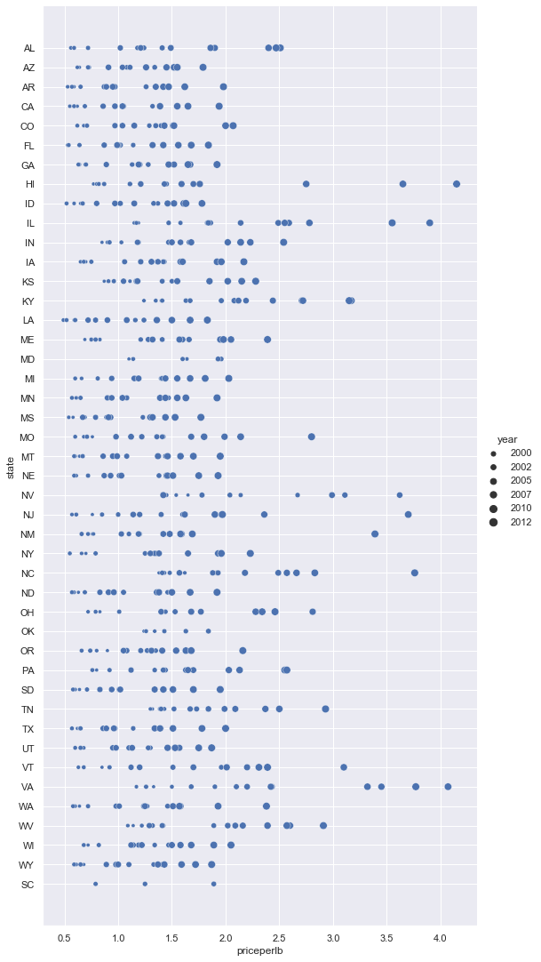
Another way to visualize this trend is by using size instead of color. For colorblind users, this might be a better option. Modify your visualization to represent price increases with larger dot sizes:
sns.relplot(x="priceperlb", y="state", size="year", data=honey, height=15, aspect=.5);
You can observe the dots growing larger over time.
Is this simply a case of supply and demand? Could factors like climate change and colony collapse be reducing honey availability year over year, thereby driving up prices?
To explore correlations between variables in this dataset, let's examine some line charts.
Line charts
Question: Is there a clear upward trend in honey prices per pound year over year? The easiest way to determine this is by creating a single line chart:
sns.relplot(x="year", y="priceperlb", kind="line", data=honey);
Answer: Yes, although there are some exceptions around 2003:
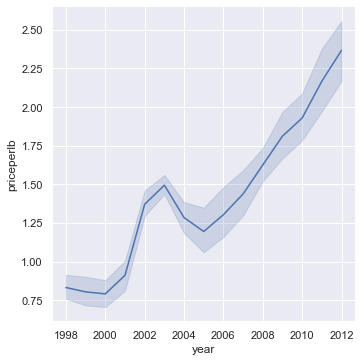
✅ Seaborn aggregates data into one line by plotting the mean and a 95% confidence interval around the mean. Source. You can disable this behavior by adding ci=None.
Question: In 2003, was there also a spike in honey supply? What happens if you examine total production year over year?
sns.relplot(x="year", y="totalprod", kind="line", data=honey);
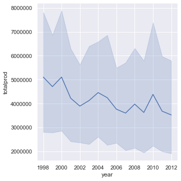
Answer: Not really. Total production appears to have increased in 2003, even though overall honey production has been declining during these years.
Question: In that case, what might have caused the spike in honey prices around 2003?
To investigate further, you can use a facet grid.
Facet grids
Facet grids allow you to focus on one aspect of your dataset (e.g., 'year') and create a plot for each facet using your chosen x and y coordinates. This makes comparisons easier. Does 2003 stand out in this type of visualization?
Create a facet grid using relplot, as recommended by Seaborn's documentation.
sns.relplot(
    data=honey,
    x="yieldpercol", y="numcol",
    col="year",
    col_wrap=3,
    kind="line"
In this visualization, you can compare yield per colony and number of colonies year over year, side by side, with a column wrap set to 3:
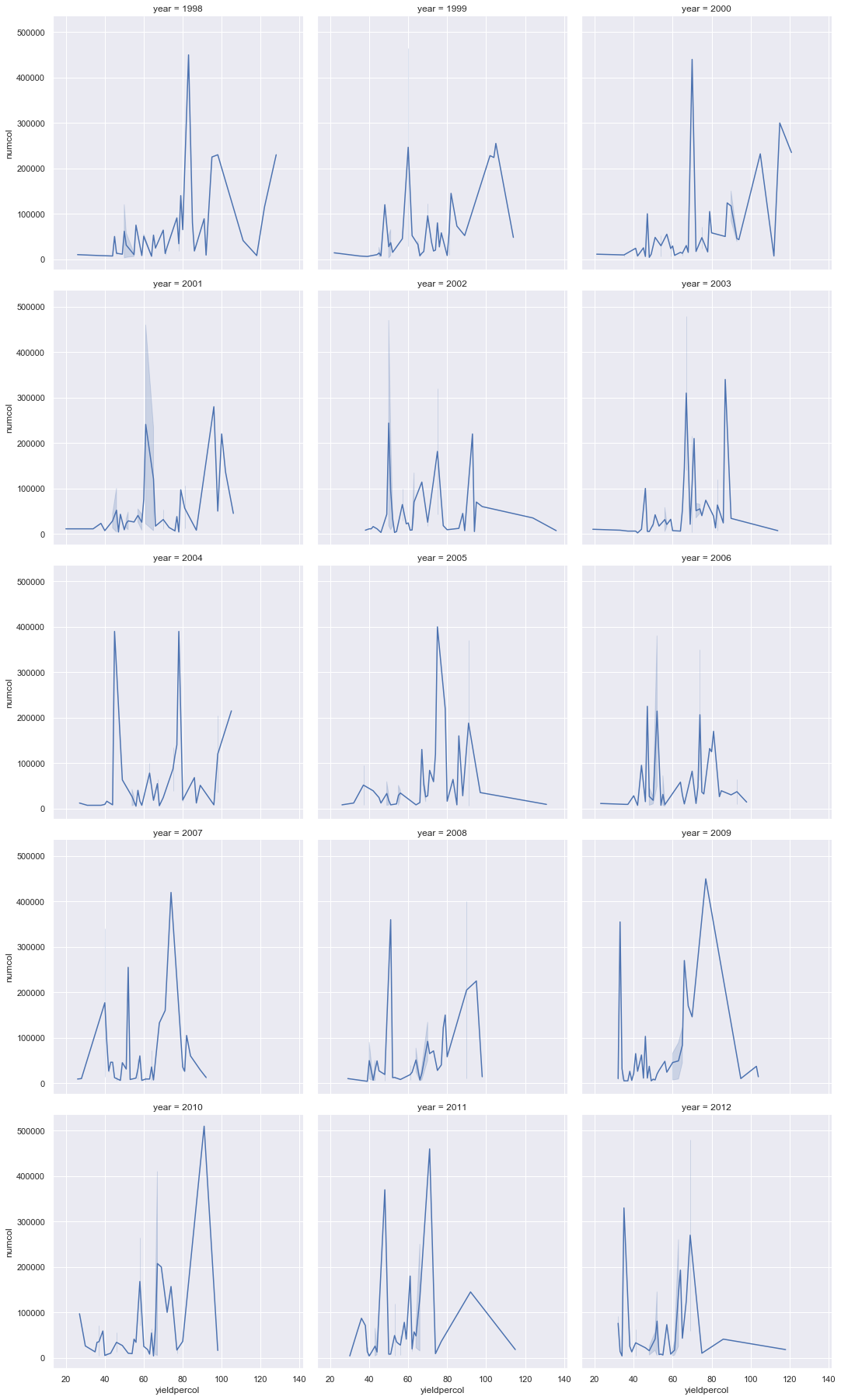
For this dataset, nothing particularly stands out regarding the number of colonies and their yield year over year or state by state. Is there another way to explore correlations between these variables?
Dual-line Plots
Try a multiline plot by overlaying two line plots, using Seaborn's 'despine' to remove the top and right spines, and ax.twinx from Matplotlib. Twinx allows a chart to share the x-axis while displaying two y-axes. Superimpose yield per colony and number of colonies:
fig, ax = plt.subplots(figsize=(12,6))
lineplot = sns.lineplot(x=honey['year'], y=honey['numcol'], data=honey,
                        label = 'Number of bee colonies', legend=False)
sns.despine()
plt.ylabel('# colonies')
plt.title('Honey Production Year over Year');

ax2 = ax.twinx()
lineplot2 = sns.lineplot(x=honey['year'], y=honey['yieldpercol'], ax=ax2, color="r",
                         label ='Yield per colony', legend=False)
sns.despine(right=False)
plt.ylabel('colony yield')
ax.figure.legend();
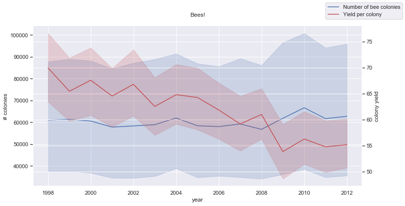
While nothing particularly stands out around 2003, this visualization ends the lesson on a slightly positive note: although the number of colonies is declining overall, it seems to be stabilizing, even if their yield per colony is decreasing.
Go, bees, go!
🐝❤️
🚀 Challenge
In this lesson, you learned more about scatterplots and line grids, including facet grids. Challenge yourself to create a facet grid using a different dataset, perhaps one you've used in previous lessons. Note how long it takes to generate and consider how many grids are practical to draw using these techniques.
Post-lecture quiz
Review & Self Study
Line plots can range from simple to complex. Spend some time reading the Seaborn documentation to learn about the various ways to build them. Try enhancing the line charts you created in this lesson using methods described in the documentation.
Assignment
Disclaimer:
This document has been translated using the AI translation service Co-op Translator. While we aim for accuracy, please note that automated translations may include errors or inaccuracies. The original document in its native language should be regarded as the authoritative source. For critical information, professional human translation is advised. We are not responsible for any misunderstandings or misinterpretations resulting from the use of this translation.