# A Brief Introduction to Statistics and Probability
| ](../../sketchnotes/04-Statistics-Probability.png)|
|:---:|
| Statistics and Probability - _Sketchnote by [@nitya](https://twitter.com/nitya)_ |
Statistics and Probability Theory are two closely related branches of Mathematics that are highly relevant to Data Science. While it is possible to work with data without a deep understanding of mathematics, it is still beneficial to grasp some basic concepts. Here, we provide a brief introduction to help you get started.
[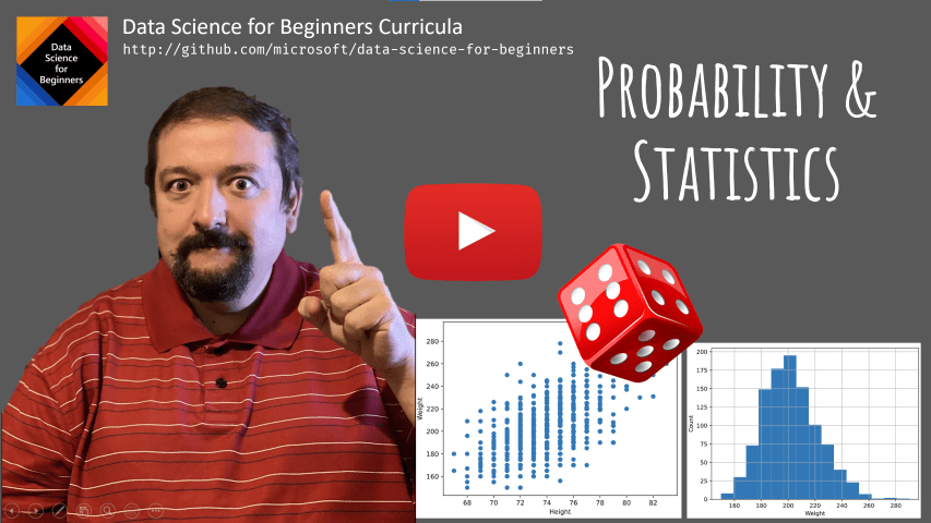](https://youtu.be/Z5Zy85g4Yjw)
## [Pre-lecture quiz](https://purple-hill-04aebfb03.1.azurestaticapps.net/quiz/6)
## Probability and Random Variables
**Probability** is a number between 0 and 1 that indicates how likely an **event** is to occur. It is calculated as the number of favorable outcomes (leading to the event) divided by the total number of possible outcomes, assuming all outcomes are equally likely. For example, when rolling a die, the probability of getting an even number is 3/6 = 0.5.
When discussing events, we use **random variables**. For instance, the random variable representing the number rolled on a die can take values from 1 to 6. This set of numbers (1 to 6) is called the **sample space**. We can calculate the probability of a random variable taking a specific value, such as P(X=3)=1/6.
The random variable in the example above is called **discrete** because its sample space is countable, meaning it consists of distinct values that can be listed. In other cases, the sample space might be a range of real numbers or the entire set of real numbers. Such variables are called **continuous**. A good example is the time a bus arrives.
## Probability Distribution
For discrete random variables, it is straightforward to describe the probability of each event using a function P(X). For every value *s* in the sample space *S*, the function assigns a number between 0 and 1, such that the sum of all P(X=s) values for all events equals 1.
The most well-known discrete distribution is the **uniform distribution**, where the sample space consists of N elements, each with an equal probability of 1/N.
Describing the probability distribution of a continuous variable, which may take values from an interval [a, b] or the entire set of real numbers ℝ, is more complex. Consider the example of bus arrival times. The probability of the bus arriving at an exact time *t* is actually 0!
> Now you know that events with 0 probability can and do happen—every time the bus arrives, for instance!
Instead, we talk about the probability of a variable falling within a specific interval, e.g., P(t1≤X2). In this case, the probability distribution is described by a **probability density function** p(x), such that:
 We also calculate the **inter-quartile range** (IQR=Q3-Q1) and identify **outliers**—values outside the range [Q1-1.5*IQR, Q3+1.5*IQR].
For small, finite distributions, the **mode**—the most frequently occurring value—can be a good "typical" value. This is especially useful for categorical data, such as colors. For example, if two groups of people strongly prefer red and blue, the mean of their preferences (if coded numerically) might fall in the orange-green range, which doesn't represent either group's preference. The mode, however, would correctly identify the most popular colors.
## Real-world Data
When analyzing real-world data, the values are often not random variables in the strict sense, as they are not the result of experiments with unknown outcomes. For example, consider the heights, weights, and ages of a baseball team. These values are not truly random, but we can still apply the same mathematical concepts. For instance, the sequence of players' weights can be treated as samples from a random variable. Below is a sequence of weights from actual Major League Baseball players, taken from [this dataset](http://wiki.stat.ucla.edu/socr/index.php/SOCR_Data_MLB_HeightsWeights) (only the first 20 values are shown):
```
[180.0, 215.0, 210.0, 210.0, 188.0, 176.0, 209.0, 200.0, 231.0, 180.0, 188.0, 180.0, 185.0, 160.0, 180.0, 185.0, 197.0, 189.0, 185.0, 219.0]
```
> **Note**: For an example of working with this dataset, check out the [accompanying notebook](../../../../1-Introduction/04-stats-and-probability/notebook.ipynb). There are also challenges throughout this lesson that you can complete by adding code to the notebook. If you're unsure how to work with data, don't worry—we'll revisit this topic later. If you don't know how to run code in Jupyter Notebook, see [this article](https://soshnikov.com/education/how-to-execute-notebooks-from-github/).
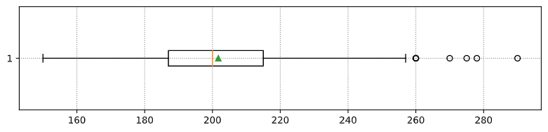
Here is a box plot showing the mean, median, and quartiles for the data:
Since the dataset includes player **roles**, we can create a box plot by role to see how the values differ across roles. This time, we'll consider height:
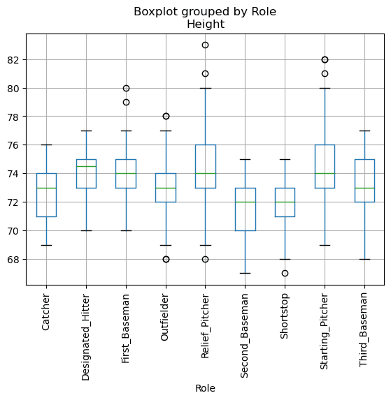
This diagram suggests that, on average, first basemen are taller than second basemen. Later in this lesson, we'll learn how to formally test this hypothesis and determine whether the data is statistically significant.
> When working with real-world data, we assume that all data points are samples drawn from some probability distribution. This assumption allows us to apply machine learning techniques and build predictive models.
To visualize the data distribution, we can create a **histogram**. The X-axis represents weight intervals (or **bins**), and the Y-axis shows the frequency of values within each interval.
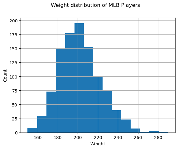
From this histogram, we see that most values cluster around a certain mean weight, with fewer values as we move further from the mean. This indicates that extreme weights are less likely. The variance shows how much the weights deviate from the mean.
> If we analyzed weights from a different population (e.g., university students), the distribution might differ in mean and variance, but the overall shape would remain similar. However, a model trained on baseball players might perform poorly on students due to differences in the underlying distribution.
## Normal Distribution
The weight distribution we observed is typical of many real-world measurements, which often follow a similar pattern but with different means and variances. This pattern is called the **normal distribution**, and it plays a crucial role in statistics.
To simulate random weights for potential baseball players, we can use the normal distribution. Given the mean weight `mean` and standard deviation `std`, we can generate 1000 weight samples as follows:
```python
samples = np.random.normal(mean,std,1000)
```
If we plot a histogram of the generated samples, it will resemble the earlier histogram. By increasing the number of samples and bins, we can create a graph that closely approximates the ideal normal distribution:
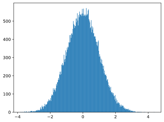
*Normal Distribution with mean=0 and std.dev=1*
## Confidence Intervals
When analyzing baseball players' weights, we assume there is a **random variable W** representing the ideal probability distribution of all players' weights (the **population**). Our dataset represents a subset of players, or a **sample**. A key question is whether we can determine the population's distribution parameters, such as mean and variance.
The simplest approach is to calculate the sample's mean and variance. However, the sample may not perfectly represent the population. This is where **confidence intervals** come into play.
> **Confidence interval** is the estimation of the true mean of the population based on our sample, with a certain probability (or **level of confidence**) of being accurate.
Suppose we have a sample X1, ..., Xn from our distribution. Each time we draw a sample from our distribution, we would end up with a different mean value μ. Thus, μ can be considered a random variable. A **confidence interval** with confidence p is a pair of values (Lp,Rp), such that **P**(Lp≤μ≤Rp) = p, i.e., the probability of the measured mean value falling within the interval equals p.
It goes beyond our brief introduction to discuss in detail how these confidence intervals are calculated. More details can be found [on Wikipedia](https://en.wikipedia.org/wiki/Confidence_interval). In short, we define the distribution of the computed sample mean relative to the true mean of the population, which is called the **Student's t-distribution**.
> **Interesting fact**: The Student's t-distribution is named after mathematician William Sealy Gosset, who published his paper under the pseudonym "Student." He worked at the Guinness brewery, and, according to one version, his employer did not want the general public to know they were using statistical tests to determine the quality of raw materials.
If we want to estimate the mean μ of our population with confidence p, we need to take the *(1-p)/2-th percentile* of a Student's t-distribution A, which can either be taken from tables or computed using built-in functions in statistical software (e.g., Python, R, etc.). Then the interval for μ would be given by X±A*D/√n, where X is the obtained mean of the sample, and D is the standard deviation.
> **Note**: We are also omitting the discussion of an important concept called [degrees of freedom](https://en.wikipedia.org/wiki/Degrees_of_freedom_(statistics)), which is relevant to the Student's t-distribution. You can refer to more comprehensive books on statistics to understand this concept in depth.
An example of calculating confidence intervals for weights and heights is provided in the [accompanying notebooks](../../../../1-Introduction/04-stats-and-probability/notebook.ipynb).
| p | Weight mean |
|------|---------------|
| 0.85 | 201.73±0.94 |
| 0.90 | 201.73±1.08 |
| 0.95 | 201.73±1.28 |
Notice that the higher the confidence probability, the wider the confidence interval.
## Hypothesis Testing
In our baseball players dataset, there are different player roles, which can be summarized below (refer to the [accompanying notebook](../../../../1-Introduction/04-stats-and-probability/notebook.ipynb) to see how this table was calculated):
| Role | Height | Weight | Count |
|-------------------|------------|------------|-------|
| Catcher | 72.723684 | 204.328947 | 76 |
| Designated_Hitter | 74.222222 | 220.888889 | 18 |
| First_Baseman | 74.000000 | 213.109091 | 55 |
| Outfielder | 73.010309 | 199.113402 | 194 |
| Relief_Pitcher | 74.374603 | 203.517460 | 315 |
| Second_Baseman | 71.362069 | 184.344828 | 58 |
| Shortstop | 71.903846 | 182.923077 | 52 |
| Starting_Pitcher | 74.719457 | 205.163636 | 221 |
| Third_Baseman | 73.044444 | 200.955556 | 45 |
We can observe that the mean height of first basemen is greater than that of second basemen. Thus, we might be tempted to conclude that **first basemen are taller than second basemen**.
> This statement is called **a hypothesis**, because we do not know whether the fact is actually true or not.
However, it is not always obvious whether we can make this conclusion. From the discussion above, we know that each mean has an associated confidence interval, and thus this difference could just be a statistical error. We need a more formal way to test our hypothesis.
Let's compute confidence intervals separately for the heights of first and second basemen:
| Confidence | First Basemen | Second Basemen |
|------------|-----------------|-----------------|
| 0.85 | 73.62..74.38 | 71.04..71.69 |
| 0.90 | 73.56..74.44 | 70.99..71.73 |
| 0.95 | 73.47..74.53 | 70.92..71.81 |
We can see that under no confidence level do the intervals overlap. This proves our hypothesis that first basemen are taller than second basemen.
More formally, the problem we are solving is to determine if **two probability distributions are the same**, or at least have the same parameters. Depending on the distribution, we need to use different tests for this. If we know that our distributions are normal, we can apply the **[Student's t-test](https://en.wikipedia.org/wiki/Student%27s_t-test)**.
In the Student's t-test, we compute the so-called **t-value**, which indicates the difference between means, taking into account the variance. It has been shown that the t-value follows the **Student's t-distribution**, which allows us to get the threshold value for a given confidence level **p** (this can be computed or looked up in numerical tables). We then compare the t-value to this threshold to accept or reject the hypothesis.
In Python, we can use the **SciPy** package, which includes the `ttest_ind` function (along with many other useful statistical functions!). This function computes the t-value for us and also performs the reverse lookup of the confidence p-value, so we can simply look at the confidence to draw a conclusion.
For example, our comparison between the heights of first and second basemen gives us the following results:
```python
from scipy.stats import ttest_ind
tval, pval = ttest_ind(df.loc[df['Role']=='First_Baseman',['Height']], df.loc[df['Role']=='Designated_Hitter',['Height']],equal_var=False)
print(f"T-value = {tval[0]:.2f}\nP-value: {pval[0]}")
```
```
T-value = 7.65
P-value: 9.137321189738925e-12
```
In our case, the p-value is very low, meaning there is strong evidence supporting that first basemen are taller.
There are also other types of hypotheses we might want to test, for example:
* To prove that a given sample follows a specific distribution. In our case, we assumed that heights are normally distributed, but this needs formal statistical verification.
* To prove that the mean value of a sample corresponds to some predefined value.
* To compare the means of multiple samples (e.g., differences in happiness levels among different age groups).
## Law of Large Numbers and Central Limit Theorem
One of the reasons why the normal distribution is so important is the **central limit theorem**. Suppose we have a large sample of independent N values X1, ..., XN, sampled from any distribution with mean μ and variance σ2. Then, for sufficiently large N (in other words, as N→∞), the mean ΣiXi will be normally distributed, with mean μ and variance σ2/N.
> Another way to interpret the central limit theorem is to say that regardless of the original distribution, when you compute the mean of a sum of random variable values, you end up with a normal distribution.
From the central limit theorem, it also follows that as N→∞, the probability of the sample mean being equal to μ becomes 1. This is known as **the law of large numbers**.
## Covariance and Correlation
One of the tasks in Data Science is finding relationships between data. We say that two sequences **correlate** when they exhibit similar behavior at the same time, i.e., they either rise/fall simultaneously, or one sequence rises when the other falls and vice versa. In other words, there seems to be some relationship between the two sequences.
> Correlation does not necessarily indicate a causal relationship between two sequences; sometimes both variables can depend on an external cause, or it can be purely by chance that the two sequences correlate. However, strong mathematical correlation is a good indication that two variables are somehow connected.
Mathematically, the main concept that shows the relationship between two random variables is **covariance**, which is computed as: Cov(X,Y) = **E**\[(X-**E**(X))(Y-**E**(Y))\]. We compute the deviation of both variables from their mean values, and then take the product of those deviations. If both variables deviate together, the product will always be positive, resulting in positive covariance. If both variables deviate out-of-sync (i.e., one falls below average when the other rises above average), we will always get negative numbers, resulting in negative covariance. If the deviations are independent, they will sum to roughly zero.
The absolute value of covariance does not tell us much about the strength of the correlation, as it depends on the magnitude of the actual values. To normalize it, we can divide covariance by the standard deviation of both variables to get **correlation**. The advantage of correlation is that it is always in the range [-1,1], where 1 indicates strong positive correlation, -1 indicates strong negative correlation, and 0 indicates no correlation at all (variables are independent).
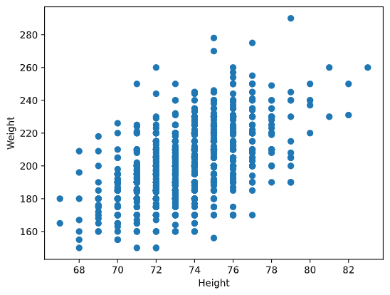
**Example**: We can compute the correlation between the weights and heights of baseball players from the dataset mentioned above:
```python
print(np.corrcoef(weights,heights))
```
As a result, we get a **correlation matrix** like this one:
```
array([[1. , 0.52959196],
[0.52959196, 1. ]])
```
> A correlation matrix C can be computed for any number of input sequences S1, ..., Sn. The value of Cij is the correlation between Si and Sj, and diagonal elements are always 1 (which represents the self-correlation of Si).
In our case, the value 0.53 indicates that there is some correlation between a person's weight and height. We can also create a scatter plot of one value against the other to visualize the relationship:
> More examples of correlation and covariance can be found in the [accompanying notebook](../../../../1-Introduction/04-stats-and-probability/notebook.ipynb).
## Conclusion
In this section, we have learned:
* Basic statistical properties of data, such as mean, variance, mode, and quartiles.
* Different distributions of random variables, including the normal distribution.
* How to find correlations between different properties.
* How to use mathematical and statistical tools to prove hypotheses.
* How to compute confidence intervals for random variables given a data sample.
While this is not an exhaustive list of topics in probability and statistics, it should provide a solid foundation for this course.
## 🚀 Challenge
Use the sample code in the notebook to test the following hypotheses:
1. First basemen are older than second basemen.
2. First basemen are taller than third basemen.
3. Shortstops are taller than second basemen.
## [Post-lecture quiz](https://purple-hill-04aebfb03.1.azurestaticapps.net/quiz/7)
## Review & Self Study
Probability and statistics is such a broad topic that it deserves its own course. If you are interested in diving deeper into the theory, you may want to explore the following resources:
1. [Carlos Fernandez-Granda](https://cims.nyu.edu/~cfgranda/) from New York University has excellent lecture notes: [Probability and Statistics for Data Science](https://cims.nyu.edu/~cfgranda/pages/stuff/probability_stats_for_DS.pdf) (available online).
2. [Peter and Andrew Bruce. Practical Statistics for Data Scientists.](https://www.oreilly.com/library/view/practical-statistics-for/9781491952955/) [[Sample code in R](https://github.com/andrewgbruce/statistics-for-data-scientists)].
3. [James D. Miller. Statistics for Data Science](https://www.packtpub.com/product/statistics-for-data-science/9781788290678) [[Sample code in R](https://github.com/PacktPublishing/Statistics-for-Data-Science)].
## Assignment
[Small Diabetes Study](assignment.md)
## Credits
This lesson was authored with ♥️ by [Dmitry Soshnikov](http://soshnikov.com)
---
**Disclaimer**:
This document has been translated using the AI translation service [Co-op Translator](https://github.com/Azure/co-op-translator). While we aim for accuracy, please note that automated translations may include errors or inaccuracies. The original document in its native language should be regarded as the authoritative source. For critical information, professional human translation is advised. We are not responsible for any misunderstandings or misinterpretations resulting from the use of this translation.
We also calculate the **inter-quartile range** (IQR=Q3-Q1) and identify **outliers**—values outside the range [Q1-1.5*IQR, Q3+1.5*IQR].
For small, finite distributions, the **mode**—the most frequently occurring value—can be a good "typical" value. This is especially useful for categorical data, such as colors. For example, if two groups of people strongly prefer red and blue, the mean of their preferences (if coded numerically) might fall in the orange-green range, which doesn't represent either group's preference. The mode, however, would correctly identify the most popular colors.
## Real-world Data
When analyzing real-world data, the values are often not random variables in the strict sense, as they are not the result of experiments with unknown outcomes. For example, consider the heights, weights, and ages of a baseball team. These values are not truly random, but we can still apply the same mathematical concepts. For instance, the sequence of players' weights can be treated as samples from a random variable. Below is a sequence of weights from actual Major League Baseball players, taken from [this dataset](http://wiki.stat.ucla.edu/socr/index.php/SOCR_Data_MLB_HeightsWeights) (only the first 20 values are shown):
```
[180.0, 215.0, 210.0, 210.0, 188.0, 176.0, 209.0, 200.0, 231.0, 180.0, 188.0, 180.0, 185.0, 160.0, 180.0, 185.0, 197.0, 189.0, 185.0, 219.0]
```
> **Note**: For an example of working with this dataset, check out the [accompanying notebook](../../../../1-Introduction/04-stats-and-probability/notebook.ipynb). There are also challenges throughout this lesson that you can complete by adding code to the notebook. If you're unsure how to work with data, don't worry—we'll revisit this topic later. If you don't know how to run code in Jupyter Notebook, see [this article](https://soshnikov.com/education/how-to-execute-notebooks-from-github/).
Here is a box plot showing the mean, median, and quartiles for the data:

Since the dataset includes player **roles**, we can create a box plot by role to see how the values differ across roles. This time, we'll consider height:

This diagram suggests that, on average, first basemen are taller than second basemen. Later in this lesson, we'll learn how to formally test this hypothesis and determine whether the data is statistically significant.
> When working with real-world data, we assume that all data points are samples drawn from some probability distribution. This assumption allows us to apply machine learning techniques and build predictive models.
To visualize the data distribution, we can create a **histogram**. The X-axis represents weight intervals (or **bins**), and the Y-axis shows the frequency of values within each interval.

From this histogram, we see that most values cluster around a certain mean weight, with fewer values as we move further from the mean. This indicates that extreme weights are less likely. The variance shows how much the weights deviate from the mean.
> If we analyzed weights from a different population (e.g., university students), the distribution might differ in mean and variance, but the overall shape would remain similar. However, a model trained on baseball players might perform poorly on students due to differences in the underlying distribution.
## Normal Distribution
The weight distribution we observed is typical of many real-world measurements, which often follow a similar pattern but with different means and variances. This pattern is called the **normal distribution**, and it plays a crucial role in statistics.
To simulate random weights for potential baseball players, we can use the normal distribution. Given the mean weight `mean` and standard deviation `std`, we can generate 1000 weight samples as follows:
```python
samples = np.random.normal(mean,std,1000)
```
If we plot a histogram of the generated samples, it will resemble the earlier histogram. By increasing the number of samples and bins, we can create a graph that closely approximates the ideal normal distribution:

*Normal Distribution with mean=0 and std.dev=1*
## Confidence Intervals
When analyzing baseball players' weights, we assume there is a **random variable W** representing the ideal probability distribution of all players' weights (the **population**). Our dataset represents a subset of players, or a **sample**. A key question is whether we can determine the population's distribution parameters, such as mean and variance.
The simplest approach is to calculate the sample's mean and variance. However, the sample may not perfectly represent the population. This is where **confidence intervals** come into play.
> **Confidence interval** is the estimation of the true mean of the population based on our sample, with a certain probability (or **level of confidence**) of being accurate.
Suppose we have a sample X1, ..., Xn from our distribution. Each time we draw a sample from our distribution, we would end up with a different mean value μ. Thus, μ can be considered a random variable. A **confidence interval** with confidence p is a pair of values (Lp,Rp), such that **P**(Lp≤μ≤Rp) = p, i.e., the probability of the measured mean value falling within the interval equals p.
It goes beyond our brief introduction to discuss in detail how these confidence intervals are calculated. More details can be found [on Wikipedia](https://en.wikipedia.org/wiki/Confidence_interval). In short, we define the distribution of the computed sample mean relative to the true mean of the population, which is called the **Student's t-distribution**.
> **Interesting fact**: The Student's t-distribution is named after mathematician William Sealy Gosset, who published his paper under the pseudonym "Student." He worked at the Guinness brewery, and, according to one version, his employer did not want the general public to know they were using statistical tests to determine the quality of raw materials.
If we want to estimate the mean μ of our population with confidence p, we need to take the *(1-p)/2-th percentile* of a Student's t-distribution A, which can either be taken from tables or computed using built-in functions in statistical software (e.g., Python, R, etc.). Then the interval for μ would be given by X±A*D/√n, where X is the obtained mean of the sample, and D is the standard deviation.
> **Note**: We are also omitting the discussion of an important concept called [degrees of freedom](https://en.wikipedia.org/wiki/Degrees_of_freedom_(statistics)), which is relevant to the Student's t-distribution. You can refer to more comprehensive books on statistics to understand this concept in depth.
An example of calculating confidence intervals for weights and heights is provided in the [accompanying notebooks](../../../../1-Introduction/04-stats-and-probability/notebook.ipynb).
| p | Weight mean |
|------|---------------|
| 0.85 | 201.73±0.94 |
| 0.90 | 201.73±1.08 |
| 0.95 | 201.73±1.28 |
Notice that the higher the confidence probability, the wider the confidence interval.
## Hypothesis Testing
In our baseball players dataset, there are different player roles, which can be summarized below (refer to the [accompanying notebook](../../../../1-Introduction/04-stats-and-probability/notebook.ipynb) to see how this table was calculated):
| Role | Height | Weight | Count |
|-------------------|------------|------------|-------|
| Catcher | 72.723684 | 204.328947 | 76 |
| Designated_Hitter | 74.222222 | 220.888889 | 18 |
| First_Baseman | 74.000000 | 213.109091 | 55 |
| Outfielder | 73.010309 | 199.113402 | 194 |
| Relief_Pitcher | 74.374603 | 203.517460 | 315 |
| Second_Baseman | 71.362069 | 184.344828 | 58 |
| Shortstop | 71.903846 | 182.923077 | 52 |
| Starting_Pitcher | 74.719457 | 205.163636 | 221 |
| Third_Baseman | 73.044444 | 200.955556 | 45 |
We can observe that the mean height of first basemen is greater than that of second basemen. Thus, we might be tempted to conclude that **first basemen are taller than second basemen**.
> This statement is called **a hypothesis**, because we do not know whether the fact is actually true or not.
However, it is not always obvious whether we can make this conclusion. From the discussion above, we know that each mean has an associated confidence interval, and thus this difference could just be a statistical error. We need a more formal way to test our hypothesis.
Let's compute confidence intervals separately for the heights of first and second basemen:
| Confidence | First Basemen | Second Basemen |
|------------|-----------------|-----------------|
| 0.85 | 73.62..74.38 | 71.04..71.69 |
| 0.90 | 73.56..74.44 | 70.99..71.73 |
| 0.95 | 73.47..74.53 | 70.92..71.81 |
We can see that under no confidence level do the intervals overlap. This proves our hypothesis that first basemen are taller than second basemen.
More formally, the problem we are solving is to determine if **two probability distributions are the same**, or at least have the same parameters. Depending on the distribution, we need to use different tests for this. If we know that our distributions are normal, we can apply the **[Student's t-test](https://en.wikipedia.org/wiki/Student%27s_t-test)**.
In the Student's t-test, we compute the so-called **t-value**, which indicates the difference between means, taking into account the variance. It has been shown that the t-value follows the **Student's t-distribution**, which allows us to get the threshold value for a given confidence level **p** (this can be computed or looked up in numerical tables). We then compare the t-value to this threshold to accept or reject the hypothesis.
In Python, we can use the **SciPy** package, which includes the `ttest_ind` function (along with many other useful statistical functions!). This function computes the t-value for us and also performs the reverse lookup of the confidence p-value, so we can simply look at the confidence to draw a conclusion.
For example, our comparison between the heights of first and second basemen gives us the following results:
```python
from scipy.stats import ttest_ind
tval, pval = ttest_ind(df.loc[df['Role']=='First_Baseman',['Height']], df.loc[df['Role']=='Designated_Hitter',['Height']],equal_var=False)
print(f"T-value = {tval[0]:.2f}\nP-value: {pval[0]}")
```
```
T-value = 7.65
P-value: 9.137321189738925e-12
```
In our case, the p-value is very low, meaning there is strong evidence supporting that first basemen are taller.
There are also other types of hypotheses we might want to test, for example:
* To prove that a given sample follows a specific distribution. In our case, we assumed that heights are normally distributed, but this needs formal statistical verification.
* To prove that the mean value of a sample corresponds to some predefined value.
* To compare the means of multiple samples (e.g., differences in happiness levels among different age groups).
## Law of Large Numbers and Central Limit Theorem
One of the reasons why the normal distribution is so important is the **central limit theorem**. Suppose we have a large sample of independent N values X1, ..., XN, sampled from any distribution with mean μ and variance σ2. Then, for sufficiently large N (in other words, as N→∞), the mean ΣiXi will be normally distributed, with mean μ and variance σ2/N.
> Another way to interpret the central limit theorem is to say that regardless of the original distribution, when you compute the mean of a sum of random variable values, you end up with a normal distribution.
From the central limit theorem, it also follows that as N→∞, the probability of the sample mean being equal to μ becomes 1. This is known as **the law of large numbers**.
## Covariance and Correlation
One of the tasks in Data Science is finding relationships between data. We say that two sequences **correlate** when they exhibit similar behavior at the same time, i.e., they either rise/fall simultaneously, or one sequence rises when the other falls and vice versa. In other words, there seems to be some relationship between the two sequences.
> Correlation does not necessarily indicate a causal relationship between two sequences; sometimes both variables can depend on an external cause, or it can be purely by chance that the two sequences correlate. However, strong mathematical correlation is a good indication that two variables are somehow connected.
Mathematically, the main concept that shows the relationship between two random variables is **covariance**, which is computed as: Cov(X,Y) = **E**\[(X-**E**(X))(Y-**E**(Y))\]. We compute the deviation of both variables from their mean values, and then take the product of those deviations. If both variables deviate together, the product will always be positive, resulting in positive covariance. If both variables deviate out-of-sync (i.e., one falls below average when the other rises above average), we will always get negative numbers, resulting in negative covariance. If the deviations are independent, they will sum to roughly zero.
The absolute value of covariance does not tell us much about the strength of the correlation, as it depends on the magnitude of the actual values. To normalize it, we can divide covariance by the standard deviation of both variables to get **correlation**. The advantage of correlation is that it is always in the range [-1,1], where 1 indicates strong positive correlation, -1 indicates strong negative correlation, and 0 indicates no correlation at all (variables are independent).
**Example**: We can compute the correlation between the weights and heights of baseball players from the dataset mentioned above:
```python
print(np.corrcoef(weights,heights))
```
As a result, we get a **correlation matrix** like this one:
```
array([[1. , 0.52959196],
[0.52959196, 1. ]])
```
> A correlation matrix C can be computed for any number of input sequences S1, ..., Sn. The value of Cij is the correlation between Si and Sj, and diagonal elements are always 1 (which represents the self-correlation of Si).
In our case, the value 0.53 indicates that there is some correlation between a person's weight and height. We can also create a scatter plot of one value against the other to visualize the relationship:

> More examples of correlation and covariance can be found in the [accompanying notebook](../../../../1-Introduction/04-stats-and-probability/notebook.ipynb).
## Conclusion
In this section, we have learned:
* Basic statistical properties of data, such as mean, variance, mode, and quartiles.
* Different distributions of random variables, including the normal distribution.
* How to find correlations between different properties.
* How to use mathematical and statistical tools to prove hypotheses.
* How to compute confidence intervals for random variables given a data sample.
While this is not an exhaustive list of topics in probability and statistics, it should provide a solid foundation for this course.
## 🚀 Challenge
Use the sample code in the notebook to test the following hypotheses:
1. First basemen are older than second basemen.
2. First basemen are taller than third basemen.
3. Shortstops are taller than second basemen.
## [Post-lecture quiz](https://purple-hill-04aebfb03.1.azurestaticapps.net/quiz/7)
## Review & Self Study
Probability and statistics is such a broad topic that it deserves its own course. If you are interested in diving deeper into the theory, you may want to explore the following resources:
1. [Carlos Fernandez-Granda](https://cims.nyu.edu/~cfgranda/) from New York University has excellent lecture notes: [Probability and Statistics for Data Science](https://cims.nyu.edu/~cfgranda/pages/stuff/probability_stats_for_DS.pdf) (available online).
2. [Peter and Andrew Bruce. Practical Statistics for Data Scientists.](https://www.oreilly.com/library/view/practical-statistics-for/9781491952955/) [[Sample code in R](https://github.com/andrewgbruce/statistics-for-data-scientists)].
3. [James D. Miller. Statistics for Data Science](https://www.packtpub.com/product/statistics-for-data-science/9781788290678) [[Sample code in R](https://github.com/PacktPublishing/Statistics-for-Data-Science)].
## Assignment
[Small Diabetes Study](assignment.md)
## Credits
This lesson was authored with ♥️ by [Dmitry Soshnikov](http://soshnikov.com)
---
**Disclaimer**:
This document has been translated using the AI translation service [Co-op Translator](https://github.com/Azure/co-op-translator). While we aim for accuracy, please note that automated translations may include errors or inaccuracies. The original document in its native language should be regarded as the authoritative source. For critical information, professional human translation is advised. We are not responsible for any misunderstandings or misinterpretations resulting from the use of this translation.